Show the code
## Activate the Core Packages
library(tidyverse) ## Brings in a core of useful functions
library(gt)        ## Tables

## Specific packages
library(milestones)There are alternative names for bar-timelines. Gantt charts is the best known name. However, as with Gantt charts, many of these visualization alternatives are written for special purposes. Gantt charts are for project planning and the software offerings use the project-planning data framework.
The bar_timelines function is designed to work with the same sort of table used with the milestones function. The goal is to have an easy to understand data structure accompanied by a straightforward set of steps, most of which can be copy-and-pasted into a new application. This makes for a shallow learning curve.
The goal of the bar_timelines function is to fit into a research workflow that uses a reproducible document structure. Specialists who focus on the details of project planning are not the audience. Instead, this tool should help investigators who have small amounts of data which will benefit from a relatively simple bar-timeline visualization.
## Activate the Core Packages
library(tidyverse) ## Brings in a core of useful functions
library(gt) ## Tables
## Specific packages
library(milestones)This simple example shows the eight major steps used to create a data table and corresponding bar-timeline. There may be additional data-wrangling code needed in some cases, but for simple bar-timelines, these are the basic steps that are used.
Table and figure captions: These are provided with the YAML “cap” statements.
Initialize default styles: The bar_styles function should always be the first statement when creating a new table and visualization.
Data input: There are many styles used in R to input data. The read_csv function is used in virtually all of the examples as the organization of the data is logical and there is little need for data values to be enclosed in quotation marks. It is important to use the proper column names in the data table. If other names are used in the data table, columns need to be renamed later. An example of this is shown later in the code.
Generate a presentation table: The gt package is used to create presentation tables in all of the examples. Note that there is emphasis on making a well-formatted table that shows the proper set of data columns, along with annotations such as the source of the data.
Key color table: This is optional. The purpose of this linkage between some text and a color is to create a legend that explains the role of the colors used in the bars. As with the data table, it is possible to input the data values in several different ways. The read_csv function is used for clarity, consistency and ease of use.
Adjustments to default values: There are many ways to modify the appearance of a bar-timeline. Usually, the use of default values produces an acceptable graphic. But “acceptable” is a low standard. You customize many of the bar-timeline features by providing values to the column values, such as column$text_size <- 5 to make the text inside each bar larger.
Column renaming: The bar-timeline data table must have columns with the names “event”, “start” and “end”. The values in these columns control the basic annotation, location and length of each bar. Each row is a separate bar. Additional columns, such as one named “color” have values that are used to customize each bar. The set of names which is used is critical to the successful operation of the bar_timelines function. If the data table is named properly, this step can be skipped. Otherwise, this is a place for the column renaming.
Bar_timelines function: Most often, all you need to do is call the function with the standard parameters. The result is an object produced by ggplot2. As a result, modifications can be made. An example is changing the default X axis annotation.
## Initialize default styles
column <- bar_styles()

## Create the data table
data <- read_csv(col_names=TRUE, show_col_types=FALSE, file=
 "name,       start,      end,        color,   text_color
  Washington, 1789-03-29, 1797-02-03, bisque4, white
  Adams,      1789-03-29, 1797-02-03, tan,     black
  Adams,      1797-02-03, 1801-02-03, bisque4, white
  Jefferson,  1797-02-03, 1801-02-03, tan,     black
  Jefferson,  1801-02-03, 1809-02-03, bisque4, white
  Burr,       1801-02-03, 1809-02-03, tan,     black")

## Generate a presentation table
gt(data) |>
  cols_hide(columns=c(color, text_color)) |>
tab_source_note(source_note = "Wikipedia")| name | start | end |
|---|---|---|
| Washington | 1789-03-29 | 1797-02-03 |
| Adams | 1789-03-29 | 1797-02-03 |
| Adams | 1797-02-03 | 1801-02-03 |
| Jefferson | 1797-02-03 | 1801-02-03 |
| Jefferson | 1801-02-03 | 1809-02-03 |
| Burr | 1801-02-03 | 1809-02-03 |
| Wikipedia | ||
Early US Presidents
## Key color table
key_color_table <-
    read_csv(col_names=TRUE, show_col_types=FALSE, file=
      "text,  color
       President, bisque4
       VP,        tan")

## Adjustments to default values
column$key_title   <- "United\nStates"
column$text_size   <- 4
column$source_info <- "Source: Wikipedia"

## Column renaming
data <- data |>
   rename(event = name)

## Generate the bar_timelines
bar_timelines(datatable = data,
                     styles = column,
                     key_color_table = key_color_table)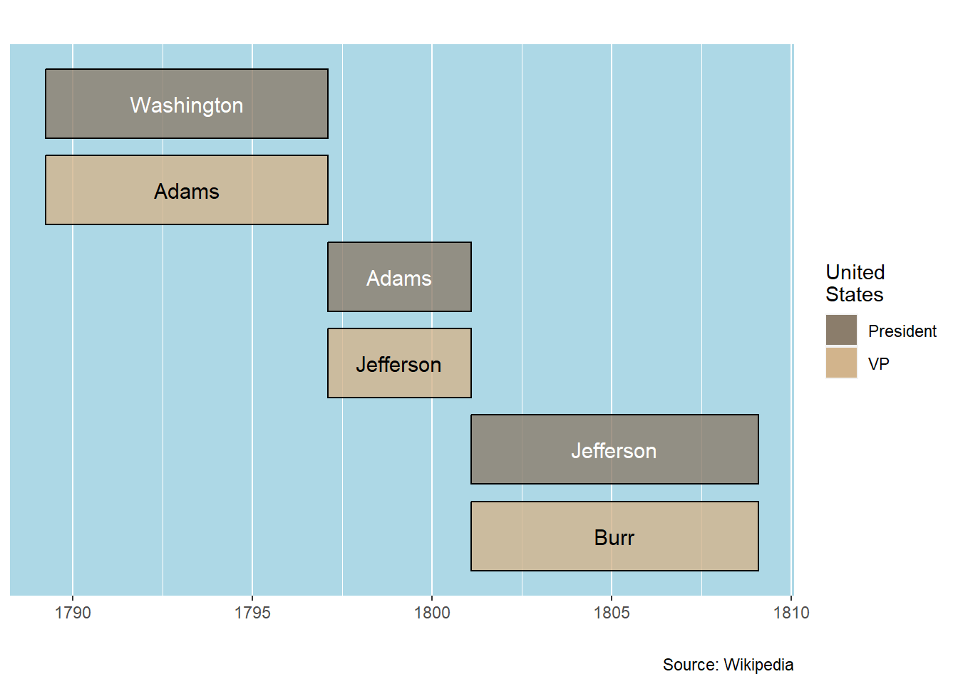
Bars are arranged on separate lines in the order in which they occur in the data table. If you want to change the order, you use a data table column called “row.”
Row values start with 1 at the top of the bar-timeline and are larger values going down the table. Usually, you use integers, such as 1, 2, 3 for the row values. It is possible to use other values, such a 1, 1.5, 3, 3.5, for special cases.
Table rows that have the same row value will have the bars placed on the same row in the bar-timeline.
The start and end dates in the data table don’t have any year. Therefore, they are not true date values. This is corrected by adding an arbitrary year and doing the conversion to a date. The year is not shown in the graphic, so the choice of year added to these dates doesn’t make any difference.
The fruit names (which are renamed to “event”) are wrapped with the str_wrap function. This allows the longer names to be fit into the bars.
The following example shows how all this works.
## Initialize default styles
column <- bar_styles()

## Create the data table
data <- read_csv(col_names=TRUE, show_col_types=FALSE, file=
 "fruit,           start, end, row, color
  apricot,         May-1,    July-1,    1,  sandybrown
  cling peach,     May-15,   June-15,   2,  coral1
  freestone peach, June-15,  Aug-15,    2,  darkorange2
  navel orange,    Dec-1,    Dec-31,    3,  orange
  navel orange,    Jan-1,    Mar-1,     3,  orange
  meyer lemon,     Nov-1,    Dec-31,    4,  lightgoldenrod1
  meyer lemon,     Jan-1,    Apr-1,     4,  lightgoldenrod1
  pear,            Aug-1,    Oct-1,     5,  yellowgreen
  plum,            June-21,  Sept-1,    6,  plum2")

## Generate a presentation table
gt(data) |>
  cols_hide(columns=c(color, row)) |>
tab_source_note(source_note = "Wikipedia")| fruit | start | end |
|---|---|---|
| apricot | May-1 | July-1 |
| cling peach | May-15 | June-15 |
| freestone peach | June-15 | Aug-15 |
| navel orange | Dec-1 | Dec-31 |
| navel orange | Jan-1 | Mar-1 |
| meyer lemon | Nov-1 | Dec-31 |
| meyer lemon | Jan-1 | Apr-1 |
| pear | Aug-1 | Oct-1 |
| plum | June-21 | Sept-1 |
| Wikipedia | ||
Fruit Seasons
## Adjustments to default values
column$text_size   <- 3.5
column$source_info <- "Source: Wikipedia"

## Column renaming
data <- data |>
   rename(event = fruit)

## Wrap events
data <- data |>
  mutate(event = str_wrap(event, 6))

## Make start and end into dates (use of 2020 is arbitrary)
data <- data |>
  mutate(start = ymd(paste0("2020-",start))) |>
  mutate(end   = ymd(paste0("2020-",end)))

## Generate the bar_timeline
bar_timelines(datatable = data,
                styles = column) +
   ## Modify the x axis scale to have month abbreviations
       scale_x_date(date_breaks = "month", date_labels = "%b")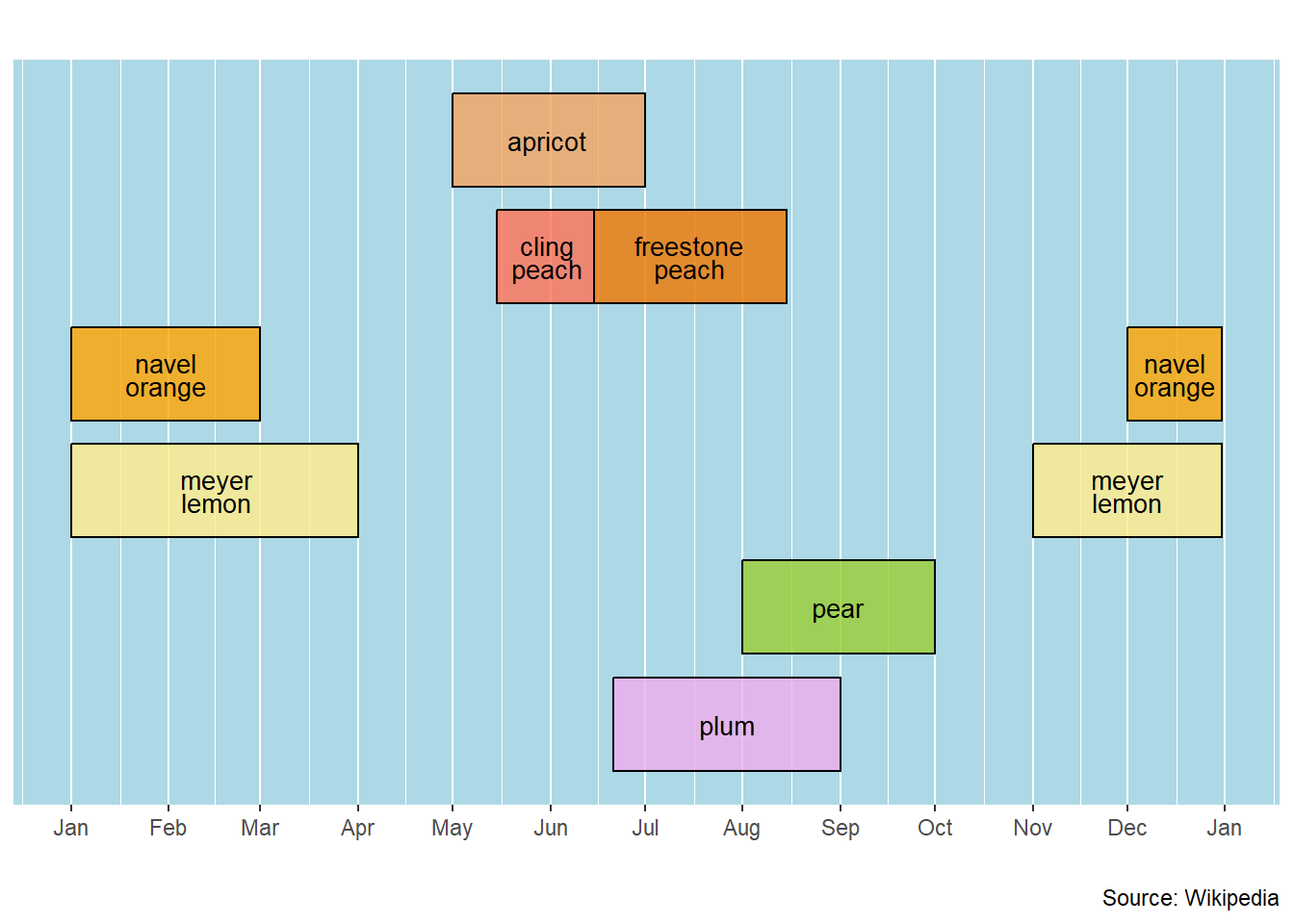
The timeline expects to have a start and end as a date. The good news is that this is a fairly flexible definition. You can always use proper dates (e.g., y-m-d format) for the start and end values. Numerical values that aren’t actual dates can also be used to order the events on the timeline.
Two examples show how this works.
You can use a variety of date formats, and even mix them up, if you keep the order of date elements (i.e., day, month & year) constant.
Use the ymd function if there is any question about whether your data are being read as dates.
## Initialize
column <- bar_styles()

## Read the data
data <- read_csv(col_names=TRUE, show_col_types=FALSE, file=
   "event,      start,         end
    Assessment, 2020/1/6,      2020/3/31
    Fund Drive, 2020 2 1,      2020 4 30
    Planning,   2020-April-1,  2020-May-31
    Field Work, 2020-6-1,      2020-10-15")

## Make proper dates
data$start <- ymd(data$start)
data$end   <- ymd(data$end)

## Make a data table
gt(data) |>
tab_source_note(source_note = "Source: Made up example")| event | start | end |
|---|---|---|
| Assessment | 2020-01-06 | 2020-03-31 |
| Fund Drive | 2020-02-01 | 2020-04-30 |
| Planning | 2020-04-01 | 2020-05-31 |
| Field Work | 2020-06-01 | 2020-10-15 |
| Source: Made up example | ||
Date Format Test
## Modify the default values
column$source_info <- "Source: Made up example"
column$x_axis_label <- "2020"

## Generate the bar timeline
bar_timelines(datatable = data,
                        styles = column)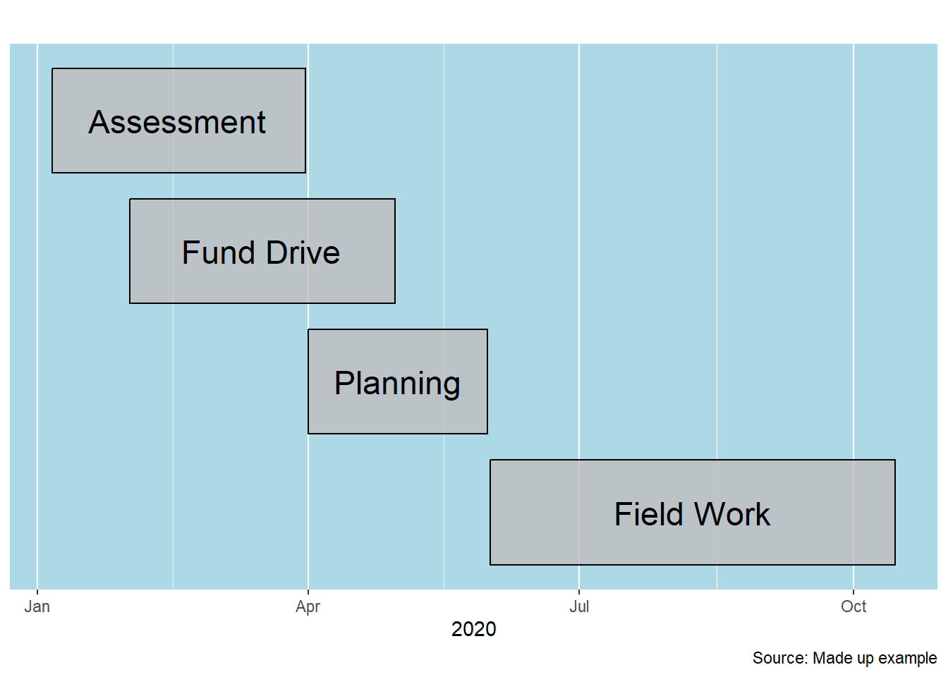
Sometimes, you don’t have specific dates. Instead, you just have interval start and end values. Months are an example. Here, we don’t want to use month names on the X axis as it isn’t clear when this process will begin.
## Initialize
column <- bar_styles()

## Read the data
data <- read_csv(col_names=TRUE, show_col_types=FALSE, file=
    "event,      start, end
     Proposal,     1,    3
     Lit Review,   2,    4
     Permits,      3,    5
     Field Prep,   3,    6
     Field Study,  8,   13
     Analysis,    13,   15
     Writing,     14,   17")

## Build a presentation table
gt(data) |>
tab_source_note(source_note = "Committee Review: Jan 2021")| event | start | end |
|---|---|---|
| Proposal | 1 | 3 |
| Lit Review | 2 | 4 |
| Permits | 3 | 5 |
| Field Prep | 3 | 6 |
| Field Study | 8 | 13 |
| Analysis | 13 | 15 |
| Writing | 14 | 17 |
| Committee Review: Jan 2021 | ||
Intervals Test
## Adjust the default values
column$source_info  <- "Committee Review: Jan 2021"
column$x_axis_label <- "Project Months"
column$text_size    <- 3

## Generate the bar timeline
bar_timelines(datatable = data,
                       styles = column)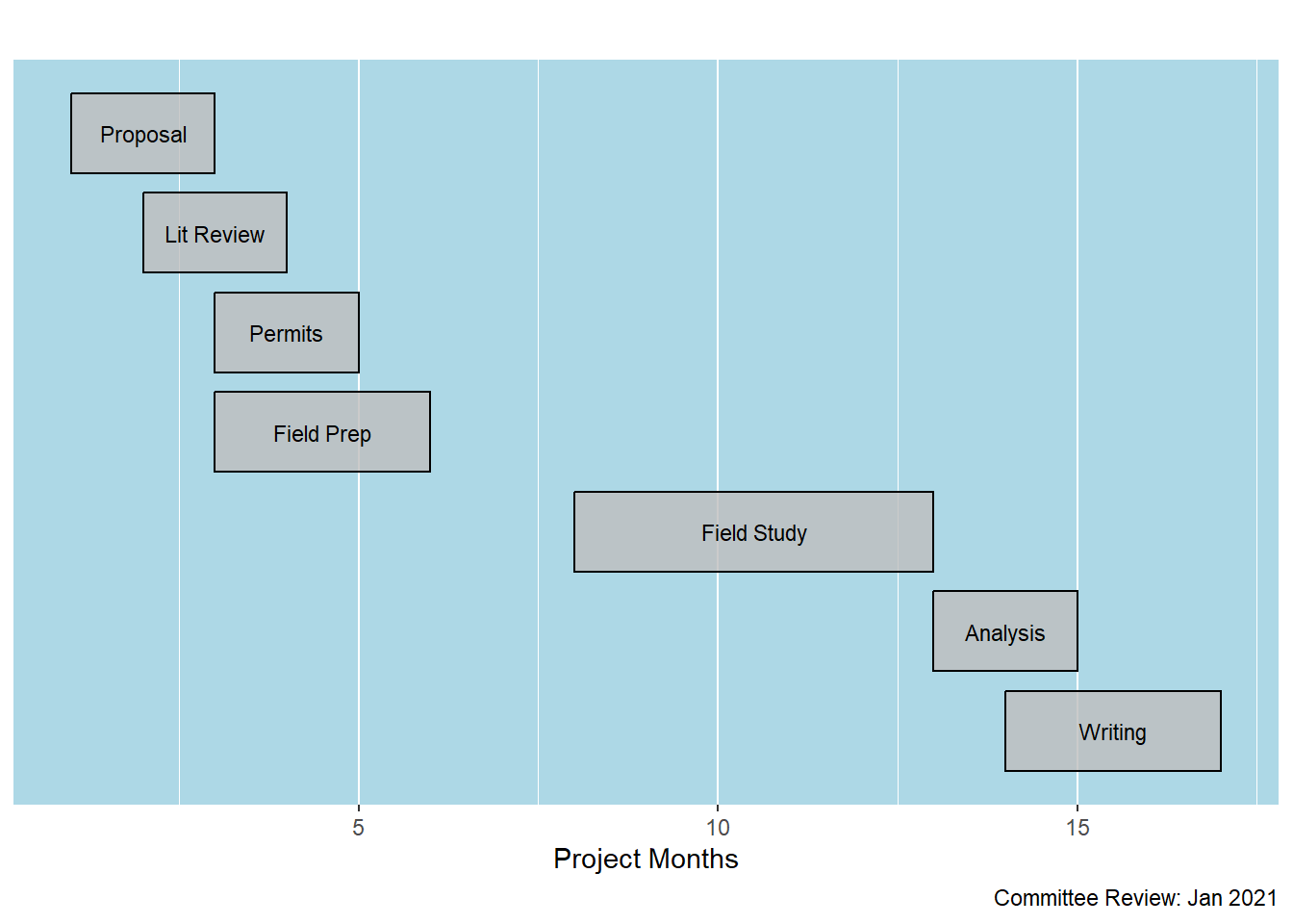
We generally think of dates as having the three components (day, month and year). The bar_timelines function works fine if you provide only the year. You don’t need to convert the year data into a date variable.
## Initialize
column <- bar_styles()

## Read the data
data <- read_csv(col_names=TRUE,show_col_types=FALSE, file=
    "event,               start, end
     electromechanical,   1930,  1950
     electronic,          1940,  1955
     transistors,         1950,  1960
     integrated circuits, 1960,  1970
     microprocessors,     1970,  2023
     internet,            1995,  2023
     mobile,              2000,  2023
     cloud,               2010,  2023")

## Generate a data table
gt(data) |>
tab_source_note(source_note = "Wikipedia: adjusted to years")| event | start | end |
|---|---|---|
| electromechanical | 1930 | 1950 |
| electronic | 1940 | 1955 |
| transistors | 1950 | 1960 |
| integrated circuits | 1960 | 1970 |
| microprocessors | 1970 | 2023 |
| internet | 1995 | 2023 |
| mobile | 2000 | 2023 |
| cloud | 2010 | 2023 |
| Wikipedia: adjusted to years | ||
Historical Developments in Computing
## Adjust default values
column$source_info   <- "Wikipedia: adjusted to years"
column$x_axis_label  <- "Year"
column$text_size     <- 3
column$outline_color <- "navajowhite3"
column$alpha         <- 0.6
column$color         <- "navajowhite1"

## Wrap the event names
data <- data |>
  mutate(event = str_wrap(event,12))

## Generate the bar timeline
bar_timelines(datatable = data,
                styles = column) +
  ## Modify the x axis scale
    scale_x_continuous(breaks=seq(1920, 2020, by = 10))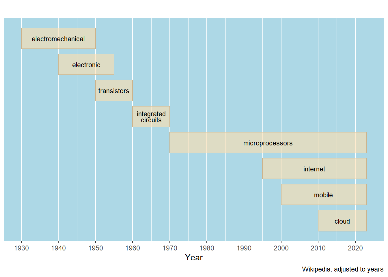
There are a number of ways you can modify the attributes of a bar-timeline.
Use these values with a format like column$color <- "red" to change all the bars to red. Alternatively, add a column to the data table with the name of the column (e.g., red) and enter values for each of the entries (i.e., rows).
| column name | default | comment |
|---|---|---|
| row | data table rows arranged top to bottom | 1 is at the top |
| color | grey | Inside color of the bar and, if used, the key |
| height | 0.8 | Height of the bar |
| alpha | 0.8 | Bar transparency |
| outline_color | black | Color of the line around the bar |
| text | NULL | Names for the color blocks in the key |
| text_size | 6 | Size of the event text |
| text_color | black | Color of the event text |
| key_title | NULL | Title of the key (legend) to the bar colors |
| x_axis_label | NULL | Label for the X axis |
| background_color | lightblue | Background of the plot area on which the bars are shown. |
| title | NULL | An alternative to using the YAML fig-cap statement |
| source_info | NULL | Consider this an important bit of info to add to each chart |
Sometimes it’s necessary to use the power of R to build an effective bar-timeline.
The dates don’t have a comma separating the day and year. If there is a comma, it’s hard to input the data. Using read_csv2 and semicolon field separators is an alternative. That lets you used commas inside a data field.
The colors for the parties are relatively unsaturated (by color choice) to keep the bars from being too dark. The background color is also neutral (mid-brown). The names of the presidents are in either black or white, depending on the party. All these choices were made to help visually-challenged people see the information in the graphic.
The assignment of the bar and text colors are done with dplyr’s mutate and case_when functions. This coding structure is quite handy.
The legend is generated when there is a table used with the key_color_table parameter of the bar_timelines function. This legend (here called a “key”) links text to color values. In the spirit of consistency, these values are input using the read_csv function.
## Initialize
column <- bar_styles()

## Read the data
data <- read_csv(col_names=TRUE, show_col_types=FALSE, file=
    "event,     start,           end,             party
     R Nixon,   January 20 1969, August 9 1974,   R
     G Ford,    August 9 1974,   January 20 1977, R
     J Carter,  January 20 1977, January 20 1981, D
     R Reagan,  January 20 1981, January 20 1989, R
     GHW Bush,  January 20 1989, January 20 1993, R
     B Clinton, January 20 1993, January 20 2001, D
     GW Bush,   January 20 2001, January 20 2009, R
     B Obama,   January 20 2009, January 20 2017, D
     D Trump,   January 20 2017, January 20 2021, R
     J Biden,   January 20 2021, January 20 2025, D")

## Convert char to date
data$start <- mdy(data$start)
data$end   <- mdy(data$end)

## Make a good table
gt(data) |>
  ## Rename a column (temporary)
   cols_label(event = "President") |>
  ## Source data
  tab_source_note(source_note = "Source: Wikipedia") |>
  ## Footnote on Biden's current term
  tab_footnote(
    footnote = "Assumed end of current term",
locations = cells_body(columns=end, rows=10))| President | start | end | party |
|---|---|---|---|
| R Nixon | 1969-01-20 | 1974-08-09 | R |
| G Ford | 1974-08-09 | 1977-01-20 | R |
| J Carter | 1977-01-20 | 1981-01-20 | D |
| R Reagan | 1981-01-20 | 1989-01-20 | R |
| GHW Bush | 1989-01-20 | 1993-01-20 | R |
| B Clinton | 1993-01-20 | 2001-01-20 | D |
| GW Bush | 2001-01-20 | 2009-01-20 | R |
| B Obama | 2009-01-20 | 2017-01-20 | D |
| D Trump | 2017-01-20 | 2021-01-20 | R |
| J Biden | 2021-01-20 | 1 2025-01-20 | D |
| Source: Wikipedia | |||
| 1 Assumed end of current term | |||
Terms of Recent US Presidents
## Make color and text_color different for each party
data <- data |>
  mutate(color = case_when(party == "R" ~ "lightcoral",
                           party == "D" ~ "lightblue3")) |>
  mutate(text_color = case_when(party == "R" ~ "white",
                                party == "D" ~ "black"))

## Key table colors
key_color_table <- read_csv(col_names=TRUE,
                            show_col_types=FALSE,file=
   "text,       color
    Democratic, lightblue3
    Republican, lightcoral")

## Annotation & Adjustments
column$source_info      <- "Source: Wikipedia"
column$x_axis_label     <- "Term"
column$text_size        <- 3
column$background_color <- "wheat3"
column$outline_color    <- "gray60"
column$key_title        <- "Presidental\nParty"

## Generate the bar timeline
bar_timelines(datatable = data,
                     styles = column,
                     key_color_table = key_color_table)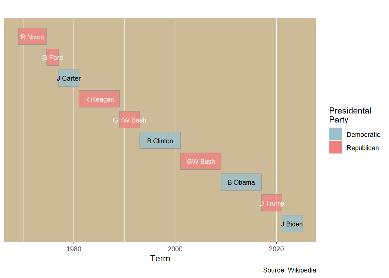
Most of the bar-timelines shown in the previous examples are fairly basic. Most bar-timelines that researchers will make are likely to be like these simple examples.
It is possible, and often desirable, to push this tool into new realms.
Recall that the bar_timelines function is creating a ggplot2 object. That means that you can use any of the ggplot2 capabilities to add or modify a bar-timeline.
This bar timeline shows a relatively simple chart that is enhanced with a horizontal line and text annotations.
First, the dates in the data need to be standardized.
The bar timeline is generated next. Note that the result is a standard ggplot2 object. That means that it can be modified by using more ggplot2 functions (here, theme and annotate).
If only a line is drawn (without any use of annotate), the geom_hline and geom_vline functions can be used. These two functions, however, are not compatible with annotate. As a result, lines are drawn with the annotate “segment” geom argument. An annotate line segment will expand the limits of the plot area. This might be useful if some text doesn’t otherwise fit inside the plot.
## Initialize
column <- bar_styles()

## Read the data
data <- read_csv(show_col_types = FALSE, file =
   "row, event, start, end, notes
1, Washington DC, 3-16-2022, 4-12-2022, 'Cherry blossoms'
2, West Coast, 5-17-2022, 6-15-2022, 'SoCal, Oregon & NYC'
3, Kaua`i, 9-19-2022, 9-23-2022, 'Garden Isle'
4, West Coast, 10-26-2022, 11-30-2022, 'SoCal, Oregon & Washington'
6, Japan, 1-11-2023, 1-31-2023, 'SoCal & Japan'
7, Southwest, 3-1-2023, 3-29-2023, 'SoCal & Utah'
8, Big Island, 5-12-2023, 5-16-2023, 'Sokha graduation'
9, SoCal, 5-31-2023, 6-8-2023, 'SoCal'
10, Midwest, 8-7-2023, 8-16-2023, 'Tom, MOBOT & Huntington'
11, British Columbia, 9-5-2023, 10-2-2023, 'BC, Oregon & SoCal'")

## Start and end to dates
data$start <- mdy(data$start)
data$end   <- mdy(data$end)

## Remove the single quotation marks
data <- data |>
  mutate(notes = gsub("'","",notes))

## Create a data table
gt(data) |>
  cols_hide(columns=c(row)) |>
tab_source_note(source_note = "Source: Travel records")| event | start | end | notes |
|---|---|---|---|
| Washington DC | 2022-03-16 | 2022-04-12 | Cherry blossoms |
| West Coast | 2022-05-17 | 2022-06-15 | SoCal, Oregon & NYC |
| Kaua`i | 2022-09-19 | 2022-09-23 | Garden Isle |
| West Coast | 2022-10-26 | 2022-11-30 | SoCal, Oregon & Washington |
| Japan | 2023-01-11 | 2023-01-31 | SoCal & Japan |
| Southwest | 2023-03-01 | 2023-03-29 | SoCal & Utah |
| Big Island | 2023-05-12 | 2023-05-16 | Sokha graduation |
| SoCal | 2023-05-31 | 2023-06-08 | SoCal |
| Midwest | 2023-08-07 | 2023-08-16 | Tom, MOBOT & Huntington |
| British Columbia | 2023-09-05 | 2023-10-02 | BC, Oregon & SoCal |
| Source: Travel records | |||
Travel Log
## Annotation & Adjustments
column$source_info   <- "Source: Travel records"
column$text_size     <- 3
column$outline_color <- "navajowhite3"
column$alpha         <- 0.6
column$color         <- "navajowhite1"

## Generate the bar timeline
travel <- bar_timelines(datatable = data,
                       styles = column)

## Simplify and add supplemental information
travel +
  theme(axis.text.x=element_blank(),
        axis.ticks.x=element_blank()) +
  annotate("segment", x = as.Date("2022-1-1"),
                      xend = as.Date("2023-12-31"),
                      y = 5, yend = 5,
                      color = "navajowhite3") +
  annotate("text", x = as.Date("2022-5-1"), y = 4.5,
           label = "2022") +
  annotate("text", x = as.Date("2022-5-1"), y = 5.5,
label = "2023") 
There are several things highlighted here.
There are really two sets of bars. Some for the sports and others for the season. The data for each bar comes from the same set of data. The colors distinguish the sets.
The x axis annotation is modified to show just the month names (as abbreviations). This also shows that the bar_timelines function returns a regular ggplot2 object. You can modify these objects by supplying additional ggplot2 functions, such as the scale_x_date used here.
The data are approximate as the dates change a bit between years.
## Initialize
column <- bar_styles()

## Read the data
data <- read_csv(col_names=TRUE,show_col_types=FALSE, file=
    "event,     start,    end,        row, color
     NFL,       9-1-2022, 12-15-2022, 1, wheat
     Playoff,   1-5-2022,  2-15-2022, 1, wheat3
     NBA,      10-1-2022, 12-31-2022, 2, wheat
     NBA,       1-1-2022,  4-15-2022, 2, wheat
     Playoff,  4-16-2022,  6-15-2022, 2, wheat3
     MLB,      3-20-2022,  10-1-2022, 3, wheat
     Playoff,  10-2-2022, 10-31-2022, 3, wheat3
     NHL,       9-1-2022, 12-31-2022, 4, wheat
     NHL,       1-1-2022,   4-5-2022, 4, wheat
     Playoff,   4-6-2022,   6-5-2022, 4, wheat3
     MLS,      2-20-2022, 10-20-2022, 5, wheat
     Playoff,  11-5-2022,  12-1-2022, 5, wheat3
     NWSL,     4-15-2022, 10-15-2022, 6, wheat
     Playoff, 10-16-2022, 10-31-2022, 6, wheat3
     Spring,   3-19-2022,  6-19-2022, 7, orchid2
     Summer,   6-20-2022,  9-21-2022, 7, darkolivegreen3
     Fall,     9-22-2022, 12-20-2022, 7, tan2
     Winter,   12-21-2021, 3-18-2022, 7, lightblue2")

## Start and end to dates
data$start <- mdy(data$start)
data$end   <- mdy(data$end)

## Generate a data table
gt(data) |>
  cols_hide(columns = c(row, color)) |>
  tab_source_note(source_note =
"Source: Wilipedia with adjustments")| event | start | end |
|---|---|---|
| NFL | 2022-09-01 | 2022-12-15 |
| Playoff | 2022-01-05 | 2022-02-15 |
| NBA | 2022-10-01 | 2022-12-31 |
| NBA | 2022-01-01 | 2022-04-15 |
| Playoff | 2022-04-16 | 2022-06-15 |
| MLB | 2022-03-20 | 2022-10-01 |
| Playoff | 2022-10-02 | 2022-10-31 |
| NHL | 2022-09-01 | 2022-12-31 |
| NHL | 2022-01-01 | 2022-04-05 |
| Playoff | 2022-04-06 | 2022-06-05 |
| MLS | 2022-02-20 | 2022-10-20 |
| Playoff | 2022-11-05 | 2022-12-01 |
| NWSL | 2022-04-15 | 2022-10-15 |
| Playoff | 2022-10-16 | 2022-10-31 |
| Spring | 2022-03-19 | 2022-06-19 |
| Summer | 2022-06-20 | 2022-09-21 |
| Fall | 2022-09-22 | 2022-12-20 |
| Winter | 2021-12-21 | 2022-03-18 |
| Source: Wilipedia with adjustments | ||
Major League Sports
## Adjust default values
column$source_info   <- "Source: Wikipedia with adjustments"
column$text_size     <- 3
column$outline_color <- "gray50"
column$alpha         <- 0.6
column$x_axis_label  <- "Periods of Play"

## Generate the bar timeline
bar_timelines(datatable = data,
                          styles = column) +
    ## Modify the x axis scale
       scale_x_date(date_breaks = "1 month", date_labels = "%b")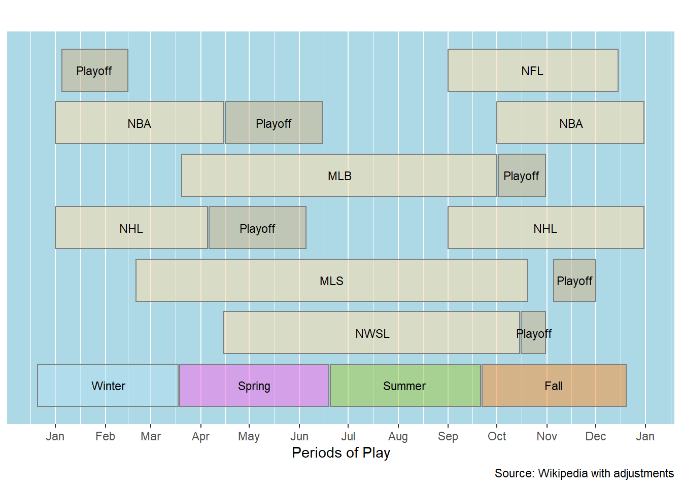
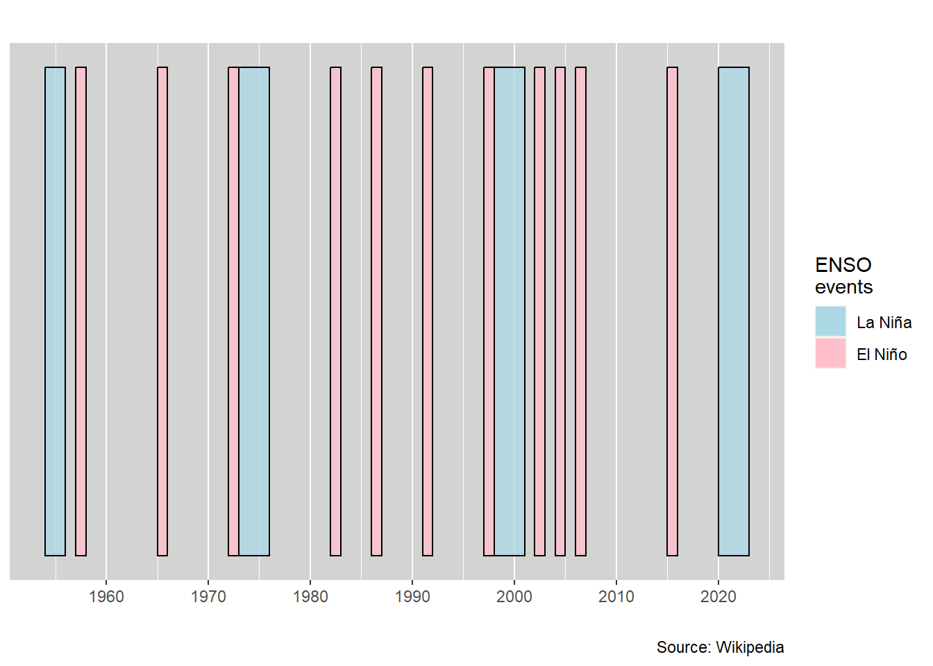
This example is very minimalist. Even though the graphic is simple, it provides a graphic visualization of the pattern of El Niño and La Niña years.
The text is removed by setting the value to “00000000” as this is interpreted as transparent (zero opacity).
Providing a single row value places all the bars on one row.
The X axis label values are given special attention. Since the start and end values are years (with no implication of these being dates), the scale_x_continuous function is used to indicate the range and frequency of the axis breaks. When the X axis is based on date values, a different function (scale_x_date) is used to control the spacing and annotation characteristics.
## Initialize
column <- bar_styles()

data <- read_csv(col_names=TRUE,show_col_types=FALSE, file=
 "type,    start, end
  El Niño, 1957,  1958
  El Niño, 1965,  1966
  El Niño, 1972,  1973
  El Niño, 1982,  1983
  El Niño, 1986,  1987
  El Niño, 1991,  1992
  El Niño, 1997,  1998
  El Niño, 2002,  2003
  El Niño, 2004,  2005
  El Niño, 2006,  2007
  El Niño, 2015,  2016
  La Niña, 1973,  1976
  La Niña, 1954,  1956
  La Niña, 1998,  2001
  La Niña, 2020,  2023")

## Generate a table
gt(data) |>
tab_source_note(source_note = "Source: Wikipedia")| type | start | end |
|---|---|---|
| El Niño | 1957 | 1958 |
| El Niño | 1965 | 1966 |
| El Niño | 1972 | 1973 |
| El Niño | 1982 | 1983 |
| El Niño | 1986 | 1987 |
| El Niño | 1991 | 1992 |
| El Niño | 1997 | 1998 |
| El Niño | 2002 | 2003 |
| El Niño | 2004 | 2005 |
| El Niño | 2006 | 2007 |
| El Niño | 2015 | 2016 |
| La Niña | 1973 | 1976 |
| La Niña | 1954 | 1956 |
| La Niña | 1998 | 2001 |
| La Niña | 2020 | 2023 |
| Source: Wikipedia | ||
Recent El Niño/La Niña Historical Patterns
## Rename column to the expected name & sort by start value
data <- data |>
  rename(event = type) |>
  arrange(start)

## Color the bars for the different event types
data <- data |>
  mutate(color = case_when(
    event == "El Niño" ~ "pink",
    event == "La Niña" ~ "lightblue"))

## Modify default values
column$text_color       <- "00000000" ## transparent
column$background_color <- "lightgray"
column$row              <- 1 ## Put all events on one row
column$source_info      <- "Source: Wikipedia"
column$key_title        <- "ENSO\nevents"

## Key table colors
key_color_table <- read_csv(col_names=TRUE,
                            show_col_types=FALSE,file=
   "text,       color
    El Niño, pink
    La Niña, lightblue")

## Generate the bar-timeline with a legend
bar_timelines(datatable = data,
                styles = column,
             key_color_table = key_color_table) +
    ## Modify the x axis scale
    scale_x_continuous(breaks=seq(1950, 2020, by = 10))