Show the code
## Activate the Core Packages
library(tidyverse) ## Brings in a core of useful functions
library(gt)        ## Tables

## Specific packages
library(milestones)This document continues a theme of using table-driven visualizations in Quarto-centric documents. Tables and graphics go together in powerful ways.
It all has to do with time.
How can we best visualize events?
To answer this question, we explore time using two technique. Each shows events in a different way. There is no one-best solution. Each style of visualization has a purpose.
A major objective is to demonstrate a simple form for data entry that links to an equally easy to use set of commands to create the visualization. To do that, we are going to use data tables.
An underlying assumption is that most people don’t create time-based visualizations very often. For them, it seems a waste of time to learn the intricacies of a generalized tool, such as ggplot2, as they are applied to a specific type of graphic output. The alternative is to create a wrapper for the tool that “hides” the complexity.
We can demonstrate the power of using a “wrapper” on the two time-based graphics: milestones and bar-graphs.
## Activate the Core Packages
library(tidyverse) ## Brings in a core of useful functions
library(gt) ## Tables
## Specific packages
library(milestones)This preview shows simple applications of the two data visualizations.
Note the characteristics of the data being portrayed.
Milestones: Events are discrete and occur episodically, not regularly.
Bar-timelines: Events occur over periods that may be unequal. The start and end times are not necessarily at the same interval for all the events.
The schedule for a typical academic semester is shown in a basic milestone graphic and its associated data table.
## Initialize defaults
column <- lolli_styles()

## Read the data
data <- read_csv(col_names=TRUE, show_col_types=FALSE, file=
        "event,                   date
         Fall semester begins,    8-1-2023
         Course drop deadline,    9-12-2023
         Incomplete removal,      11-1-2023
         Thesis/Dissertation due, 11-3-2023
         Finals begin,            12-11-2023
         Commencement,            12-16-2023")

## Make sure dates are used
data$date <- mdy(data$date)

## table to accompany the graphic
gt(data) |>
  fmt_date(columns = date,
           date_style = "MMMEd") |>
tab_source_note(source_note="Source: UHM Course Schedule")| event | date |
|---|---|
| Fall semester begins | Tue, Aug 1 |
| Course drop deadline | Tue, Sep 12 |
| Incomplete removal | Wed, Nov 1 |
| Thesis/Dissertation due | Fri, Nov 3 |
| Finals begin | Mon, Dec 11 |
| Commencement | Sat, Dec 16 |
| Source: UHM Course Schedule | |
2023 Fall Semester Schedule
## Graphic modifications
column$y_extend_pct <- 0.2
column$source_info  <- "Source: UHM Course Schedule"

## Generate a text_milestone graphic
milestones(datatable = data,
               styles = column) +
scale_x_date(breaks = "1 month", date_labels = "%b") 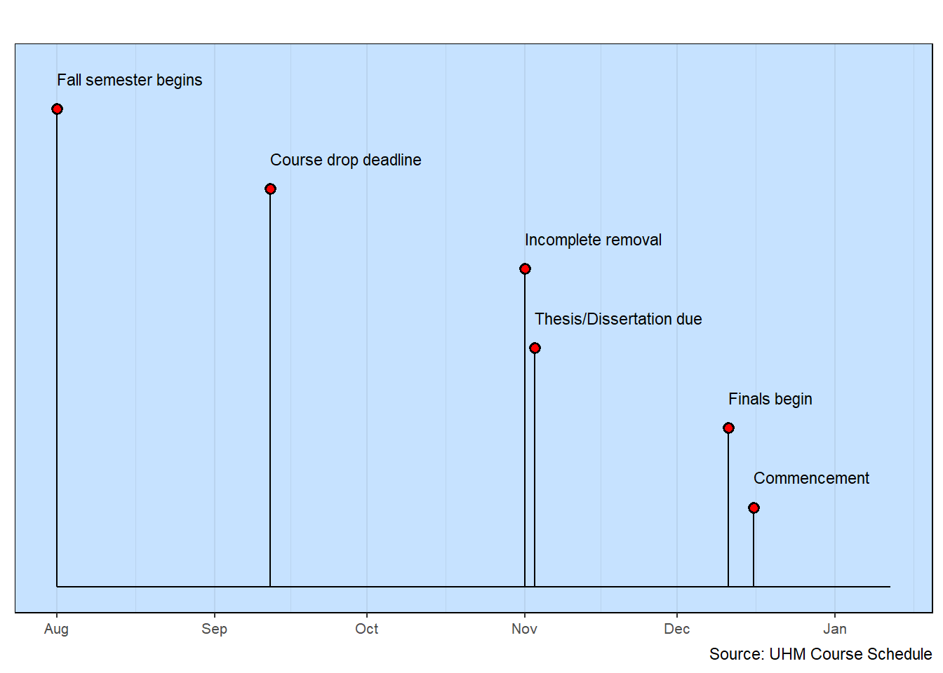
The example is a simple planning schedule using a basic bar-timeline along with an associated data table.
## Initialize default styles
column <- bar_styles()

## Read the data
## Note: uses single quotes because commas are in the data
data <- read_csv(col_names=TRUE, show_col_types=FALSE, file=
   "event,      start,     end,        responsibility
    Assessment, 2020/1/6,  2020/3/31,  'Jones, Smith'
    Fund Drive, 2020/2/1,  2020/4/30,  'Jones'
    Planning,   2020/4/1,  2020/5/31,  'Smith, Brown, Singh'
    Field Work, 2020/6/1,  2020/10/15, 'Mendez, Green'
    Evaluation, 2020/11/1, 2020/11/30, 'Jones, Singh'")

## Make sure dates are used
data$start <- ymd(data$start)
data$end   <- ymd(data$end)

## Strip the single-quotation marks
data <- data |>
  mutate(responsibility = gsub("'","",responsibility))

## Create a data table
gt(data) |>
  fmt_date(columns = c(start,end),
           date_style = "MMMd") |>
  tab_header(title="Academic Analysis Project",
             subtitle="2020") |>
tab_source_note(source_note="Source: Fake data")| Academic Analysis Project | |||
| 2020 | |||
| event | start | end | responsibility |
|---|---|---|---|
| Assessment | Jan 6 | Mar 31 | Jones, Smith |
| Fund Drive | Feb 1 | Apr 30 | Jones |
| Planning | Apr 1 | May 31 | Smith, Brown, Singh |
| Field Work | Jun 1 | Oct 15 | Mendez, Green |
| Evaluation | Nov 1 | Nov 30 | Jones, Singh |
| Source: Fake data | |||
2020 Academic Analysis Project
## Adjust the default data
column$source_info   <- "Source: Fake data"
column$x_axis_label  <- "2020"
column$outline_color <- "skyblue3"

## Generate the bar-timeline
bar_timelines(datatable = data, styles = column)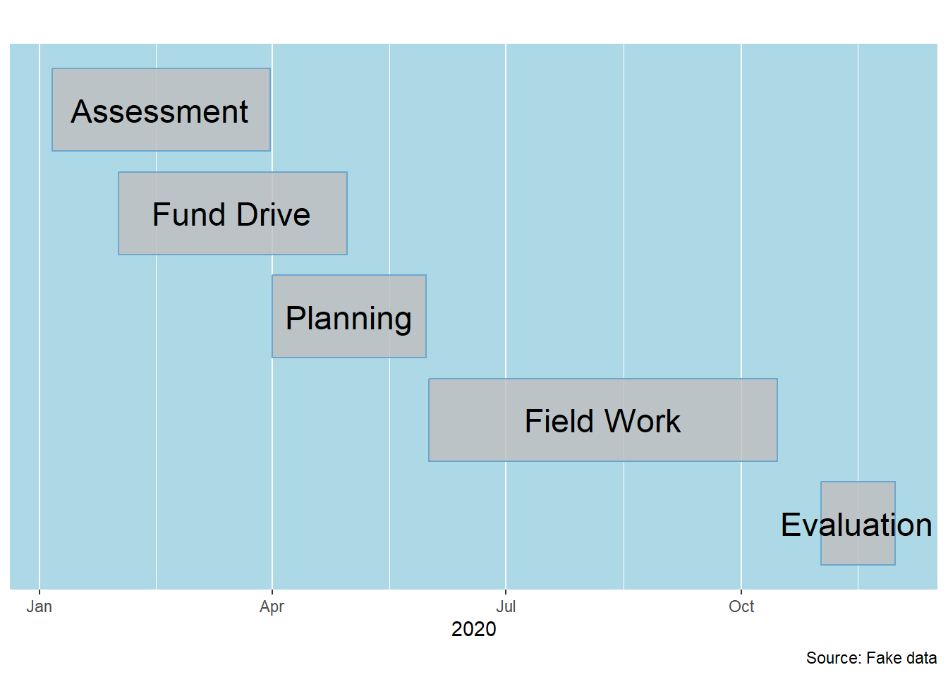
Both types of visualizations were generated in about the same way. Each started with a data table. There was some data checking. Then a few fairly straightforward function calls were made. What’s missing (because it’s hidden in the wrapper) are the details provided to ggplot.
There is a lot that can be done to enhance these two types of visualizations.
Much of what is needed to create a variety of graphical visualizations of timelines is tapped by using functions in the R packages. There are situations, where it is useful to create new functions to simplify recurring tasks.
Sometimes, the function is simply a wrapper that makes it easier to use an existing function. For example, it is possible to supply default values with the wrapper code so that a generalized function is more easily used in a particular context. An example is the milestones. This function wraps around some lines of ggplot code that so that it is clear what data are needed for ggplot to create a text milestone visualization.
The code for the following functions is found in the Appendix.
This version of the functions requires that you copy the functions into your analysis code and run them so they are initialized. In the future, the functions will likely be made available for more direct use though the standard R-studio installation procedure.
Tables are an important fundamental part of milestone visualization. A table has several roles as an essential partner to the graphic visualization.
Data Storage: Columns of information about each timeline event are held in tables. Usually, only a few of the columns are used in the graphic visualization. Examining the table provides a richer basis for the interpretation of the events.
Precise Values: The graphic visualization often provides a broad overview. The table supplies the precise data. Moreover, the data are often arranged in columns, a format that is both familiar and useful when looking at sets of data.
Formatting Information: Tables can have columns of values that are used to add richness to the visualization. Color, size and position are just a few of the graphic elements that can be specified in a table that are then carried over to the visualization.
The tables are often printed in association with the graphic visualization. Some of the information in the table is not printed (like formatting data). Correspondingly, the graphic may not have all the table information.
Most of the examples pair a graphic visualization with a corresponding table. This further emphasizes the importance of data tables.
Considerable attention is given to making good presentation tables.