Show the code
## Activate the Core Packages
library(tidyverse) ## Brings in a core of useful functions
library(gt)        ## Tables

## Specific packages
library(milestones)The stone pillars Romans alongside roadways were placed a mile apart. Looking at the information on the pillar told you where you were at, generally the distance from the start of the roadway. Now, we use the same term to measure distances, not as miles, but as positions along a timeline.
Our markers are significant events. The distances we use are dates.
Consider your own significant events: when you were born, when you first walked, and when you started school.
All sorts of situations are characterized by having notable events that don’t necessarily occur on a rigid schedule.
The discipline of phenology is based on the collection and analysis of life-history events of organisms. When do a plant’s leaves first emerge, its first buds are seen, the first flowers develop, and the leaves begin to drop.
A simple graphic often suffices. Here, we go beyond that to show that there are possibilities that are not used because of software limitations or a failure to know about the features. There are a lot of enhancements that add visual information to a basic milestone chart.
## Activate the Core Packages
library(tidyverse) ## Brings in a core of useful functions
library(gt) ## Tables
## Specific packages
library(milestones)Each milestones graphic needs, at a minimum, two values for each event.
event: This is the name to be used as text to identify a “lollipop” shaped marker.
date: This is the location of the “lollipop” shaped marker on the timeline.
A table of data with columns with these two names (event, date) is sufficient to get started.
The data table can contain more information than just the two required columns. In the following example, there are two columns of information that are not used in the graphic but are used in the accompanying table.
## Initialize defaults
column <- lolli_styles()

## Read data
data <- read_csv(col_names=TRUE, show_col_types=FALSE, file=
       "event,     date,    category, comment
        Hinnamnor, 2022-8-28, 5, 242 km W of Keelung
        Kompasu,   2022-10-7, 0, Taiwan
        Chanthu,   2021-9-5,  5, Taiwan
        In Fa,     2021-7-15, 2, Taiwan
        Surigae,   2021-4-11, 5, Taiwan
        Maysak,    2020-8-26, 2, Taiwan
        Bavi,      2020-8-20, 3, Taiwan")

## Make sure dates are real dates
data$date <- ymd(data$date)

## Generate a table
gt(data) |>
  fmt_date(columns = date,
           date_style = "m_day_year") |>
  tab_footnote(
    footnote = "tropical storm = 0",
    locations = cells_column_labels(columns=category)) |>
tab_source_note(source_note = "Source: worlddata.info")| event | date | category1 | comment |
|---|---|---|---|
| Hinnamnor | Aug 28, 2022 | 5 | 242 km W of Keelung |
| Kompasu | Oct 7, 2022 | 0 | Taiwan |
| Chanthu | Sep 5, 2021 | 5 | Taiwan |
| In Fa | Jul 15, 2021 | 2 | Taiwan |
| Surigae | Apr 11, 2021 | 5 | Taiwan |
| Maysak | Aug 26, 2020 | 2 | Taiwan |
| Bavi | Aug 20, 2020 | 3 | Taiwan |
| Source: worlddata.info | |||
| 1 tropical storm = 0 | |||
## Generate a milestones chart
milestones(datatable = data, styles = column) +
scale_x_date(breaks = "3 month", date_labels = "%m-%y") 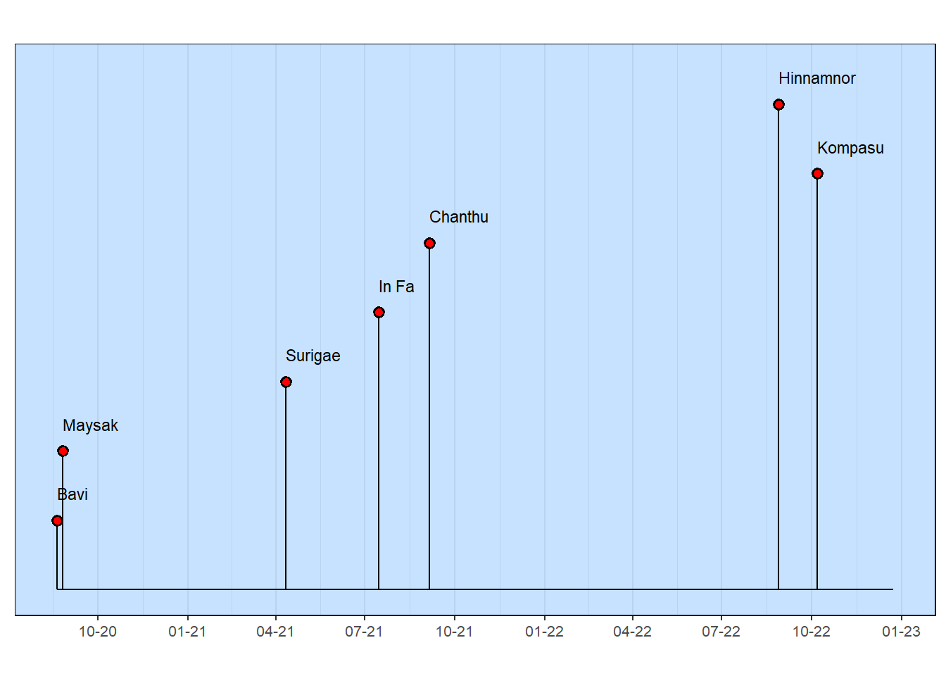
Some things worked pretty well, such as the table. That’s because some formatting was done to make sure that the information is presented in a way that’s easily understood (e.g., spelling out the month names). A detail, like the footnote explaining the “0” value for the category is helpful. All tables need to show where the data originated.
The major deficiency of the milestones graphic is the vertical arrangement of the Typhoon names (and the corresponding length of each “lollipop” stem). Note that the arrangement comes from the row order in the original table, with the first row having the highest name in the milestones chart.
Improving the appearance of the milestones graphic is done by using data values. This is described in the next section.
The list of features show primarily show graphic properties of the symbols and text used to mark events on a timeline. There are a few features that are used for the overall appearance or identification of the data.
Using the statement column <- lollistyles() sets each of the enhancement values to its default value. It is a good practice to use this function
| column name | default | comment |
|---|---|---|
| row | data table rows arranged top to bottom | Big values are high, small values near baseline, negative values are below the baseline |
| color | red | Color of the open area inside the “lollipop” head |
| point_size | 2 | Size of the “lollipop” head |
| outline | black | Outline color of the “lollipop” head |
| stroke | 1 | Width of the line connecting the “lollipop” head to the baseline |
| text_size | 3 | Size of the text associated with each “lollipop” |
| text_color | black | Color of the text associated with each “lollipop” |
| background_color | slategray1 | Fills the entire background |
| grid_color | slategray2 | Lines drawn vertically on the background |
| y_extend_percent | 0.1 | Percent of the length of the baseline to be added to each end of the baseline (e.g., 10%) |
| x_axis_label | NULL | |
| title | NULL | An alternative to using the YAML fig-cap statement |
| source_info | NULL | Consider this an important bit of info to add to each chart |
Enhancements are made to a milestones chart by giving a value to a column variable. This can be done in two ways.
Single value for all events: Assign a value using column$ as a prefix. For example, to change the color of all of the lollipop heads, specify column$color <- "blue".
Different values for events: Add a column to the table, using the name of the property to be changed as the column name. For example, adding a column named “color” to the table, then adding a color name for each lollipop head in the row for each event.
The following chunk shows a few modifications to the previous milestones graphic that demonstrate all of these modification techniques.
## Initialize defaults
column <- lolli_styles()

## Read data
data <- read_csv(col_names=TRUE, show_col_types=FALSE, file=
       "event,     date,  category, row, color, comment
        Hinnamnor, 2022-8-28, 5, 2, pink, 242 km W of Keelung
        Kompasu,   2022-10-7, 0, 1, red,  Taiwan
        Chanthu,   2021-9-5,  5, 1, red,  Taiwan
        In Fa,     2021-7-15, 2, 2, red,  Taiwan
        Surigae,   2021-4-11, 5, 3, red,  Taiwan
        Maysak,    2020-8-26, 2, 1, red,  Taiwan
        Bavi,      2020-8-20, 3, 2, red,  Taiwan")

## Make sure dates are real dates
data$date <- ymd(data$date)

## Generate a table
gt(data) |>
  cols_hide(columns = c(row, color)) |>
  fmt_date(columns = date,
           date_style = "m_day_year") |>
  tab_footnote(
    footnote = "tropical storm = 0",
    locations = cells_column_labels(columns=category)) |>
tab_source_note(source_note = "Source: worlddata.info")| event | date | category1 | comment |
|---|---|---|---|
| Hinnamnor | Aug 28, 2022 | 5 | 242 km W of Keelung |
| Kompasu | Oct 7, 2022 | 0 | Taiwan |
| Chanthu | Sep 5, 2021 | 5 | Taiwan |
| In Fa | Jul 15, 2021 | 2 | Taiwan |
| Surigae | Apr 11, 2021 | 5 | Taiwan |
| Maysak | Aug 26, 2020 | 2 | Taiwan |
| Bavi | Aug 20, 2020 | 3 | Taiwan |
| Source: worlddata.info | |||
| 1 tropical storm = 0 | |||
Recent Typhoons in Taiwan
## Adjust default values
column$text_size    <- 4
column$point_size   <- data$category + 2
column$y_extend_pct <- 0.2
column$source_info  <- "Source: worlddata.info"

## Generate a milestones chart
milestones(datatable = data,
           styles = column) +
scale_x_date(breaks = "3 month", date_labels = "%m-%y") 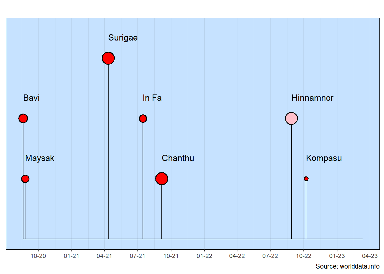
There are a lot of improvements in the milestones chart. All of this was done with pretty logical data additions.
rows: This improved the overall layout so data points are clearly seen and the layout doesn’t create any false impressions.
color: The one large typhoon that only came close to Taiwan is now shown separately with a different color.
size: The typhoon category (i.e., maximum sustained winds) is shown by changing the size of the lollipop head.
text_size: This size better matches the overall layout while not being so large that there is any overlap of the event names.
y_extend_percent: This was increased slightly so the right-hand event names would not extend off the chart.
source_info: It’s a good practice to always include the source of the data at the bottom of the chart.
The event names are quite long in this example. Note also that the row values are scaled between 5 and -5. This range works quite well with the text size default.
Quantative to Qualitative: The lollipop head color is calculated based on the row value. By using a case_when statement, you can see that several different colors can be selected based on the row value. This is a good general capability to have as you often will want to convert a quantitative value into a qualitative value (here, as different colors).
## Initialize defaults
column <- lolli_styles()

data <- read_csv(col_names=TRUE, show_col_types=FALSE, file=   "date,       event,                             row
   2016-02-01, Initial meeting with community,    5,
   2016-04-30, Energy Commission submission,      3.5,
   2016-05-24, University Ethics approval,        2.5,
   2016-07-01, Energy Commission approval,       -1.5,
   2016-11-01, Construction RFQ announced,        1.5,
   2017-09-06, Construction bid deadline,         2.5,
   2017-11-21, Government funding approval,      -1.5,
   2018-02-21, Construction started,              1.5")

## Identifying Info
title  <- "University Reactor Development"
source <- "US Energy Dept Document 2018.1432"

## Make the input dates into true date values.
data$date <- ymd(data$date)

## Make a table
gt(data) |>
  cols_hide(columns=row) |>
tab_source_note(source_note = "Source: fake data") | date | event |
|---|---|
| 2016-02-01 | Initial meeting with community |
| 2016-04-30 | Energy Commission submission |
| 2016-05-24 | University Ethics approval |
| 2016-07-01 | Energy Commission approval |
| 2016-11-01 | Construction RFQ announced |
| 2017-09-06 | Construction bid deadline |
| 2017-11-21 | Government funding approval |
| 2018-02-21 | Construction started |
| Source: fake data | |
University Research Reactor
## Adjust a few defaults
column$y_extend_pct <- 0.2
column$source_info  <- "Source: fake data"

## Calculate the color of the lollipop heads
data <- data |>
  mutate(color = case_when(row < 0 ~  "orange",
                           row >= 0 ~ "darkgreen"))

## Generate the milestones chart
milestones(datatable = data, styles = column)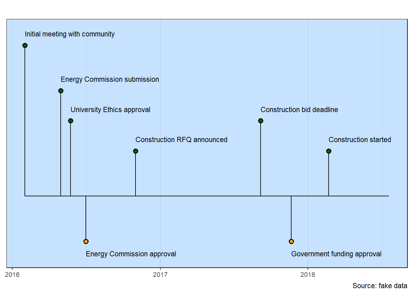
Sometimes you only have a year for when an event occurred. That’s OK. You’ll get an appropriate milestones timeline just as you expect.
The following example shows the use of a short except to create each event. Since the table and milestones chart appear together, the short event name does not need to be put into the table.
The input table isn’t very easy to read because of the long book names. The table generated by gt should make the data easier to see.
The appearance of the gt table benefits from aligning the date at the top of each cell.
## Initialize defaults
column <- lolli_styles()

data <- read_csv(col_names=TRUE, show_col_types=FALSE, file=
     "date, event, book
1839, Beagle Voyage, The Voyage of the Beagle
1842, Coral Reefs, Structure and Distribution of Coral Reefs
1844, Volcanic Islands, Geological Observations on the Volcanic Islands Visited during the Voyage of the Beagle
1859, Origin of Species, On the Origin of Species by Means of Natural Selection or the Preservation of Favoured Races in the Struggle for Life
1868, Domestication, The Variation of Animals and Plants under Domestication
1871, Descent of Man, The Descent of Man and Selection in Relation to Sex
1872, Emotions, The Expression of the Emotions in Man and Animals
1875, Insectivorous, Insectivorous Plants
1876, Fertilisation, The Effects of Cross and Self Fertilisation in the Vegetable Kingdom
1877, Flowers, The Different Forms of Flowers on Plants of the Same Species
1881, Worms, The Formation of Vegetable Mould through the Actions of Worms
1880, Plant Movement, The Power of Movement in Plants
1887, Autobiography, The Autobiography of Charles Darwin")

## Sort the table by date
data <- data |>
  arrange(date)

## Build a table
gt(data) |>
  cols_hide(columns = event) |>
  tab_style(cell_text(v_align = "top"),
            locations = cells_body(columns = date)) |>
tab_source_note(source_note = "Source: Wikipedia") | date | book |
|---|---|
| 1839 | The Voyage of the Beagle |
| 1842 | Structure and Distribution of Coral Reefs |
| 1844 | Geological Observations on the Volcanic Islands Visited during the Voyage of the Beagle |
| 1859 | On the Origin of Species by Means of Natural Selection or the Preservation of Favoured Races in the Struggle for Life |
| 1868 | The Variation of Animals and Plants under Domestication |
| 1871 | The Descent of Man and Selection in Relation to Sex |
| 1872 | The Expression of the Emotions in Man and Animals |
| 1875 | Insectivorous Plants |
| 1876 | The Effects of Cross and Self Fertilisation in the Vegetable Kingdom |
| 1877 | The Different Forms of Flowers on Plants of the Same Species |
| 1880 | The Power of Movement in Plants |
| 1881 | The Formation of Vegetable Mould through the Actions of Worms |
| 1887 | The Autobiography of Charles Darwin |
| Source: Wikipedia | |
Books by Charles Darwin
## Adjust some defaults
column$color <- "orange"
column$size  <- 4
column$source_info <- "Source: Wikipedia"

## Milestones timeline
milestones(datatable = data, styles = column)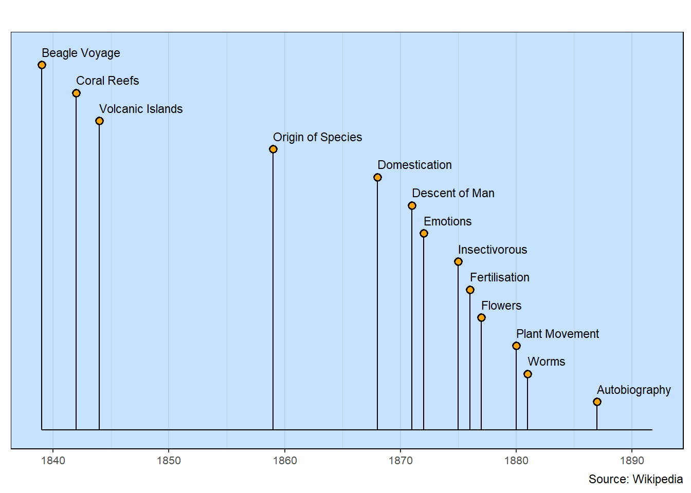
Letting the lollipop arrangement use the default row spacing works well for this chart.
The next example comes from a 2021 paper with the title “Pandemics Throughout History.” A table in that paper focuses on a specific aspect of pandemics.
A data table extracted from this paper is pretty messy. The first step is format the data into a clear and useful table.
Several of the cause organisms are given as scientific names. The case_when function singles out these entries and adds markdown code so the names will appear in italics in the gt table. A fmt_markdown() statement activates the markdown code. (This could have been done by editing the data table, but the calculation shown here is to demonstrate a more general methodology.)
As shown earlier, the columns in the gt table are also aligned at the top.
A dplyr function (str_wrap) is used to wrap lines of text so that each segment is no longer than a specified value. This is a flexible way to make multi-line event names.
## Initialize defaults
column <- lolli_styles()

## Read the data
data <- read_csv(col_names=TRUE, show_col_types=FALSE, file=
"date, span, event, cause, association
1881, 1881–1886, Fifth cholera pandemic, Vibrio cholerae, Contaminated water
1885, 1885–ongoing, Third plague, Yersinia pestis, Fleas associated to wild rodents
1889, 1889–1893, Russian flu, Influenza A/H3N8?, Avian?
1899, 1899–1923, Sixth cholera pandemic, Vibrio cholerae,   Contaminated water
1918, 1918–1919, Spanish flu, Influenza A/H1N1, Avian
1957, 1957–1959,    Asian flu,  Influenza A/H2N2, Avian
1961, 1961-ongoing, Eleventh cholera pandemic,  Vibrio cholerae, Contaminated water
1968, 1968–1970, Hong Kong flu, Influenza A/H3N2, Avian
2002, 2002–2003, Severe acute respiratory syndrome (SARS), SARS-CoV, Bats; palm civets
2009, 2009–2010, Swine flu, Influenza A/H1N1, Pigs
2015, 2015-ongoing, Middle East respiratory syndrome (MERS),    MERS-CoV, Bats; dromedary camels
2019, 2019-ongoing, COVID-19, SARS-CoV-2, Bats; pangolins?")

## Wrap the scientific names so they are italics
data <- data |>
  mutate(cause = case_when(
    cause == "Vibrio cholerae" ~ "*Vibrio cholerae*",
    cause == "Yersinia pestis" ~ "*Yersinia pestis*",
    .default = cause))

## Generate a table
gt(data) |>
  cols_hide(columns = date) |>
  fmt_markdown() |>
  tab_style(cell_text(v_align = "top"),
     locations = cells_body(columns = everything())) |>
tab_source_note(source_note = "doi: 10.3389/fmicb.2020.631736")| span | event | cause | association |
|---|---|---|---|
1881–1886 |
Fifth cholera pandemic |
Vibrio cholerae |
Contaminated water |
1885–ongoing |
Third plague |
Yersinia pestis |
Fleas associated to wild rodents |
1889–1893 |
Russian flu |
Influenza A/H3N8? |
Avian? |
1899–1923 |
Sixth cholera pandemic |
Vibrio cholerae |
Contaminated water |
1918–1919 |
Spanish flu |
Influenza A/H1N1 |
Avian |
1957–1959 |
Asian flu |
Influenza A/H2N2 |
Avian |
1961-ongoing |
Eleventh cholera pandemic |
Vibrio cholerae |
Contaminated water |
1968–1970 |
Hong Kong flu |
Influenza A/H3N2 |
Avian |
2002–2003 |
Severe acute respiratory syndrome (SARS) |
SARS-CoV |
Bats; palm civets |
2009–2010 |
Swine flu |
Influenza A/H1N1 |
Pigs |
2015-ongoing |
Middle East respiratory syndrome (MERS) |
MERS-CoV |
Bats; dromedary camels |
2019-ongoing |
COVID-19 |
SARS-CoV-2 |
Bats; pangolins? |
| doi: 10.3389/fmicb.2020.631736 | |||
Pandemics Throughout History
## Adjust defaults
column$y_extend_pct <- 0.2

## Wrap the text for the events using Linewrapper function
data <- data |>
   mutate(event = str_wrap(event, width = 30))

## Milestones timeline
milestones(datatable = data, styles = column)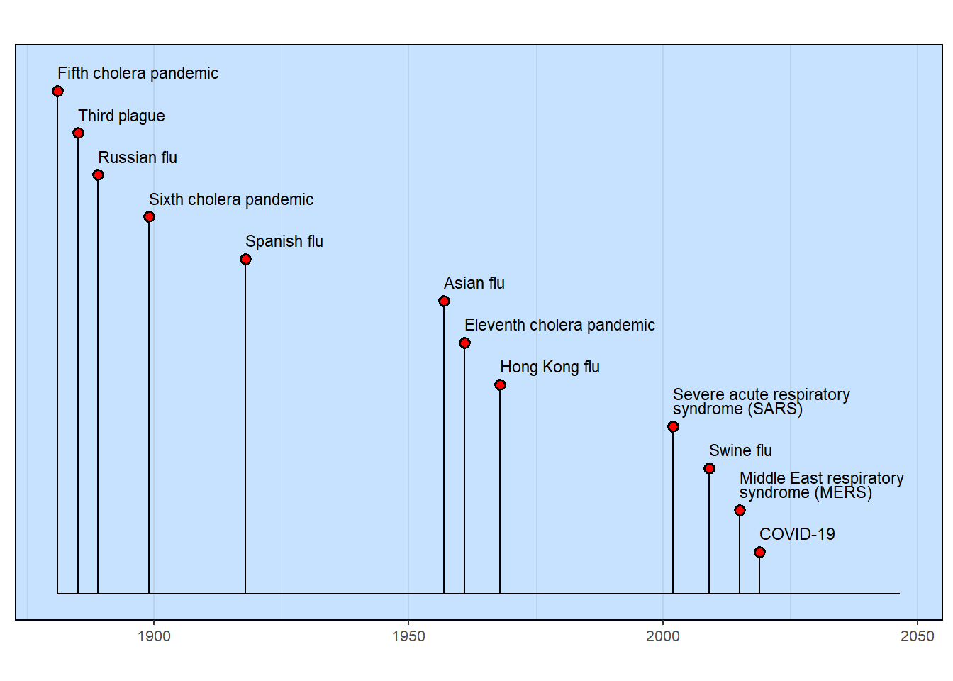
The table-based methodology demands that columns have specific names. The column with the event name must be named “event”. Sometimes, this is inconvenient as a data table, for example, might be best with names that better describe the data content. That’s what is happening here. Note how the data table column names are changed just before the milestones timeline is generated.
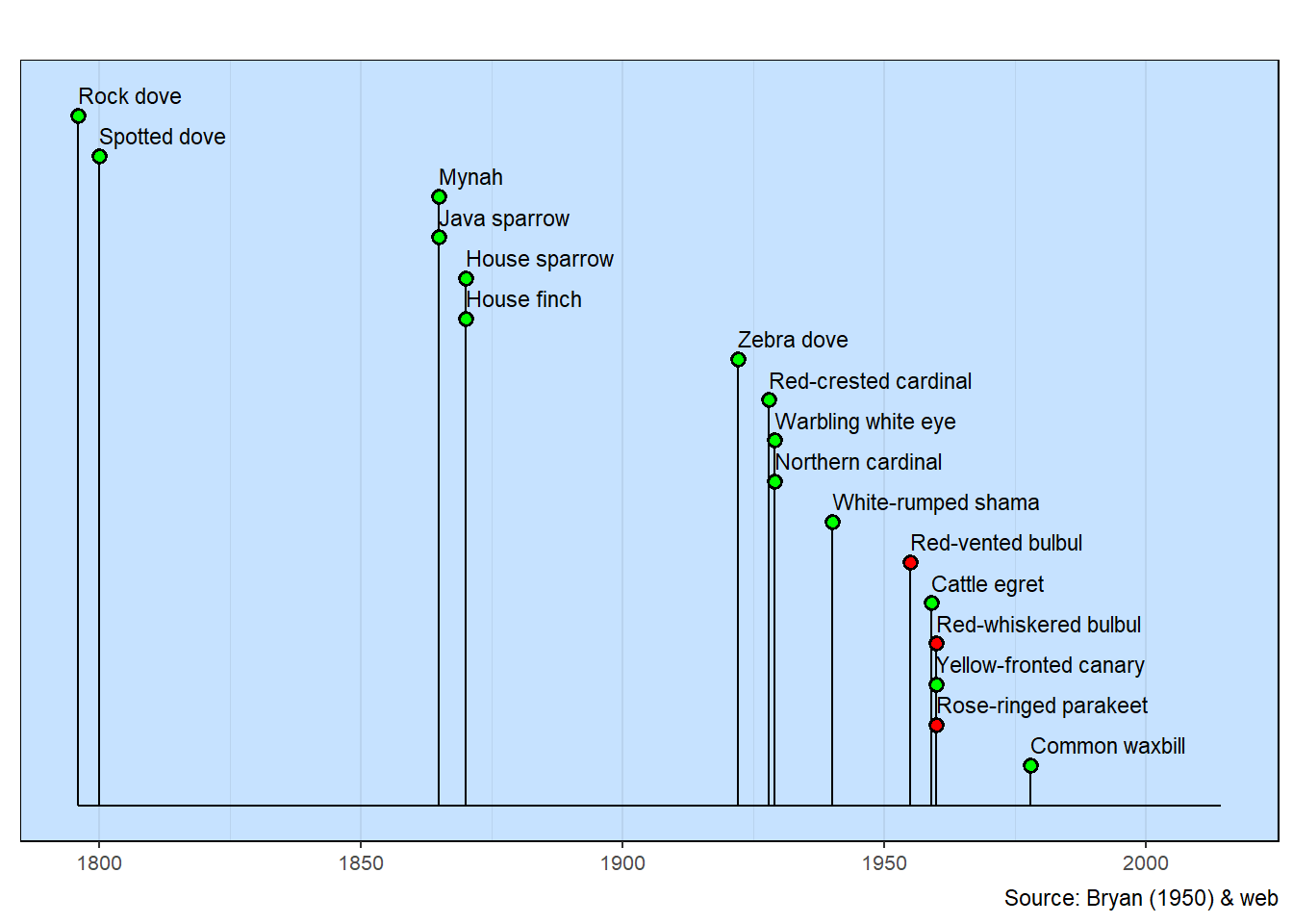
E. H. Bryan published a small paper in 1950 that lists the birds in Hawai`i. Notes for each bird list the date of introduction of the non-native birds. A few species have been let loose since Bryan’s time. Information about them can be found with simple web searches.
The list used here are likely the most common introduced birds you’ll see in urban Honolulu. There are a few native birds, such as the White tern, Pacific golden-plover and Black-crowned night heron, that you’ll see. They aren’t on this list as their presence in Hawai`i vastly predates the start of the timeline.
Three species in the milestones visualization have a red lollipop head. These are official invasive species.
The dates, in some cases, are approximate as there is little known about the introduction of the bird species.
## Initialize defaults
column <- lolli_styles()

## Read the data
data <- read_csv(col_names=TRUE, show_col_types=FALSE, file=
 "common,             scientific,            intro, status
  Mynah,              Acridotheres tristis,  1865, green
  Warbling white eye, Zosterops japonicus,   1929, green
  Rock dove,          Columba livia,         1796, green
  Zebra dove,         Geopelia striata,      1922, green
  Spotted dove,       Spilopelia chinensis,  1800, green
  Northern cardinal,  Cardinalis cardinalis, 1929, green
  Red-crested cardinal, Paroaria coronata,   1928, green
  House sparrow,      Passer domesticus,     1870, green
  House finch,        Haemorhous mexicanus,  1870, green
  White-rumped shama, Copsychus malabaricus, 1940, green
  Red-vented bulbul,  Pycnonotus cafer,      1955, red
  Red-whiskered bulbul, Pycnonotus jocosus,  1960, red
  Yellow-fronted canary, Serinus mozambicus, 1960, green
  Cattle egret,       Bubulcus ibis,         1959, green
  Rose-ringed parakeet, Psittacula krameri,  1960, red
  Common waxbill,     Estrilda astrild,      1978, green
  Java sparrow,       Lonchura oryzivora,    1865, green")

## Sort by date introduced
data <- data |>
  arrange(intro)

## Create a table
gt(data) |>
  cols_hide(columns = status) |>
   tab_style(
    style     = cell_text(style = "italic"),
    locations = cells_body(columns = scientific)) |>
tab_source_note(source_note = "Bryan (1950) & web")| common | scientific | intro |
|---|---|---|
| Rock dove | Columba livia | 1796 |
| Spotted dove | Spilopelia chinensis | 1800 |
| Mynah | Acridotheres tristis | 1865 |
| Java sparrow | Lonchura oryzivora | 1865 |
| House sparrow | Passer domesticus | 1870 |
| House finch | Haemorhous mexicanus | 1870 |
| Zebra dove | Geopelia striata | 1922 |
| Red-crested cardinal | Paroaria coronata | 1928 |
| Warbling white eye | Zosterops japonicus | 1929 |
| Northern cardinal | Cardinalis cardinalis | 1929 |
| White-rumped shama | Copsychus malabaricus | 1940 |
| Red-vented bulbul | Pycnonotus cafer | 1955 |
| Cattle egret | Bubulcus ibis | 1959 |
| Red-whiskered bulbul | Pycnonotus jocosus | 1960 |
| Yellow-fronted canary | Serinus mozambicus | 1960 |
| Rose-ringed parakeet | Psittacula krameri | 1960 |
| Common waxbill | Estrilda astrild | 1978 |
| Bryan (1950) & web | ||
Common Introduced Birds in Hawaii
## Change the column names
data <- data |>
  rename(event = common, date = intro, color = status)

## Adjust defaults
column$y_extend_pct <- 0.2
column$source_info <- "Source: Bryan (1950) & web"

## Milestones timeline
milestones(datatable = data, styles = column)