A basic pedigree diagram consists of some simple symbols, connector lines and names. That’s fine for many purposes. A table listing the key elements of the pedigree diagram is a natural adjunct. The table may be simple and add a few bits of information not contained in the associated diagram.
To get started, load up the needed libraries.
Show the code
## Activate the Core Packageslibrary(tidyverse) ## Brings in a core of useful functionslibrary(gt) ## Tables## special librarieslibrary(kinship2) ## Core package to calculate and plotlibrary(R.devices) ## External plot files (e.g., PNG)library(tinypedigree) ## For the tiny_pedigree function
Consider how a few changes can enhance the interpretive value of the pedigree diagram.
3.1 Data table basics
As a quick review, the following columns are required for any pedigree diagram.
Multiple names in a cell under column name of the following table indicate synonyms for the column name.
column
purpose
comment
ID
id
A unique identifier for every individual.
Usually a name. But it can be a numeric ID.
dad
father
Name of the individual’s father, if known. Otherwise NA.
If a name is given, it must match one of the names in the ID column.
mom
mother
Name of the individual’s mother, if known. Otherwise NA.
If a name is given, it must match one of the names in the ID column.
gender
sex
Identify the gender of each individual.
Valid entries: (1=male, 2=female) or (male, female)
The first two people in the table should have NA for the dad and mom columns.
3.2 Symbol enhancements
There are three basic ways to change the appearance of the symbols used for each individual in the pedigree diagram. Note that hilite and color interact.
Multiple names in a cell under column name of the following table indicate synonyms for the column name.
column name
default
comments
stroke
status
dead
0 = no stroke
A binary value (0 or 1, FALSE or TRUE, no or yes). NA is not allowed.
Places a diagonal slash through the symbol. This is always a thin black line.
hilite
highlight
fill
0 = no fill; only symbol outline
A binary value (0 or 1, FALSE or TRUE, no or yes), or NA.
Whether or not to use the color value to fill the symbol. If 0, symbol outline uses the color value. A NA value places a colored question mark inside the symbol instead of a fill.
color
“black”
A color name or color value. The fill is solid.
Note that you can use uppercase or lower case or a mixture for yes, no, true and false.
You use these enhancements by adding columns to the main data table. Each row in the table (i.e., individual) will receive a value in the column for the enhancement.
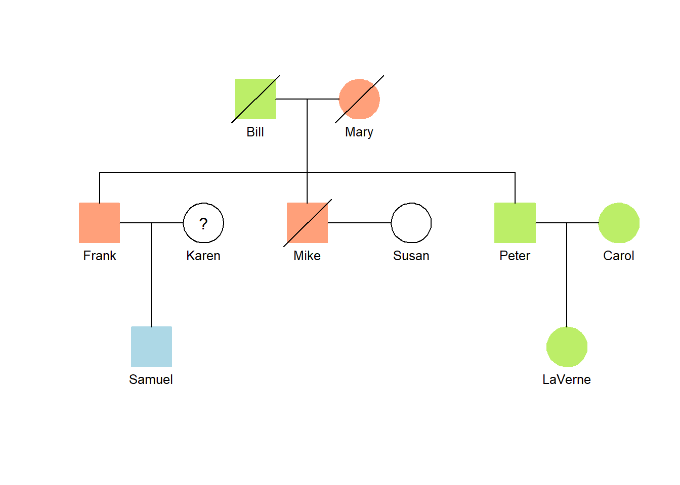
Here is an example.
Show the code
## Family relationshipdata <-read_csv(col_names=TRUE, show_col_types=FALSE, file="ID, dad, mom, gender, stroke, hilite, color Bill, NA, NA, male, YES, YES, darkolivegreen2 Mary, NA, NA, female, YES, YES, lightsalmon1 Frank, Bill, Mary, male, NO, YES, lightsalmon1 Mike, Bill, Mary, male, YES, YES, lightsalmon1 Peter, Bill, Mary, male, NO, YES, darkolivegreen2 Carol, NA, NA, female, NO, YES, darkolivegreen2 LaVerne, Peter, Carol, female, NO, YES, darkolivegreen2 Karen, NA, NA, female, NO, NA, black Samuel, Frank, Karen, male, NO, YES, lightblue Susan, NA, NA, female, NO, NO, black")## Create a tablegt(data)|>tab_source_note(source_note="Source: Demonstration data")
ID
dad
mom
gender
stroke
hilite
color
Bill
NA
NA
male
YES
YES
darkolivegreen2
Mary
NA
NA
female
YES
YES
lightsalmon1
Frank
Bill
Mary
male
NO
YES
lightsalmon1
Mike
Bill
Mary
male
YES
YES
lightsalmon1
Peter
Bill
Mary
male
NO
YES
darkolivegreen2
Carol
NA
NA
female
NO
YES
darkolivegreen2
LaVerne
Peter
Carol
female
NO
YES
darkolivegreen2
Karen
NA
NA
female
NO
NA
black
Samuel
Frank
Karen
male
NO
YES
lightblue
Susan
NA
NA
female
NO
NO
black
Source: Demonstration data
Show the code
## Link married without childrenlinks <-read_csv(col_names=TRUE, show_col_types=FALSE, file="id1, id2 Mike, Susan")## Generate the pedigree data structure (with no-children couples)tiny_pedigree(data=data, links=links)
3.3 Chart appearance
There are two parameters that can be supplied to the tiny_pedigree function.
textsize: The value controls the relative size of the type used for the names. Mostly, you’ll use this to make the names smaller. Try values between 0.6 and 0.9.
symbolsize: This makes the symbols larger or smaller. Useful values range from 0.8 to 2.0.
fold: This is a binary parameter. If TRUE, the names are separated at spaces and put on separate lines. This is very useful when you have long names.
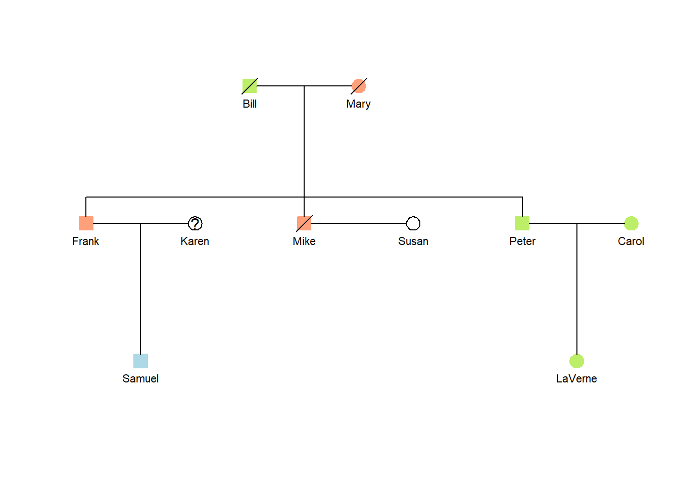
Here is an example of the previous pedigree diagram with smaller symbols and names.
Show the code
## Use the results from the previous chunk.## Smaller names and symbolstiny_pedigree(data=data, links=links, textsize =0.7,symbolsize =0.7)
You can see that this will be useful when you have a lot of long names and plenty of people.
3.4 Presentation tables
Pedigree charts and presentation tables go together. Yes, that’s been said before, but it’s important so it is being repeated here. Tables generally present more information than is needed to generate a pedigree diagram. Also, some of the pedigree information may not be needed in the table. Put simply: the chart and table share some information but each is valuable in its own right.
There are a few things that help make a presentation table look professional and which contribute to its usefulness.
Columns. You have control over which columns of your master data table are shown the presentation table. Specifically, you can drop (hide) columns that are not needed in the presentation table.
Column names. The master data table is the focus. Columns store the data. The columns used for the tiny_pedigree function have specific names (e.g., ID, dad, mom, gender, color). Those column names can be changed when showing data in a presentation table.
Column formats. There are quite a few format options with the gt package. The most important are likely the date formats.
Colored data values. One or two individuals might be highlighted with color in the pedigree diagram. You can highlight the same people in the presentation table. You can use this color coordination to call attention to some specific attribute shown in the presentation table.
Footnotes and data sources. Columns, as well as individual data values, can be footnoted. It is also a good practice to put the source of the data in every presentation table.
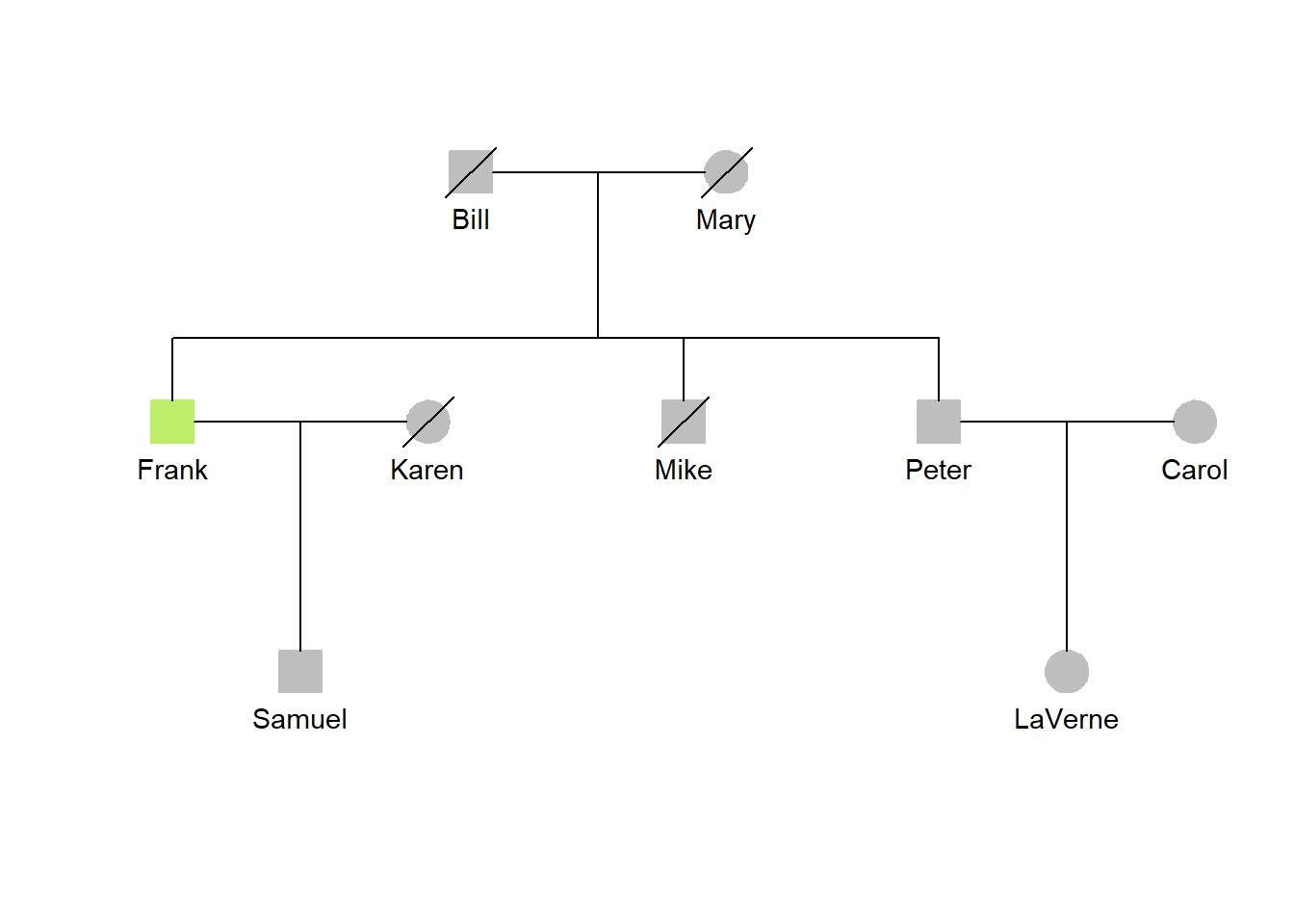
Some of these enhancements is shown in the following pedigree chart along with its presentation table.
In this example, the input for the main data table is divided into two parts that are later merged. This separates the data for the required four columns (i.e., ID, dad, mom, gender) from the optional, enhancement columns. The ID column, common to both tables, is used to unite the two input data tables.
One person is highlighted in both the presentation table and pedigree diagram.
Show the code
## Read the basic datadata1 <-read_csv(col_names=TRUE, show_col_types=FALSE, file="ID, dad, mom, gender Bill, NA, NA, male Mary, NA, NA, female Frank, Bill, Mary, male Mike, Bill, Mary, male Peter, Bill, Mary, male Carol, NA, NA, female LaVerne, Peter, Carol, female Karen, NA, NA, female Samuel, Frank, Karen, male")## Read the supplemental datadata2 <-read_csv(col_names=TRUE, show_col_types=FALSE, file="ID, dead, born, died, city, hilite, color Bill, YES, 1902, 1978, Chicago, yes, gray Mary, YES, 1904, 1992, Tampa, yes, gray Frank, NO, 1928, NA, Memphis, yes, darkolivegreen2 Mike, YES, 1930, 1943, Chicago, yes, gray Peter, NO, 1932, NA, Chicago, yes, gray Carol, NO, 1935, NA, Chicago, yes, gray LaVerne, NO, 1958, NA, Chicago, yes, gray Karen, YES, 1929, 2005, Memphis, yes, gray Samuel, NO, 1955, NA, Memphis, yes, gray")## Merge the two data sourcesdata <-merge(data1, data2, by="ID")## Obtain the current yearcurrent_year <-year(today())## Calculate the ages of the individualsdata <- data |>mutate(age =case_when(is.na(died) ~ current_year-born,TRUE~ died-born))## Put together source notenote <-paste0("Source: Demo data; Last updated: ",current_year)## Generate presentation tablegt(data) |>cols_hide(columns =c(dad, mom, gender, dead, hilite, color)) |>cols_label(ID ="Jones Family") |>sub_missing(missing_text ="") |>tab_footnote(footnote ="Last or current residence",locations =cells_column_labels(columns=city)) |>tab_footnote(footnote ="Age at death or current age",locations =cells_column_labels(columns=age)) |>tab_style(style =list(cell_fill(color ="darkolivegreen2")),locations =cells_body(rows =3)) |>tab_source_note(source_note=note)
Jones Family
born
died
city1
age2
Bill
1902
1978
Chicago
76
Carol
1935
Chicago
88
Frank
1928
Memphis
95
Karen
1929
2005
Memphis
76
LaVerne
1958
Chicago
65
Mary
1904
1992
Tampa
88
Mike
1930
1943
Chicago
13
Peter
1932
Chicago
91
Samuel
1955
Memphis
68
Source: Demo data; Last updated: 2023
1 Last or current residence
2 Age at death or current age
Show the code
## Create the pedigree tiny_pedigree(data=data, textsize =0.9, symbolsize =0.9)
3.5 Generating external charts
The R.devices package is used to generate the external chart files.
The use of the devEval function is shown at the end of the following chunk. There are some properties to note.
"png" is the graphic file type to be generated. “pdf” is an alternative.
filename is the full name for the graphic file. The name should include the proper extension (e.g., “.png”). This file will be put in the figures folder inside the current folder.
width defines the width of the image being created. This works with the units value.
units has either “in” or “cm” as its value.
res is the dot density. It’s likely this will always be set at 300 (for dots per inch).
{tiny_pedigree(data=data)} This re-runs the pedigree generation inside the devEval function. Note the use of curly braces. They are necessary! If other parameters have been used (e.g., (data=data, links=links, symbolsize=0.8), this information should be inside the curly braces, too.
Show the code
## Basic datadata <-read_csv(col_names =TRUE, show_col_types=FALSE, file="ID, dad, mom, gender, stroke, born John, NA, NA, male, 1, 1902 Mary, NA, NA, female, 1, 1904 Bill, John, Mary, male, 0, 1928 Hank, John, Mary, male, 1, 1930 Andy, John, Mary, male, 0, 1933 Ruth, NA, NA, female, 0, 1935 Jane, Andy, Ruth, female, 0, 1958")## Add data to the main table (constant for all individuals)data$color <-"lightsalmon1"data$hilite <-"yes"## Print a tablegt(data) |>cols_hide(columns=c(dad,mom,color,hilite)) |>tab_footnote(footnote ="values: alive = 0; dead = 1",locations =cells_column_labels(columns=stroke)) |>tab_source_note(source_note="Source: Demonstration data")
ID
gender
stroke1
born
John
male
1
1902
Mary
female
1
1904
Bill
male
0
1928
Hank
male
1
1930
Andy
male
0
1933
Ruth
female
0
1935
Jane
female
0
1958
Source: Demonstration data
1 values: alive = 0; dead = 1
Show the code
## Generate and plot the pedigree data structuretiny_pedigree(data=data)
Show the code
## Save the diagram as a PNG file (in the figures directory)devEval("png", filename="basic_test.png", width=7.5, units="in", res=300, {tiny_pedigree(data=data)})
[1] "figures/basic_test.png"
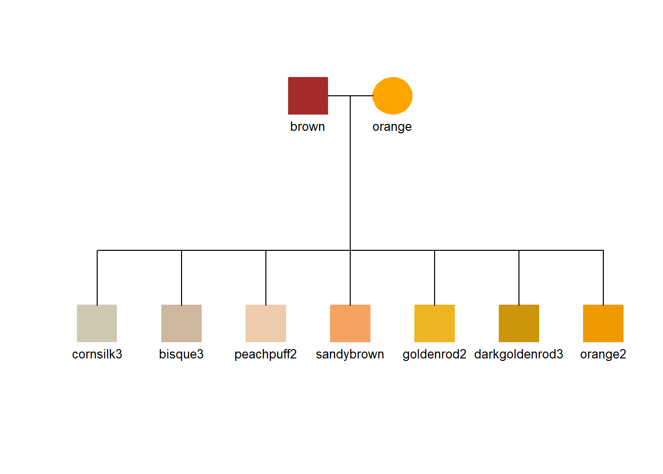
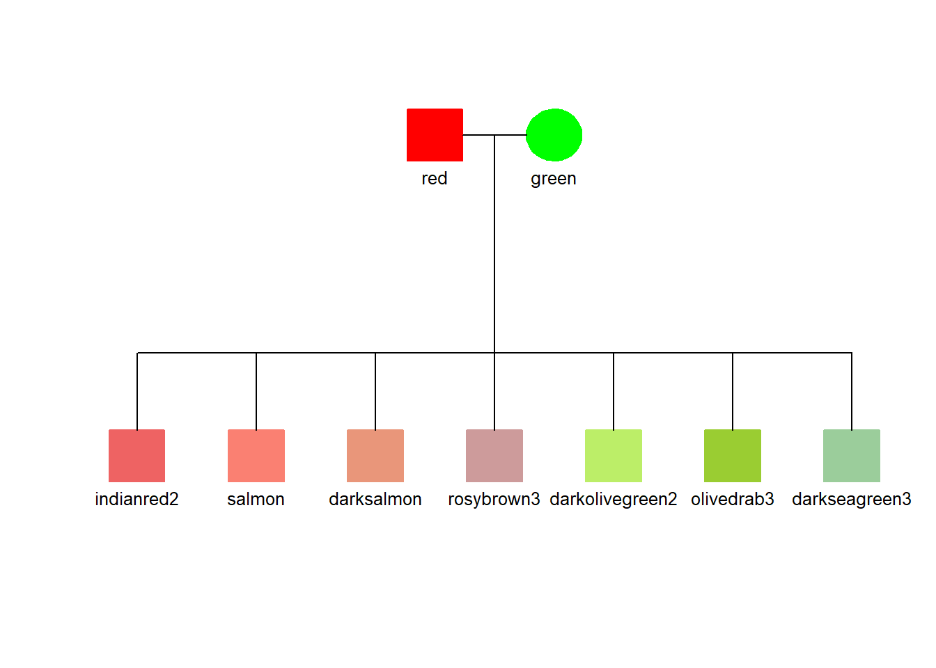
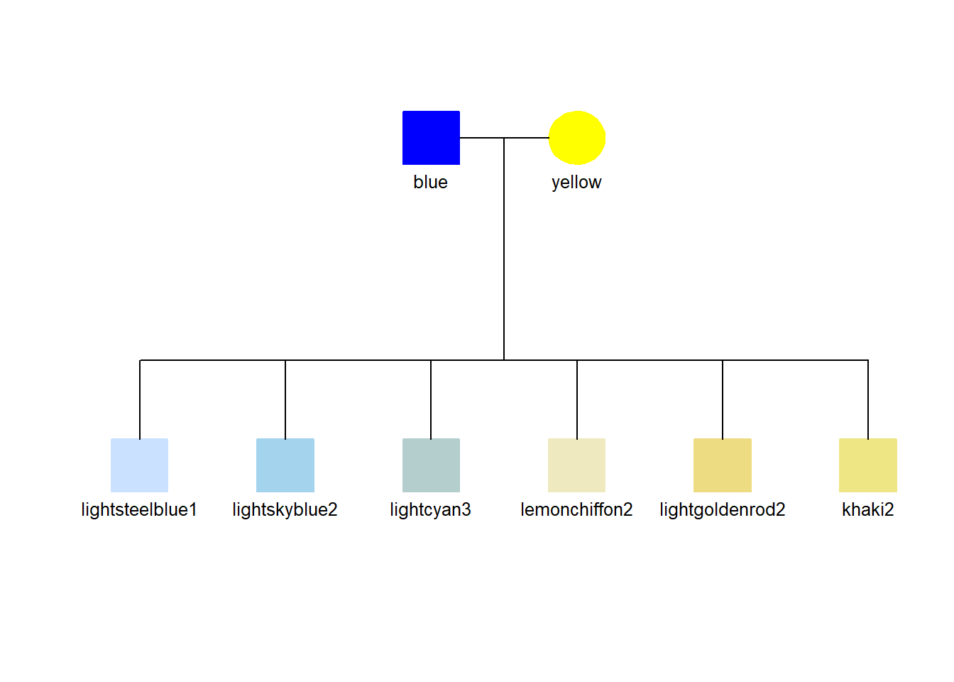
3.6 Color legend using a pedigree diagram
We can use the pedigree diagram to show a set of colors if we interpret the column names broadly (not as family relationships). Here, three examples show some of the colors that might be useful in enhancing symbols with a fill color.
This might not be an ideal format for a legend to the colors, but in the context of a working research document, it is an easy adaptation for an often needed documentation element.
Show the code
## Read the datadata <-read_csv(col_names =TRUE, show_col_types=FALSE, file="ID, dad, mom, gender brown, NA, NA, 0 orange, NA, NA, 1 cornsilk3, brown, orange, 0 bisque3, brown, orange, 0 peachpuff2, brown, orange, 0 sandybrown, brown, orange, 0 goldenrod2, brown, orange, 0 darkgoldenrod3, brown, orange, 0 orange2, brown, orange, 0")## Make the color from the ID, fill the symbolsdata$color <- data$IDdata$hilite <-1## Generate the pedigree legendtiny_pedigree(data=data)
Brown to Orange with low saturation
Show the code
## Read the datadata <-read_csv(col_names =TRUE, show_col_types=FALSE, file="ID, dad, mom, gender red, NA, NA, 0 green, NA, NA, 1 indianred2, red, green, 0 salmon, red, green, 0 darksalmon, red, green, 0 rosybrown3, red, green, 0 darkolivegreen2, red, green, 0 olivedrab3, red, green, 0 darkseagreen3, red, green, 0")## Make the color from the ID, fill the symbolsdata$color <- data$IDdata$hilite <-1## Generate the pedigree legendtiny_pedigree(data=data)
Red to Green with low saturation
Show the code
## Read the datadata <-read_csv(col_names=TRUE, show_col_types=FALSE, file="ID, dad, mom, gender blue, NA, NA, 0 yellow, NA, NA, 1 lightsteelblue1, blue, yellow, 0 lightskyblue2, blue, yellow, 0 lightcyan3, blue, yellow, 0 lemonchiffon2, blue, yellow, 0 lightgoldenrod2, blue, yellow, 0 khaki2, blue, yellow, 0")## Make the color from the ID, fill the symbolsdata$color <- data$IDdata$hilite <-1## Generate the pedigree legendtiny_pedigree(data=data)
Blue to Yellow with low saturation
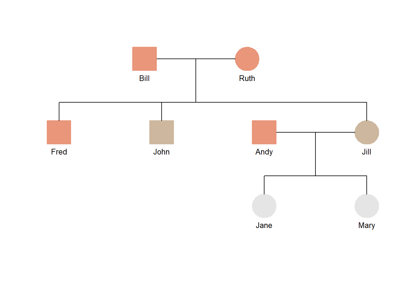
3.7 Case_when statements to add a column
Most often, you’ll simply code the values used for the pedigree chart into the master data table. This is simple and straightforward.
You can also write some code to create values in your data table. The case_when statement is a good way to do this.
The case_when statement lets you look at values in a column and, if there is a match to some desired value, add a value to another column. This can be very useful as a way to add selective color coding, for example, to a pedigree chart.
The syntax of a case_when statement can appear to be confusing at first. Here are a few hints to get started in the context of master data tables used for pedigree diagrams. Once you see the pattern, you can imagine a number of other situations where this will be useful.
Goal: Add a value to a data table column (target data column) based on the value for an individual in a different column (test data column).
One or Multiple Test Conditions: A condition is tested for each row’s test data column and, if TRUE, a value is assigned to the target data column for the row. Multiple tests can be made with each resulting in the assignment of a different value.
Value Assignment. A single value is added to the target data column with each test that yields a value of TRUE.
Default Condition: If none of the test conditions are met, there is a default value that is assigned to the target data column.
The next example shows how this works. The target column is color. The test conditions are based on the age column. Three age ranges (above 50 and between 40 and 50, and below 40) each get a color assignment. The lowest age class is shown here using the .default option. Notice the slight difference in syntax (“~” vs “=”).
Show the code
## Read the datadata <-read_csv(col_names=TRUE, show_col_types=FALSE, file="ID, dad, mom, gender, age Bill, NA, NA, male, 72 Ruth, NA, NA, female, 69 Fred, Bill, Ruth, male, 51 John, Bill, Ruth, male, 49 Jill, Bill, Ruth, female, 46 Andy, NA, NA, male, 54 Jane, Andy, Jill, female, 22 Mary, Andy, Jill, female, 18")## Add color value based on agedata <- data |>mutate(color =case_when( age >50~"darksalmon", age <=50& age >=40~"bisque3",.default ="gray90"))## Create a presentation tablegt(data) |>cols_hide(columns=c(dad, mom, gender)) |>tab_source_note(source_note="Source: Demonstration data")
ID
age
color
Bill
72
darksalmon
Ruth
69
darksalmon
Fred
51
darksalmon
John
49
bisque3
Jill
46
bisque3
Andy
54
darksalmon
Jane
22
gray90
Mary
18
gray90
Source: Demonstration data
Show the code
## Add a hilite column to fill the symbols using the colordata$hilite <-TRUE## Generate a pedigree diagramtiny_pedigree(data=data)