There are more levels of detail for borders in the United States than most other countries. Since I live in the US and travel extensively in this country, it seems logical to focus on this geographic region.
Note that the 48 contiguous states are the focus here. The standard border sets (e.g., map_data) leave off Hawai`i and Alaska. This limitation is treated, in part, in the Shapefiles chapter.
The detail levels include the entire country, states and counties. This is a very useful set of boundaries.
4.1 Initialize the Libraries and Data
There are a few things needed to setup the environment.
Click on the button to see the code. You’ll find similar buttons throughout this document.
Show the code
## Set an option for the read_csv functionoptions(readr.show_col_types =FALSE) ## Suppress warning msg## Initialize the Standard Librarieslibrary(readr)library(ggplot2)library(dplyr)library(gt)## Initialize sitemaps & plainmapslibrary(sitemaps)library(plainmaps)## Map Librarieslibrary(mapdata)library(sf)## Initialize for Sitemapscolumn <-site_styles()hide <-site_google_hides()
4.2 Build Something Simple as a Test
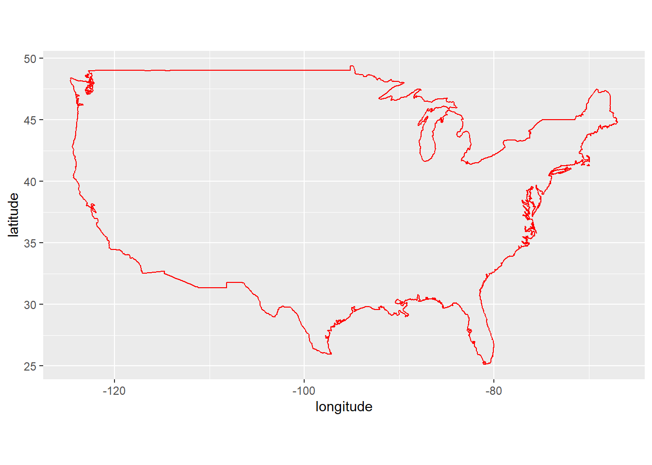
It’s always good to make sure things are running OK before heading into a big, complex project.
Note that the coord_fixed(1.3) statement makes the height/width relationship appear appropriate. Without this statement, the map will appear distorted.
The code here has not been simplified. Later, you’ll see that there is a function (region_plot as part of theplainmapspackage) that “hide” a lot of the code details, making it easier to get basic border outline plots.
Show the code
## Extract some data.usa <-map_data("usa")## Plot the data as an outline map.ggplot() +geom_polygon(data = usa, aes(x=long,y = lat, group = group),fill=NA,color="red") +coord_fixed(1.3) +labs(x ="longitude", y ="latitude")
4.3 Extract State Boundaries
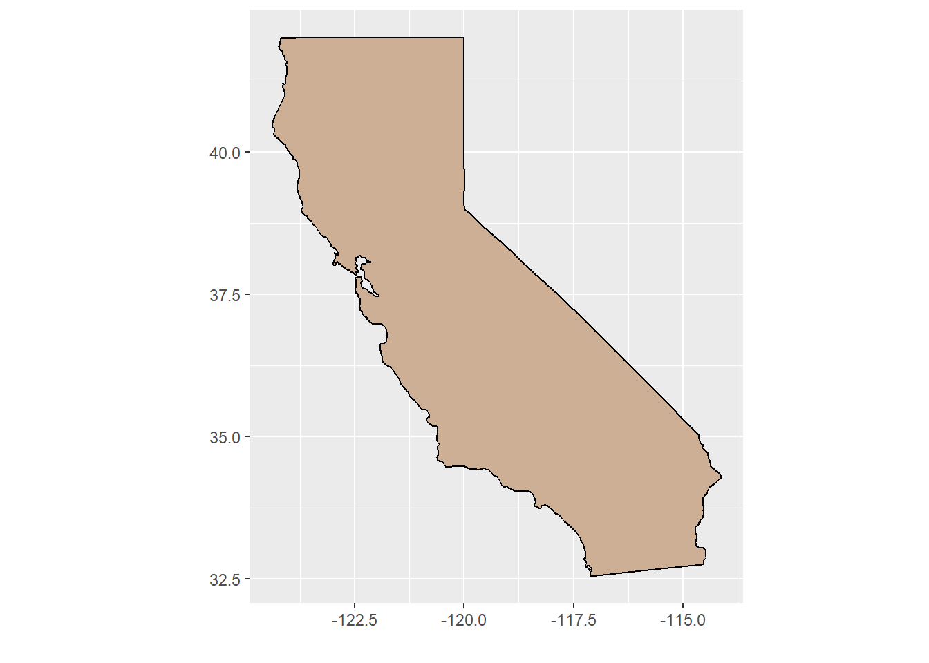
All the US states, except Alaska and Hawai`i, can be handled by extracting outline data using the map_data function.
Show the code
## Extract the set of US states.states <-map_data("state")## Remove just one state (california) from the set.cal <- states %>%filter(region =="california")## Create the state map.CA_map <-ggplot(data = cal) +## Draw the border and fill it with colorgeom_polygon(aes(x = long, y = lat,group = group), fill ="peachpuff3", color ="black") +## Adjust for lat/lon distortioncoord_fixed(1.3) +## Suppress the axis titles (lat, lon)labs(x ="", y ="")## Show the state map.CA_map
4.4 Show Part of a State
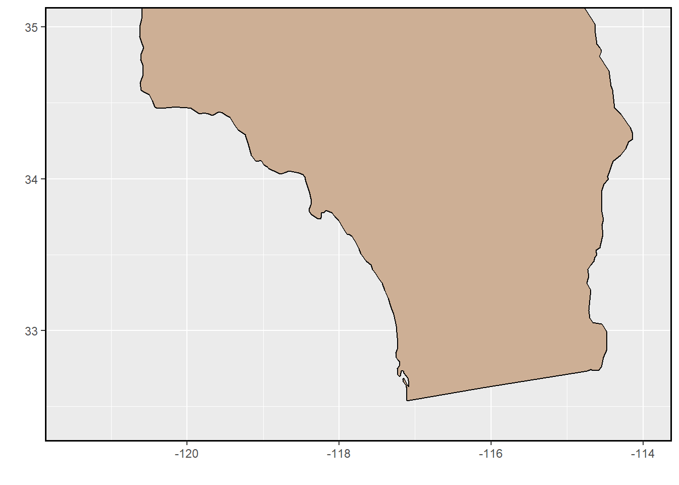
We’ll use the previous map of California and show just the general Southern California area.
The theme statement draws a dark line around the entire map area. Without this, the top of the Southern California area is without a boundary line. This cleans up the appearance.
Show the code
## Trim the map created in the previous chunk.SoCal <- CA_map +coord_cartesian(ylim=c(32.4,35.0), xlim=c(-121.5,-114.0)) +theme(panel.border =element_rect(linewidth=1,color="black",fill=NA))## Show the map.SoCal
4.5 Extract Multiple States
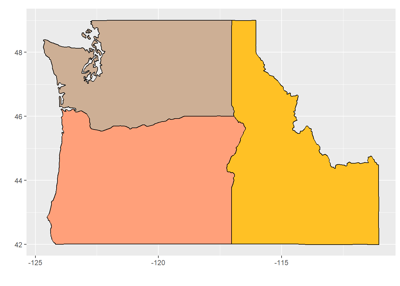
We can use multiple filter statements to save multiple state boundaries from the states collection.
Show the code
## Use data (states) from a previous chunk.## Extract three adjacent states.WA <- states |>filter(region =="washington")ID <- states |>filter(region =="idaho")OR <- states |>filter(region =="oregon")## Create a plot the three states.PNW <-ggplot() +## Draw the outline and fill each state with a colorgeom_polygon(data = WA,aes(x = long, y = lat,group = group), fill ="peachpuff3", color ="black") +geom_polygon(data = ID,aes(x = long, y = lat,group = group), fill ="goldenrod1", color ="black") +geom_polygon(data = OR,aes(x = long, y = lat,group = group), fill ="lightsalmon1", color ="black") +## Adjust for lat/lon distortioncoord_fixed(1.3) +## Suppress the axis titles (lat, lon)labs(x ="", y ="")## Output the map.PNW
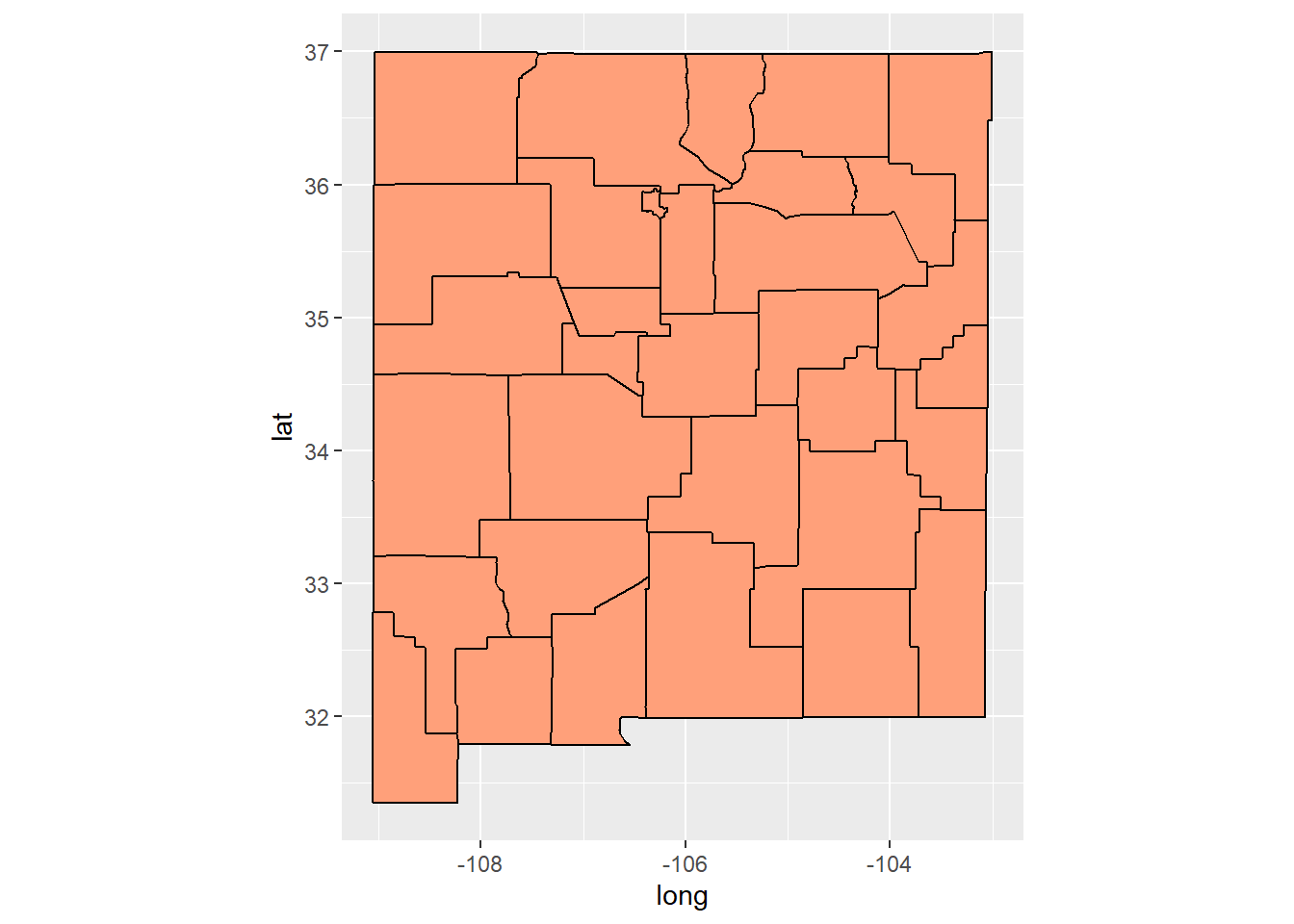
4.6 Show Counties within a State
This code chunk adds county-level boundaries to a state map.
Show the code
## Extract the state outline. states <-map_data("state") NM <- states |>filter(region =="new mexico") ## Extract the county outlines. counties <-map_data("county") NM_counties <- counties |>filter(region =="new mexico") ## Create the map as layers. NM_map <-ggplot(data = NM, mapping=aes(x = long, y = lat, group = group)) +## Draw and fill the state outlinegeom_polygon(fill ="lightsalmon1") +## Draw county lines & don't change the colorgeom_polygon(data = NM_counties, fill =NA, color ="black") +## Adjust for lat/lon distortioncoord_fixed(1.3) ## Output the map.NM_map
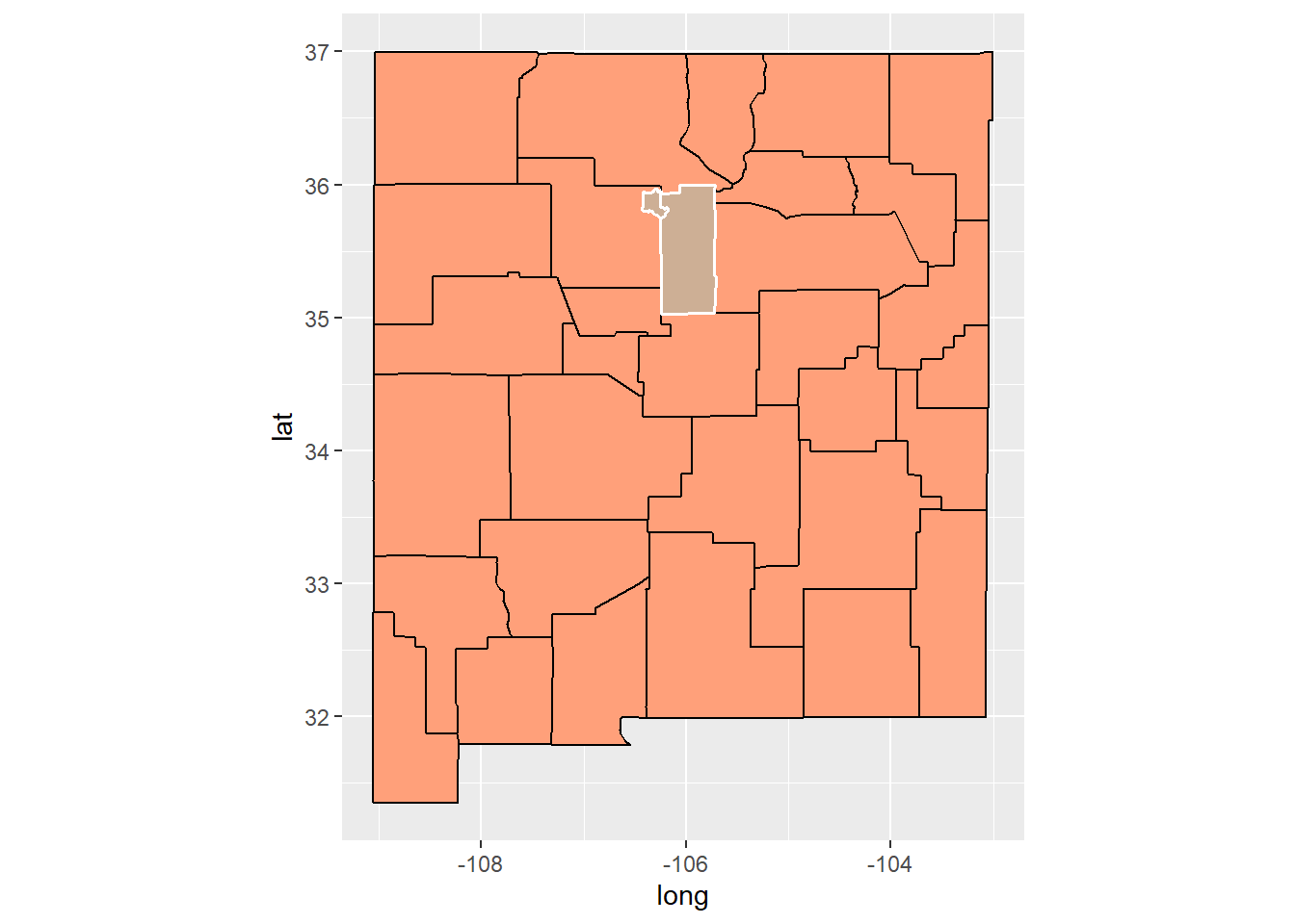
4.7 Color Selected Counties
It is often important to emphasize the location and extent of counties within a state. Using a color overlay is a straightforward way of doing this.
In the following chunk, the basemap and data are carried over from the previous chunk.
A table generated so you can see the county names. Note that these names are all lower case.
Show the code
## Uses the data and the map created in the previous chunk.## Get a list of the county names.county_names <-data.frame(unique(NM_counties$subregion))## List the county names for reference.colnames(county_names)[1] <-"County"gt(county_names) |>tab_source_note(source_note="Source: Extracted from map data")
County
bernalillo
catron
chaves
colfax
curry
de baca
dona ana
eddy
grant
guadalupe
harding
hidalgo
lea
lincoln
los alamos
luna
mckinley
mora
otero
quay
rio arriba
roosevelt
sandoval
san juan
san miguel
santa fe
sierra
socorro
taos
torrance
union
cibola
valencia
Source: Extracted from map data
Show the code
## Select several of the counties.selected_counties <- NM_counties |>filter(subregion %in%c("los alamos","santa fe"))## Overlay the selected counties on the previous basemap.NM_map +## Add an overlaygeom_polygon(data = selected_counties,mapping=aes(x = long, y = lat, group = group),fill ="peachpuff3",color ="white",linewidth =0.7)