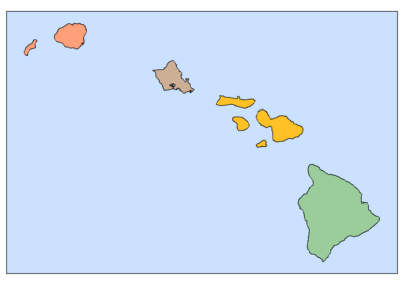
Choropleth maps show themes based on predefined regions (e.g., countries, states, counties). Colors, or shades of a single color, are used to differentiate areas. The color of a region corresponds to a data characteristic or range of data values.
8.1 Initialize the Libraries and Data
There are a few things needed to setup the environment.
The examples will make use of the boundaries for the Hawaiian Islands. These have been stored in a (local) folder. The outlines are retrieved here.
We can demonstrate a typical choropleth map using the political classification of the Hawaiian Islands.
Each island is a “predefined region.” The color code represents the county for each island.
Show the code
## Assign islands to counties by using color.fill <-NULLfill$hawaii <-"darkseagreen3"fill$maui <-"goldenrod1"fill$oahu <-"peachpuff3"fill$kauai <-"lightsalmon1"## Plot each of the islands with its fill color.ggplot() +geom_polygon(data=hawaii_simple, aes(x=lon,y=lat),fill=fill$hawaii, linewidth=0.4,color="black") +geom_polygon(data=oahu_simple, aes(x=lon,y=lat),fill=fill$oahu, linewidth=0.4,color="black") +geom_polygon(data=lanai_simple, aes(x=lon,y=lat),fill=fill$maui, linewidth=0.4,color="black") +geom_polygon(data=kauai_simple, aes(x=lon,y=lat),fill=fill$kauai, linewidth=0.4,color="black") +geom_polygon(data=niihau_simple, aes(x=lon,y=lat),fill=fill$kauai, linewidth=0.4,color="black") +geom_polygon(data=kahoolawe_simple, aes(x=lon,y=lat),fill=fill$maui, linewidth=0.4,color="black") +geom_polygon(data=maui_simple, aes(x=lon,y=lat),fill=fill$maui, linewidth=0.4,color="black") +geom_polygon(data=molokai_simple, aes(x=lon,y=lat),fill=fill$maui, linewidth=0.4,color="black") +coord_fixed(1.1) + island_map_theme
8.3 Using Data to Assign Colors
Note that in this example, the colors are not assigned directly in the ggplot step. Instead, data values point to specific items in a color table.
This approach is especially valuable when the color_index values are computed. Here, these values need to be integers that correspond to the range of the items in the color table.
This turns the procedure into a more useful tool for displaying choropleth maps. Note the following characteristics:
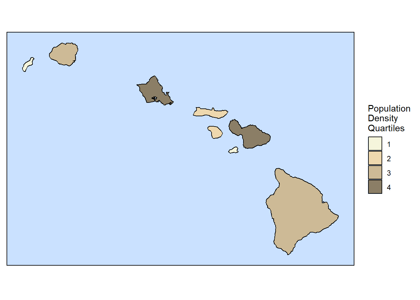
The color are given with an index value (called quartile here). It is straightforward to change the colors in just this one place.
There are four quartile values. This is because a quantitative value (density) is being used as the basis of the colors. The division is into quartiles (four values based on an order list divided into 25% groups).
The population density is calculated.
The code for the data table, used for data confirmation, looks very long. However, there are formatting elements shown here for things like numeric formats and footnotes. It is a good habit to make complete (i.e., well annotated) data tables. Usually, it’s just a matter of copying the formatting code used in other tables.
A new variable (quartile) is calculate using Sitemap’s site_cuts function. You can get more information on this function in the Site Maps document.
The color for each island is merged into the basic data table by matching the common values for quartile.
The code used in the ggplot function is simplified by using the update_geom_defaults function to set values that will be used in each of the geom_polygon functions.
The color for each island’s fill value is retrieved by indexing rows the the island name.
The legend is added with a scale_fill_manual function. The values for this are initialized in the Data and Parameter Input section.
All of these steps make a generalizable procedure that can be used for other chloropleth plots.
The code is divided into large sections to help identify the overall visualization strategy.
Show the code
## Data and Parameter Input ################################## Color table: List of colors and their index values (quartile).color_table <-read_csv(file ="color, quartile beige, 1 wheat2, 2 wheat3, 3 wheat4, 4")## Assign values for the legend.ct_value <- color_table$quartilect_color <- color_table$colorlegend_title <-"Population\nDensity\nQuartiles"## Read the names and data values for the islands.island <-read_csv(file ="name , population, area Oahu, 953000, 597 Hawaii, 185000, 4208 Maui, 155000, 1173 Kauai, 67000, 620 Molokai, 7300, 260 Lanai, 3100, 141 Niihau, 130, 72 Kahoolawe, 0, 45")## Note: Island boundaries were set in the Initialization chunk.## Data Manipulation ######################################### Calculate the population density for each islandisland <- island |>mutate(density = population/area) ## Calculate an index for the population density## This uses the Sitemaps site_cuts function to calculate quartiles.island$quartile <-site_cuts(quant_var = island$density,cuttype ="quartiles4")## Merge the colors using the quartile values as an indexisland <-merge(island, color_table, by="quartile")## Data Check ############################################### Show a well-formatted data tablegt(island) |>## Number formatsfmt_number(columns =c(population, area), use_seps =TRUE,decimals =0) |>fmt_number(columns = density,use_seps =TRUE,decimals =2) |>## Footnotestab_footnote(footnote ="miles\U00B2", ## Symbol for squaredlocations =cells_column_labels(columns=area)) |>tab_footnote(footnote ="people/mile\U00B2",locations =cells_column_labels(columns=density)) |>## Data sourcetab_source_note(source_note="Source: Gemini AI query")
quartile
name
population
area1
density2
color
1
Niihau
130
72
1.81
beige
1
Kahoolawe
0
45
0.00
beige
2
Molokai
7,300
260
28.08
wheat2
2
Lanai
3,100
141
21.99
wheat2
3
Hawaii
185,000
4,208
43.96
wheat3
3
Kauai
67,000
620
108.06
wheat3
4
Oahu
953,000
597
1,596.31
wheat4
4
Maui
155,000
1,173
132.14
wheat4
Source: Gemini AI query
1 miles²
2 people/mile²
Show the code
## Plot Section ################################################## Make a set of default values for the geom_polygon parameters.update_geom_defaults("polygon", list(color ="black", linewidth =0.4))## Plot each of the islands using the color as fill.island_map <-ggplot() +geom_polygon(data=hawaii_simple, aes(x=lon,y=lat,fill=island$color[island$name=="Hawaii"])) +geom_polygon(data=maui_simple, aes(x=lon,y=lat, fill=island$color[island$name=="Maui"])) +geom_polygon(data=molokai_simple, aes(x=lon,y=lat,fill=island$color[island$name=="Molokai"])) +geom_polygon(data=kahoolawe_simple, aes(x=lon,y=lat, fill=island$color[island$name=="Kahoolawe"]))+geom_polygon(data=lanai_simple, aes(x=lon,y=lat, fill=island$color[island$name=="Lanai"])) +geom_polygon(data=oahu_simple, aes(x=lon,y=lat,fill=island$color[island$name=="Oahu"])) +geom_polygon(data=kauai_simple, aes(x=lon,y=lat,fill=island$color[island$name=="Kauai"])) +geom_polygon(data=niihau_simple, aes(x=lon,y=lat,fill=island$color[island$name=="Niihau"])) +coord_fixed(1.1) + island_map_theme## Create the map with a legendchoro_map <- island_map +scale_fill_manual(legend_title,labels = ct_value,values = ct_color)## Plot the map and legendchoro_map
8.4 Annotation
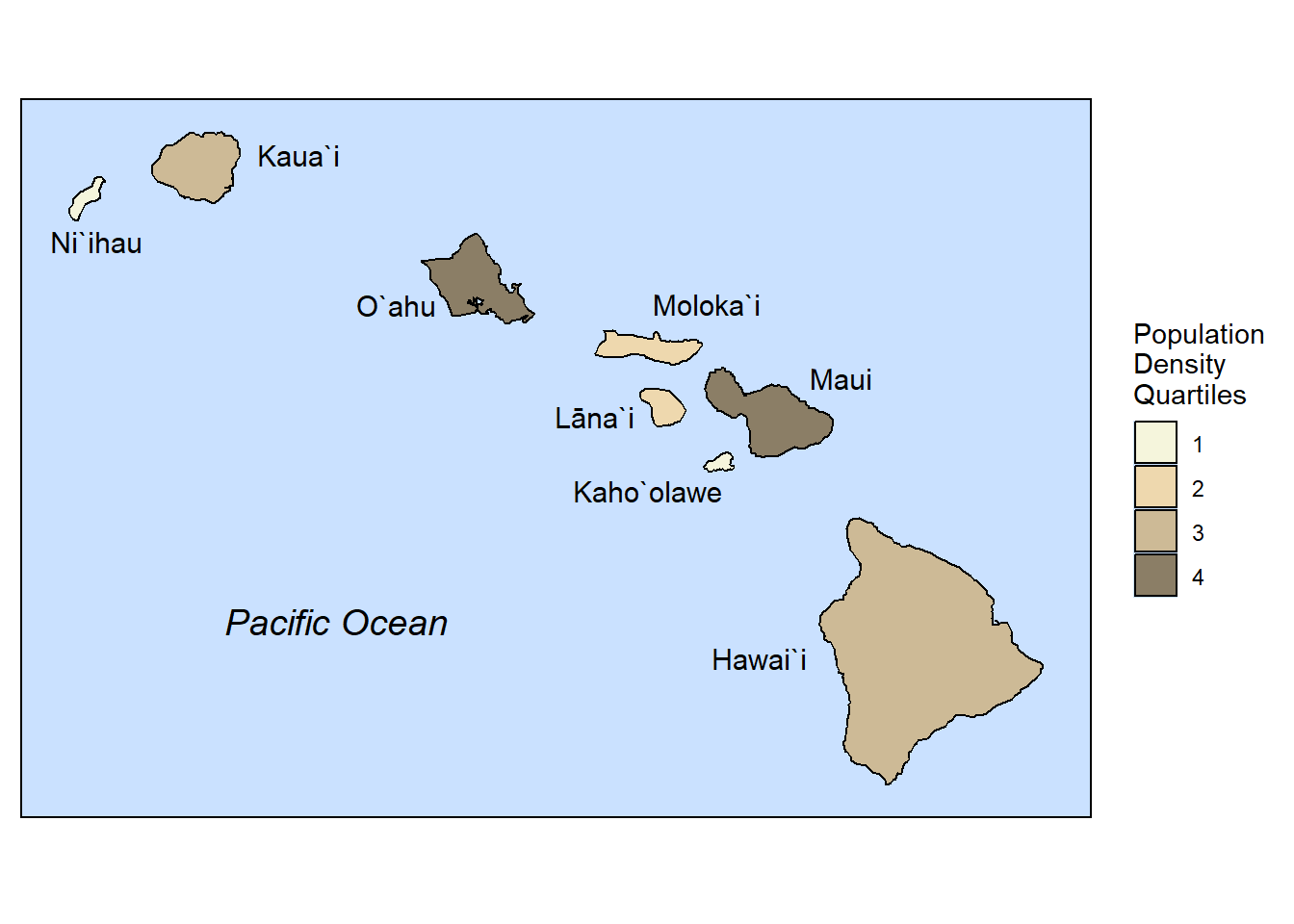
The functions in Sitemaps can be used to add text annotations to the choropleth map.
Text position coordinates can be copied from Google Maps by right-clicking on a location and copying the coordinates from the pop-up box by left-clicking on the coordinates. You get a message that the coordinates have been copied to the clipboard.
Recall that the text is centered on the lat, lon coordinates unless you change the justify value to left or right. [NOTE: JUSTIFY DOESN’T SEEM TO BE WORKING RIGHT IN SITEMAPS]
The example below uses the Population Density map from the previous chunk.
Show the code
## Create a file of names for the annotation.annotation <-read_csv(file ="text, lat, lon, fontface, name_text_size Ni`ihau, 21.67626, -160.09480, plain, 4 Kaua`i, 22.11367, -158.96844, plain, 4 O`ahu, 21.35112, -158.41976, plain, 4 Moloka`i, 21.35607, -156.68232, plain, 4 Lāna`i, 20.78355, -157.30721, plain, 4 Maui, 20.97766, -155.93282, plain, 4 Kaho`olawe, 20.40621, -157.01449, plain, 4 Hawai`i, 19.55664, -156.38691, plain, 4 Pacific Ocean, 19.74548, -158.75696, italic, 5")## Plot the map with the annotation.choro_map +site_names(datatable = annotation)