Wrangling is a strange term for the process of massaging data into the correct format. I guess that “wrangling” is a slang term in the information technology community that ignores the historical pejorative meaning. I’ll leave wrangling here as most people will understand that we’re not trying to distort or misuse data.
There are two general goals of this section:
Make the column names consistent with the requirements of the styles. For example, the column with label headers needs to be called “text.”
Create or convert data into categories so that the visualization is clear. An example is changing values in a numerical scale into ranges of values and applying a color to each range. This is the most complex of the three goals and it will be the subject of the most discussion.
Getting Started
As usual, there are some tasks that need to be done. First, we’ll load some libraries and get the Google Map key registered.
Show the code chunk
## Librarieslibrary(readr) ## Read in datalibrary(ggmap) ## Show maps, handle Google keylibrary(ggplot2) ## Build mapslibrary(dplyr) ## Data wranglinglibrary(gt) ## Tableslibrary(sitemaps) ## Functions to help build site mapslibrary(parzer) ## Convert HMS to digital coordinateslibrary(jsonlite) ## Process files using the JSON formatlibrary(httr) ## Allow API calls## Initialize Google Map key; the key is stored in a Project directory. My_Key <-read_file("P://Hot/Workflow/Workflow/keys/Google_Maps_API_Key.txt")## Test if Google Key is registered.if (!has_google_key()){## Register the Google Maps API Key.register_google(key = My_Key, account_type ="standard") } ## end Google Key test
Now we can initialize some data, just as it has been done in the other chapters.
Show the code chunk
## Use two functions from sitemaps to initialize parameterscolumn <-site_styles()hide <-site_google_hides()## Establish a theme that improves the appearance of a map.## This theme removes the axis labels and ## puts a border around the map. No legend.simple_black_box <-theme_void() +theme(panel.border =element_rect(color ="black", fill=NA, size=2),legend.position ="none")
And we’re ready to go.
Column Names
The point, label and name overlay information requires three columns of data: text, lon, and lat. Getting these columns named properly (both the words and lower-case type) is the first goal.
The remaining columns follow the names used for the parameters that are loaded with the site_styles() function.
There are two useful functions: rename and rename_with (both from the dplyr package). We’ll use these in the following example. Be sure to check the code to see the process.
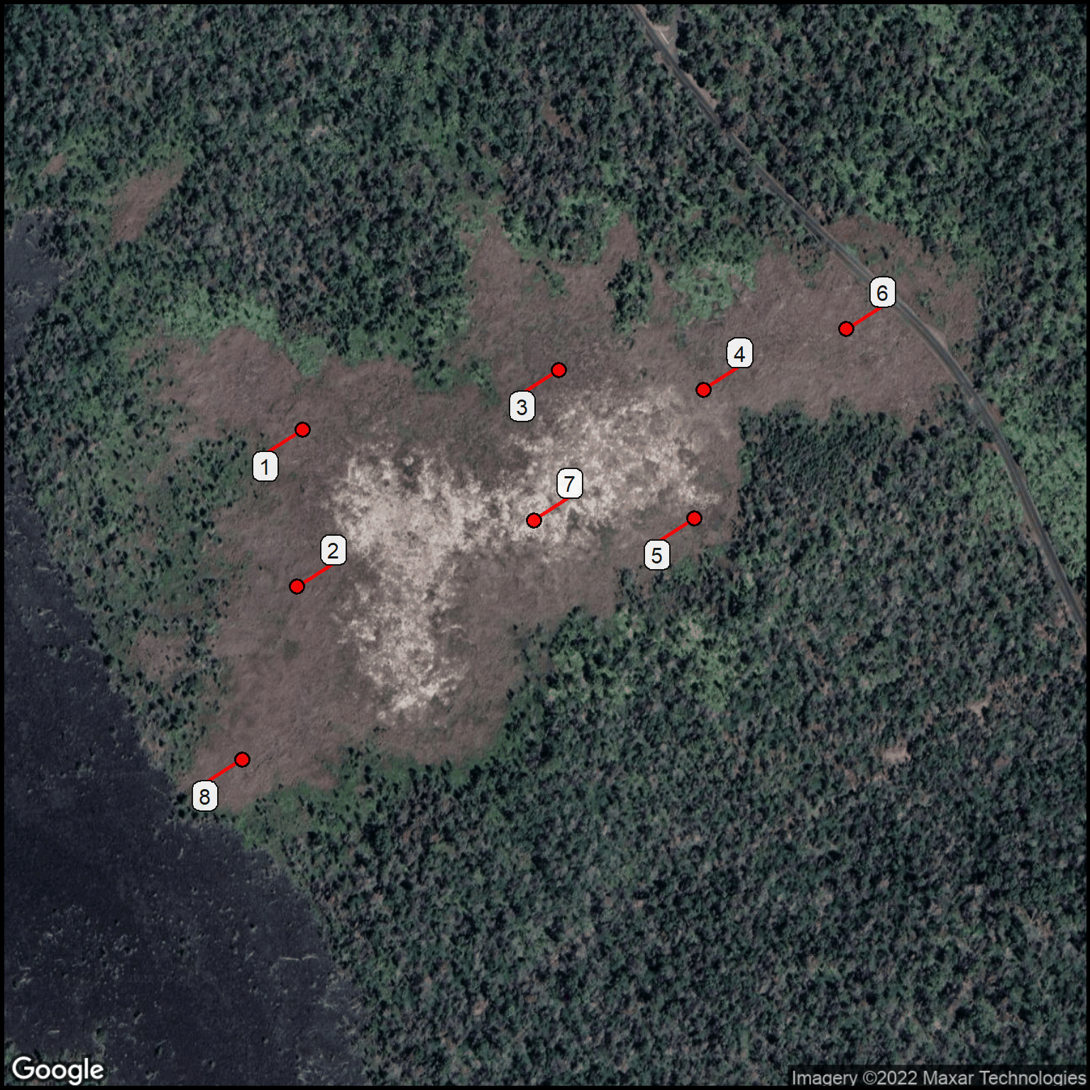
The data we’re using in this example comes from a quick survey in Hawaii Volcanoes National Park. There is an area, called the Puhimau Hotspot, that must have lava beneath the surface. The soil temperature has essentially eliminated the forest that had grown here. This is now a mostly bare area with remnant tree stumps, clumps of grass, and various plants growing close to the hot surface.
Show the code chunk
## Read in the field data.puhimau <-read_csv(col_names =TRUE, file ="Site, Lon, Lat, Temperature 1, -155.251451, 19.389354, 140 2, -155.251483, 19.388421, 125 3, -155.249834, 19.389709, 165 4, -155.248924, 19.389591, 180 5, -155.248982, 19.388827, 102 6, -155.248024, 19.389952, 97 7, -155.249994, 19.388816, 135 8, -155.251831, 19.387395, 95")## Rename the site column and shift all the column names to lowercasepuhimau2 <- puhimau %>% dplyr::rename(text = Site) %>% dplyr::rename_with(tolower)gt(puhimau2) %>%fmt_number(columns =c(lat,lon), decimals =5) %>%tab_source_note(source_note ="Data: 2017 field survey") %>%tab_footnote(footnote ="degrees F",locations =cells_column_labels(columns = temperature))
Table 1: Soil temperatures at the Puhimau Hotspot. Column names updated.
text
lon
lat
temperature1
1
−155.25145
19.38935
140
2
−155.25148
19.38842
125
3
−155.24983
19.38971
165
4
−155.24892
19.38959
180
5
−155.24898
19.38883
102
6
−155.24802
19.38995
97
7
−155.24999
19.38882
135
8
−155.25183
19.38740
95
Data: 2017 field survey
1 degrees F
Let’s check this with a map.
Show the code chunk
## Modify some default parameters.column$margin <-0.1column$gmaptype <-"satellite"## Generate a basemapbasemap <-site_google_basemap(datatable = puhimau2)## Show the map (with points & labels)ggmap(basemap) +site_labels(datatable = puhimau2) +site_points(datatable = puhimau2) + simple_black_box
Figure 1: 2017 Puhimau soil temperature survey sites.
Everything looks OK. We’ll see how to color code the temperature for each survey site i the next section.
Data as Categories
Many types of data that we’ll use for map symbolism come as categories. Examples include vegetation types (e.g., deciduous forest, desert), species (e.g., mouse, rat), and lodging (e.g., hotel, resort). Each category can be assigned a color and map symbols will show the distribution of the categories on the map.
We need to convert quantitative values to categories to get the same visual power. We’ll deal with this quantitative problem first, then look at representing data already divided into categories as different colors.
Categories from Quantitative Values
Tip
Converting quantitative values to categories is one of the most important tasks of data visualization with maps. Knowing how to use the cut function is an important skill. Applying the cut function is a critical behavior.
First, we need to divide a column of quantitative values into segments. Usually, the number is segments is quite small. Perhaps between 3 and 5. This can be done in two ways.
Perhaps the easiest and most common way is to choose a value for the number of segments. For example, you can use 3 to get a sequence of values divided into three equal parts from the smallest to the largest values.
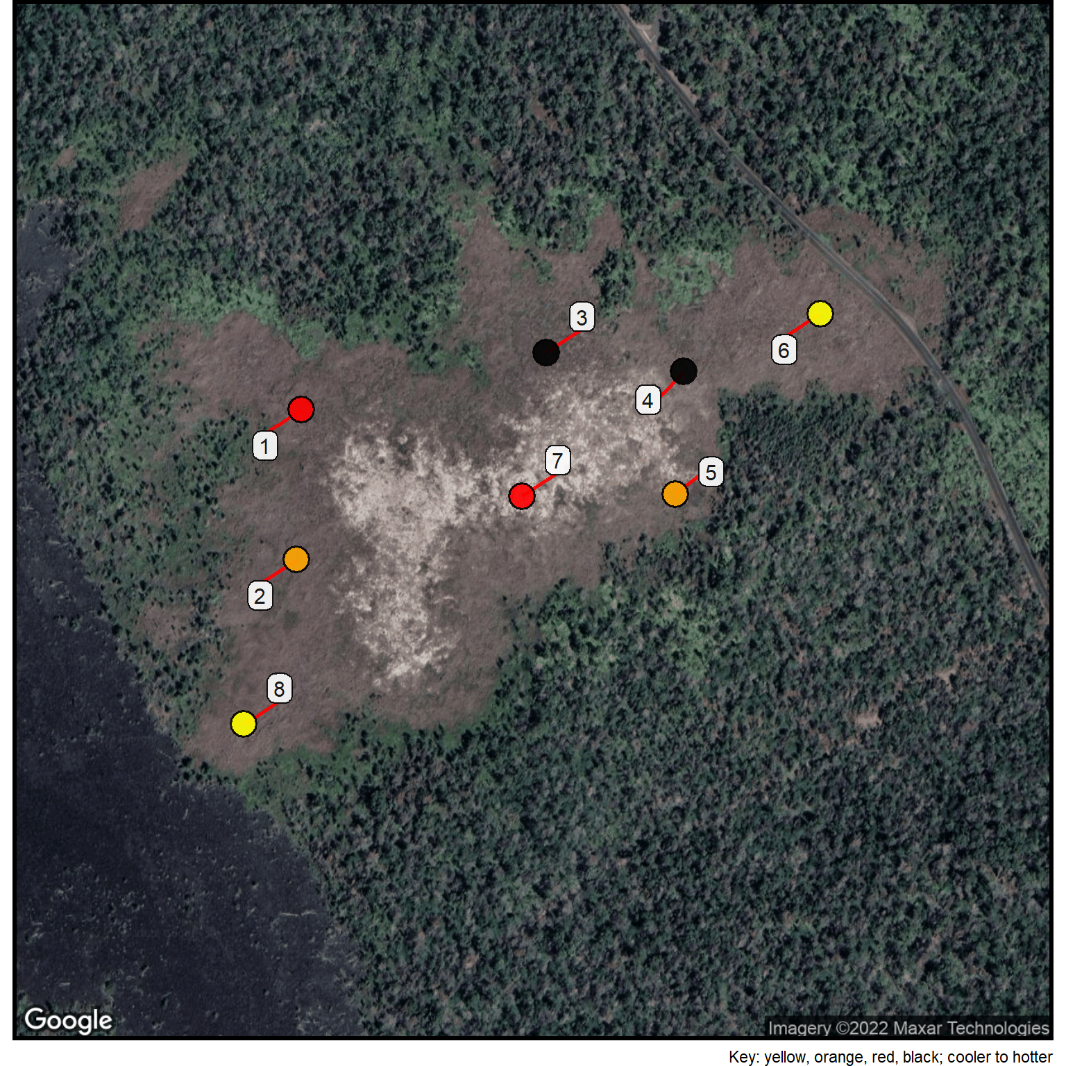
An alternative way is to consider the statistical properties of the data distribution. In this case, the soil temperatures. In this example, we’ll use the site_cuts function to divide temperature into categories based on the mean and standard deviation of the set of temperature values. The bottom set is below 1 SD from the mean, the next goes to the mean, the next to 1 SD above the mean, and the final segment is above 1 SD above the mean.
The next step is to assign a color to each segment based on the index value created using the site_cuts function. The assignment is done with a color lookup table.
Show the code chunk
## Here are the three parts of the cut.puhimau2$index <-site_cuts(quant_var = puhimau2$temperature, cuttype ="statistical4")## Color codes for the temperature segmentscolor_table <-read_csv(col_names =TRUE, file ="index, point_color 1, yellow 2, orange 3, red 4, black") ## Merge the colors into the data tablepuhimau2 <-merge(puhimau2, color_table, by ="index")## Print the table for confirmationgt(puhimau2) %>%tab_source_note(source_note ="Data: 2017 field survey") %>%tab_footnote(footnote ="degrees F",locations =cells_column_labels(columns = temperature)) %>%tab_footnote(footnote ="Yellow=low, Orange=mid, Red=high , Black=very high temperature.",locations =cells_column_labels(columns = point_color))
Table 2: Soil temperatures divided into three ranges.
index
text
lon
lat
temperature1
point_color2
1
6
-155.2480
19.38995
97
yellow
1
8
-155.2518
19.38740
95
yellow
2
2
-155.2515
19.38842
125
orange
2
5
-155.2490
19.38883
102
orange
3
1
-155.2515
19.38935
140
red
3
7
-155.2500
19.38882
135
red
4
3
-155.2498
19.38971
165
black
4
4
-155.2489
19.38959
180
black
Data: 2017 field survey
1 degrees F
2 Yellow=low, Orange=mid, Red=high , Black=very high temperature.
Show the code chunk
## Increase the size of the points.column$point_size <-6## We can use the existing basemap.## Show the map (with points & labels)ggmap(basemap) +site_labels(datatable = puhimau2) +site_points(datatable = puhimau2) +labs(caption="Key: yellow, orange, red, black; cooler to hotter") + simple_black_box
Figure 2: Yellow = lowest, Orange = mid, Red = high, Black = vert high temperatures.
Converting descriptors to color values
Show the code chunk
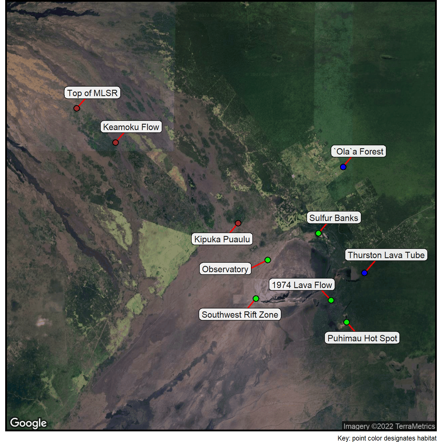
## Reinitialize the stylescolumn <-site_styles()## Read the data from the Hawaii Volcanoes National Park.sites <-read_csv(col_names =TRUE, file ="location, habitat, lat, lonKipuka Puaulu, Upland Forest & Woodland, 19.43765, -155.30317Top of MLSR, Upland Forest & Woodland, 19.49278, -155.38532Keamoku Flow, Upland Forest & Woodland, 19.47638, -155.36552Thurston Lava Tube, Rainforest, 19.41368, -155.23872`Ola`a Forest, Rainforest, 19.46464, -155.24967Sulfur Banks, Mid-elevation Woodland, 19.43278, -155.26224Southwest Rift Zone, Mid-elevation Woodland, 19.40136, -155.294091974 Lava Flow, Mid-elevation Woodland, 19.40056, -155.25574Puhimau Hot Spot, Mid-elevation Woodland, 19.39007, -155.24783Observatory, Mid-elevation Woodland, 19.41991, -155.28804")## Show the data tablegt(sites) %>%fmt_number(columns =c(lat,lon), decimals =5) %>%tab_style(style =cell_text(v_align ="top"),locations =cells_body())
Table 3: Research sites in Hawaii Volcanoes National Park.
location
habitat
lat
lon
Kipuka Puaulu
Upland Forest & Woodland
19.43765
−155.30317
Top of MLSR
Upland Forest & Woodland
19.49278
−155.38532
Keamoku Flow
Upland Forest & Woodland
19.47638
−155.36552
Thurston Lava Tube
Rainforest
19.41368
−155.23872
`Ola`a Forest
Rainforest
19.46464
−155.24967
Sulfur Banks
Mid-elevation Woodland
19.43278
−155.26224
Southwest Rift Zone
Mid-elevation Woodland
19.40136
−155.29409
1974 Lava Flow
Mid-elevation Woodland
19.40056
−155.25574
Puhimau Hot Spot
Mid-elevation Woodland
19.39007
−155.24783
Observatory
Mid-elevation Woodland
19.41991
−155.28804
What we want to place on the map is a color-coded point with each color representing the habitat type.
The first step is to make a table that relates the different habitats to the colors. Note that the column with the habitats must have the same name as the column for the habitats in the main table. We’ll also use the column name point_color for the colors as this is the parameter name used to color location symbols.
Then it is just a matter of using the R base function merge to add the colors to the original table.
Show the code chunk
## Lookup tablelookup_list <-read_csv(col_names =TRUE, file ="habitat, point_color Rainforest, blue Upland Forest & Woodland, brown Mid-elevation Woodland, green")## Merge into the data tablesites <-merge(sites, lookup_list, by="habitat")gt(sites) %>%fmt_number(columns =c(lat,lon), decimals =5) %>%tab_style(style =cell_text(v_align ="top"),locations =cells_body())
Table 4: Habitats color-coded for the research sites.
habitat
location
lat
lon
point_color
Mid-elevation Woodland
Sulfur Banks
19.43278
−155.26224
green
Mid-elevation Woodland
Southwest Rift Zone
19.40136
−155.29409
green
Mid-elevation Woodland
1974 Lava Flow
19.40056
−155.25574
green
Mid-elevation Woodland
Puhimau Hot Spot
19.39007
−155.24783
green
Mid-elevation Woodland
Observatory
19.41991
−155.28804
green
Rainforest
Thurston Lava Tube
19.41368
−155.23872
blue
Rainforest
`Ola`a Forest
19.46464
−155.24967
blue
Upland Forest & Woodland
Kipuka Puaulu
19.43765
−155.30317
brown
Upland Forest & Woodland
Top of MLSR
19.49278
−155.38532
brown
Upland Forest & Woodland
Keamoku Flow
19.47638
−155.36552
brown
We can check our progress with a map.
Note that we need to change the name of the location column to text so this site identifier appears in the point labels.
Show the code chunk
## Specify a satellite basemapcolumn$gmaptype <-"satellite"## Change the location to textsites2 <- sites %>% dplyr::rename(text = location)## Generate a basemapbasemap <-site_google_basemap(datatable = sites2)## Show the map (with points & labels)ggmap(basemap) +site_labels(datatable = sites2) +site_points(datatable = sites2) +labs(caption ="Key: point color designates habitat") + simple_black_box
Here, we’re focused on making both the table and the map richer with the addition of information. There are several ways this can be done.
Typing New Columns
If there is a data source with additional information, you might simply want to type the values into a new column in the original table. Because the code re-runs all the basic data manipulation steps, it is straight-forward to modify the original table and produce a fully updated version.
Data Services to Add Data
It may be possible to use existing table data to generate additional information. For our HVNP research sites, we can use Google Maps to obtain the elevation at each location.
The function we need, map_elevation, is another custom function in the mapfunctions package.
The get_elevation function works on the datatable, just like most of the other sitemaps functions. This means that it is looking for table columns with the lat and lon names. The function adds a new column to the datatable, called elevation.
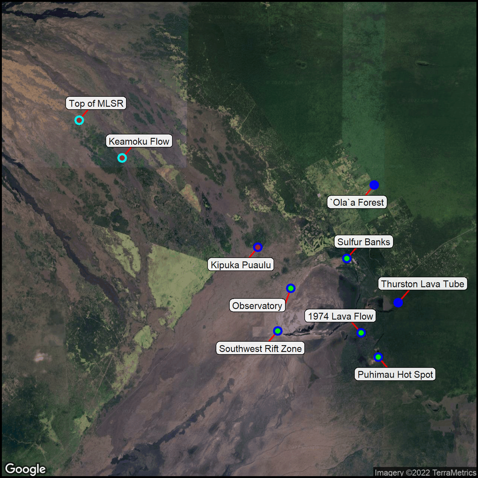
We’ll do a couple more things in this chunk: sort so the highest elevation sites are at the top of the table and create a color-code for the elevations. We’ll be using this color-code as an outline around the data points.
Show the code chunk
## Add the elevation to the sitessites3 <-site_elevation(datatable=sites2, APIkey = My_Key)## Sort the sites with highest elevation at the topsites4 <- sites3 %>%arrange(desc(elevation))## Color code the elevation ranges (top and bottom half of the elevation range)sites4$index <-site_cuts(quant_var = sites4$elevation, cuttype ="topbottom")## Color lookup tablecolor_table <-read_csv(col_names =TRUE, file ="index, point_outline_color 1, blue 2, cyan")## Merge colors into the data tablesites4 <-merge(sites4, color_table, by ="index")## Show the sorted tablegt(sites4) %>%fmt_number(columns =c(lat,lon), decimals =5) %>%tab_style(style =cell_text(v_align ="top"),locations =cells_body()) %>%tab_footnote(footnote ="Meters (from Google Maps)",locations =cells_column_labels(columns = elevation))
Table 5: Elevations added to the research locations.
index
habitat
text
lat
lon
point_color
elevation1
point_outline_color
1
Mid-elevation Woodland
Observatory
19.41991
−155.28804
green
1245
blue
1
Mid-elevation Woodland
Sulfur Banks
19.43278
−155.26224
green
1199
blue
1
Upland Forest & Woodland
Kipuka Puaulu
19.43765
−155.30317
brown
1197
blue
1
Rainforest
Thurston Lava Tube
19.41368
−155.23872
blue
1194
blue
1
Rainforest
`Ola`a Forest
19.46464
−155.24967
blue
1179
blue
1
Mid-elevation Woodland
Southwest Rift Zone
19.40136
−155.29409
green
1140
blue
1
Mid-elevation Woodland
1974 Lava Flow
19.40056
−155.25574
green
1120
blue
1
Mid-elevation Woodland
Puhimau Hot Spot
19.39007
−155.24783
green
1094
blue
2
Upland Forest & Woodland
Top of MLSR
19.49278
−155.38532
brown
2032
cyan
2
Upland Forest & Woodland
Keamoku Flow
19.47638
−155.36552
brown
1721
cyan
1 Meters (from Google Maps)
We’re now ready to see the visualization of the data for the Hawaii Volcanoes National Park site.
Show the code chunk
column$point_outline_thickness <-2## Show the map (with points & labels)ggmap(basemap) +site_labels(datatable = sites4) +site_points(datatable = sites4) + simple_black_box
Sometimes, the data table has more values than you want to display on your map. Or, you have duplicated locations and you want to simplify the map without loosing the information value of the duplicated points.
The data consolidation or reduction can be quite complex. The next section shows just one way this can be done that applies quite well to making maps.
Combining Rows
The example used here is the fuel log for a Smart car used primarily for long-distance trips in the Lower48.
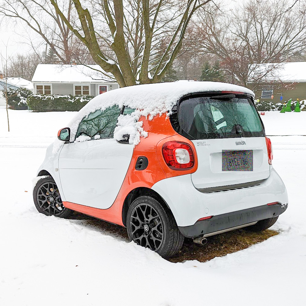
Creamsicle, the long-distance Smart car, parked in Wisconsin on a cold day.
Information about each fuel stop is recorded and typed into a spreadsheet. A portion of that spreadsheet is contained in the following code chunk. Note that a lot more information is collected at each fuel stop. This is just a convenient extract to show the problem and solution to excessive data overlap.
Show the code chunk
## Resetting the parameterscolumn <-site_styles()## Read the fuel log datafuel <-read_csv(col_names =TRUE, file ="Date, City, State, Gallons 09/23/2021, Nixa, MO, 6.000 09/23/2021, Garden City, MO, 5.124 09/24/2021, Plattsburg, MO, 4.033 09/25/2021, Lincoln, NE, 3.799 09/25/2021, Gothensburg, NE, 3.799 09/25/2021, Atwood, CO, 6.270 09/26/2021, Arvada, CO, 2.737 09/26/2021, Grand Junction, CO, 5.766 09/27/2021, Salina, UT, 5.213 09/27/2021, St George, UT, 4.839 09/28/2021, Jean, NV, 4.773 09/28/2021, Victorville, CA, 5.274 10/15/2021, Torrance, CA, 2.860 10/15/2021, Barstow, CA, 3.610 10/15/2021, Searchlight, NV, 4.824 10/16/2021, Ash Fork, AZ, 4.742 10/16/2021, Sanders, AZ, 4.869 10/17/2021, Albuquerque, NM, 4.324 10/17/2021, Wagon Mound, NM, 4.313 10/17/2021, Colorado Springs,CO, 5.138 10/18/2021, Colby, KS, 4.356 10/19/2021, Kearney, NE, 3.852 10/19/2021, Omaha, NE, 4.396 10/20/2021, Des Moines, IA, 3.280 10/20/2021, Anamosa, IA, 4.261 10/22/2021, Madison, WI, 4.239 10/28/2021, Sun Prairie, WI, 4.309 11/07/2021, Madison, WI, 4.159 11/13/2021, Sun Prairie, WI, 3.700 11/16/2021, Sun Prairie, WI, 1.881 11/20/2021, Sun Prairie, WI, 3.458 11/26/2021, Sun Prairie, WI, 4.168 12/01/2021, Sun Prairie, WI, 1.813 12/07/2021, Sun Prairie, WI, 4.271 12/14/2021, Sun Prairie, WI, 2.636 12/20/2021, Sun Prairie, WI, 3.444 12/30/2021, Sun Prairie, WI, 4.084 1/18/2022, Sun Prairie, WI, 1.751 1/18/2022, Mendota, IL, 3.790 1/19/2022, Springfield, IL, 5.357 1/20/2022, Shelbina, MO, 4.685 1/21/2022, Kansas City, MO, 5.182 1/21/2022, Junction City, KS, 3.829 1/22/2022, Hays, KS, 5.542 1/22/2022, Burlington, CO, 4.795 1/23/2022, Colorado Springs,CO, 4.663 1/23/2022, Walsenburg, CO, 2.633 1/23/2022, Questa, NM, 2.514 1/24/2022, Grants, NM, 5.698 1/25/2022, Flagstaff, AZ, 5.256 1/26/2022, Williams, AZ, 4.874 1/27/2022, Lake Havasu City,AZ, 3.318 1/27/2022, Indio, CA, 4.311 2/02/2022, Alhambra, CA, 4.818 5/20/2022, Torrance, CA, 4.918 5/23/2022, Torrance, CA, 3.552 5/29/2022, Bakersfield, CA, 4.173 5/29/2022, Firebaugh, CA, 5.219 5/30/2022, Williams, CA, 5.627 5/30/2022, Mt Shasta, CA, 5.558 5/31/2022, Roseburg, OR, 5.577 6/08/2022, Veneta, OR, 4.674 6/11/2022, Bandon, OR, 4.329 6/12/2022, Klamath, CA, 2.927 6/12/2022, Leggett, CA, 4.200 6/13/2022, Bodega Bay, CA, 2.887 6/13/2022, Santa Cruz, CA, 2.714 6/14/2022, San Luis Obispo, CA, 5.287")## Geocode the locationsfuel_loc <-geocode(paste0(fuel$City,", ",fuel$State),output ="latlon")fuel <-cbind(fuel,fuel_loc)## Output a confirmation tablegt(fuel)
Table 6: Fuel information for Creamsicle (data subset).
Date
City
State
Gallons
lon
lat
09/23/2021
Nixa
MO
6.000
-93.29435
37.04339
09/23/2021
Garden City
MO
5.124
-94.19133
38.56112
09/24/2021
Plattsburg
MO
4.033
-94.44801
39.56555
09/25/2021
Lincoln
NE
3.799
-96.70260
40.81362
09/25/2021
Gothensburg
NE
3.799
-100.16070
40.92766
09/25/2021
Atwood
CO
6.270
-103.26966
40.54776
09/26/2021
Arvada
CO
2.737
-105.08748
39.80276
09/26/2021
Grand Junction
CO
5.766
-108.55065
39.06387
09/27/2021
Salina
UT
5.213
-111.85993
38.95774
09/27/2021
St George
UT
4.839
-113.56842
37.09653
09/28/2021
Jean
NV
4.773
-115.32388
35.77887
09/28/2021
Victorville
CA
5.274
-117.29276
34.53622
10/15/2021
Torrance
CA
2.860
-118.34063
33.83585
10/15/2021
Barstow
CA
3.610
-117.01728
34.89580
10/15/2021
Searchlight
NV
4.824
-114.91970
35.46527
10/16/2021
Ash Fork
AZ
4.742
-112.48407
35.22501
10/16/2021
Sanders
AZ
4.869
-109.32879
35.20914
10/17/2021
Albuquerque
NM
4.324
-106.65042
35.08439
10/17/2021
Wagon Mound
NM
4.313
-104.70666
36.00893
10/17/2021
Colorado Springs
CO
5.138
-104.82136
38.83388
10/18/2021
Colby
KS
4.356
-101.05238
39.39584
10/19/2021
Kearney
NE
3.852
-99.08168
40.69933
10/19/2021
Omaha
NE
4.396
-95.93450
41.25654
10/20/2021
Des Moines
IA
3.280
-93.62496
41.58684
10/20/2021
Anamosa
IA
4.261
-91.28516
42.10834
10/22/2021
Madison
WI
4.239
-89.40075
43.07217
10/28/2021
Sun Prairie
WI
4.309
-89.21373
43.18360
11/07/2021
Madison
WI
4.159
-89.40075
43.07217
11/13/2021
Sun Prairie
WI
3.700
-89.21373
43.18360
11/16/2021
Sun Prairie
WI
1.881
-89.21373
43.18360
11/20/2021
Sun Prairie
WI
3.458
-89.21373
43.18360
11/26/2021
Sun Prairie
WI
4.168
-89.21373
43.18360
12/01/2021
Sun Prairie
WI
1.813
-89.21373
43.18360
12/07/2021
Sun Prairie
WI
4.271
-89.21373
43.18360
12/14/2021
Sun Prairie
WI
2.636
-89.21373
43.18360
12/20/2021
Sun Prairie
WI
3.444
-89.21373
43.18360
12/30/2021
Sun Prairie
WI
4.084
-89.21373
43.18360
1/18/2022
Sun Prairie
WI
1.751
-89.21373
43.18360
1/18/2022
Mendota
IL
3.790
-89.11759
41.54725
1/19/2022
Springfield
IL
5.357
-89.65015
39.78172
1/20/2022
Shelbina
MO
4.685
-92.04295
39.69393
1/21/2022
Kansas City
MO
5.182
-94.57857
39.09973
1/21/2022
Junction City
KS
3.829
-96.83140
39.02861
1/22/2022
Hays
KS
5.542
-99.32677
38.87918
1/22/2022
Burlington
CO
4.795
-102.26936
39.30611
1/23/2022
Colorado Springs
CO
4.663
-104.82136
38.83388
1/23/2022
Walsenburg
CO
2.633
-104.78040
37.62274
1/23/2022
Questa
NM
2.514
-105.59501
36.70391
1/24/2022
Grants
NM
5.698
-107.85145
35.14726
1/25/2022
Flagstaff
AZ
5.256
-111.65130
35.19828
1/26/2022
Williams
AZ
4.874
-112.19100
35.24946
1/27/2022
Lake Havasu City
AZ
3.318
-114.32245
34.48390
1/27/2022
Indio
CA
4.311
-116.21556
33.72058
2/02/2022
Alhambra
CA
4.818
-118.12701
34.09529
5/20/2022
Torrance
CA
4.918
-118.34063
33.83585
5/23/2022
Torrance
CA
3.552
-118.34063
33.83585
5/29/2022
Bakersfield
CA
4.173
-119.01871
35.37329
5/29/2022
Firebaugh
CA
5.219
-120.45601
36.85884
5/30/2022
Williams
CA
5.627
-122.14942
39.15461
5/30/2022
Mt Shasta
CA
5.558
-122.31057
41.30987
5/31/2022
Roseburg
OR
5.577
-123.34174
43.21650
6/08/2022
Veneta
OR
4.674
-123.35093
44.04873
6/11/2022
Bandon
OR
4.329
-124.40845
43.11900
6/12/2022
Klamath
CA
2.927
-124.03841
41.52651
6/12/2022
Leggett
CA
4.200
-123.71483
39.86548
6/13/2022
Bodega Bay
CA
2.887
-123.04806
38.33325
6/13/2022
Santa Cruz
CA
2.714
-122.03080
36.97412
6/14/2022
San Luis Obispo
CA
5.287
-120.65962
35.28275
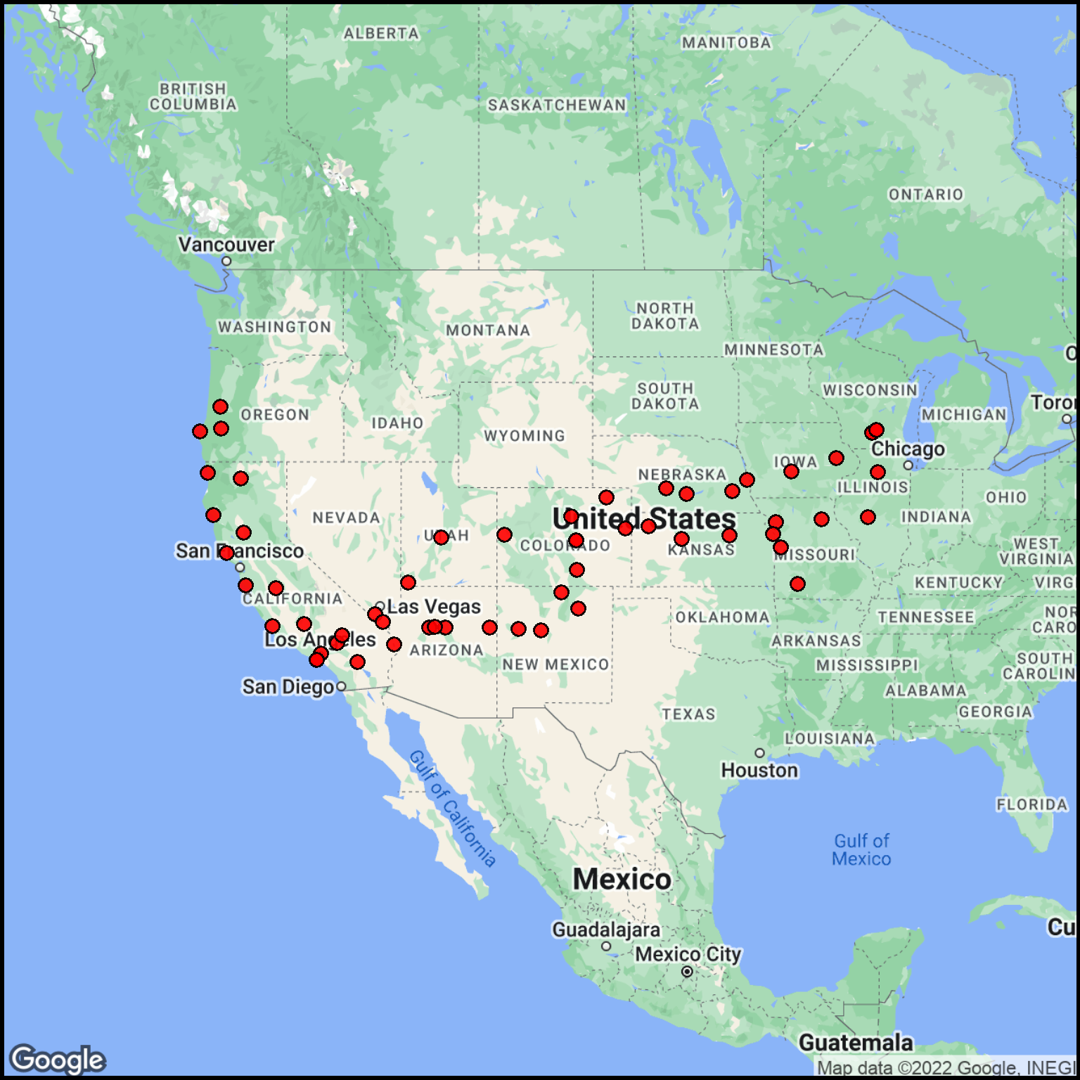
Use a preliminary map to check the fuel stop locations.
Show the code chunk
## Use the City column for the label.fuel2 <- fuel %>% dplyr::rename(text = City)## Generate a basemap.basemap <-site_google_basemap(datatable = fuel2)## Show the map (with points)ggmap(basemap) +site_points(datatable = fuel2) + simple_black_box
Figure 5: Check of the fuel stop locations.
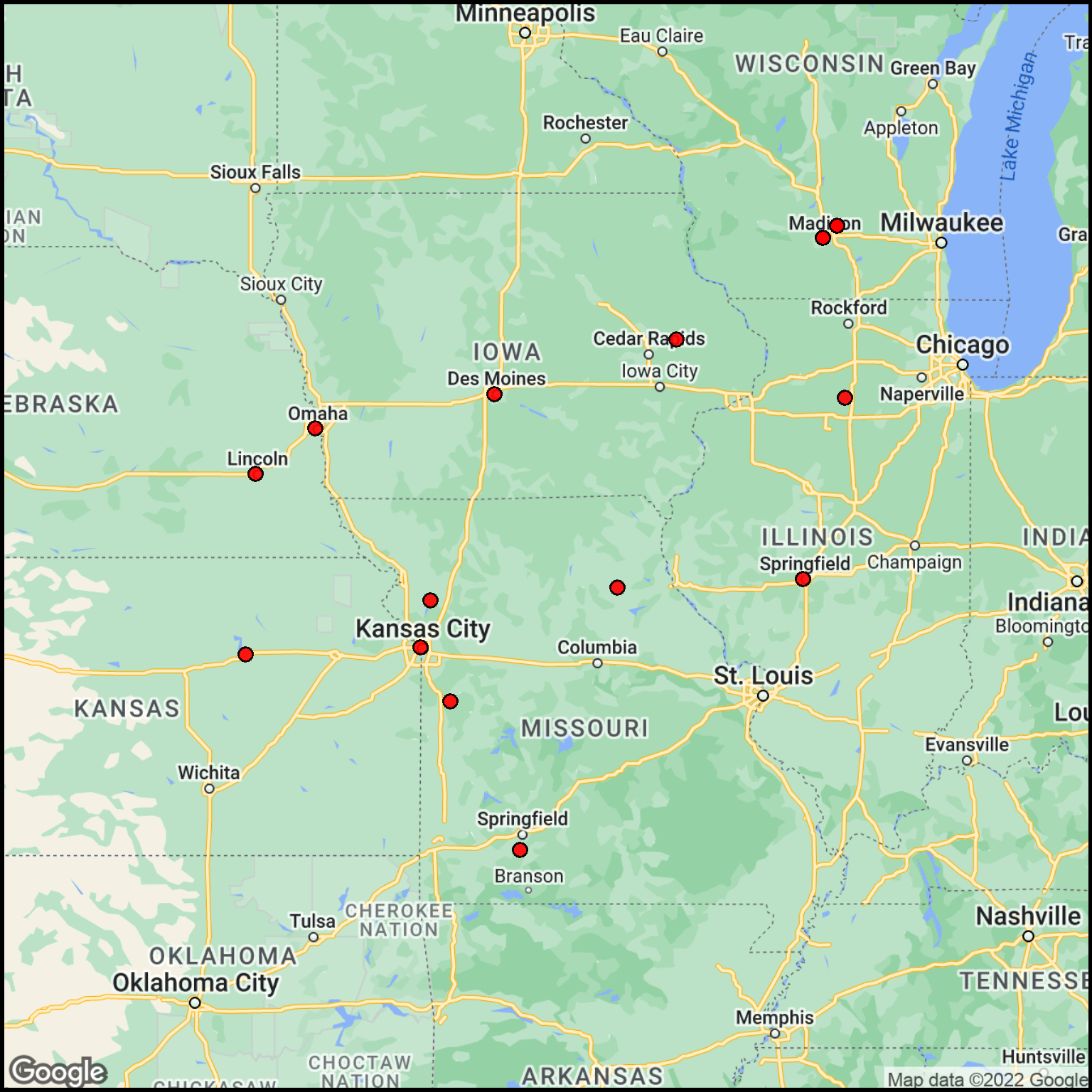
The data cover a very wide area. To see the details, we can divide the data into two parts: West and East relative to some area in Kansas.
Show the code chunk
## Choose a division linelon_divide <--98.0## Separate out the sites to the east of the divideeast_part <- fuel2 %>%filter(lon > lon_divide)## Create a basemapbasemap_east <-site_google_basemap(datatable = east_part)## Plot the mapggmap(basemap_east) +site_points(datatable = east_part) + simple_black_box
Figure 6: Fuel locations for the East segment.
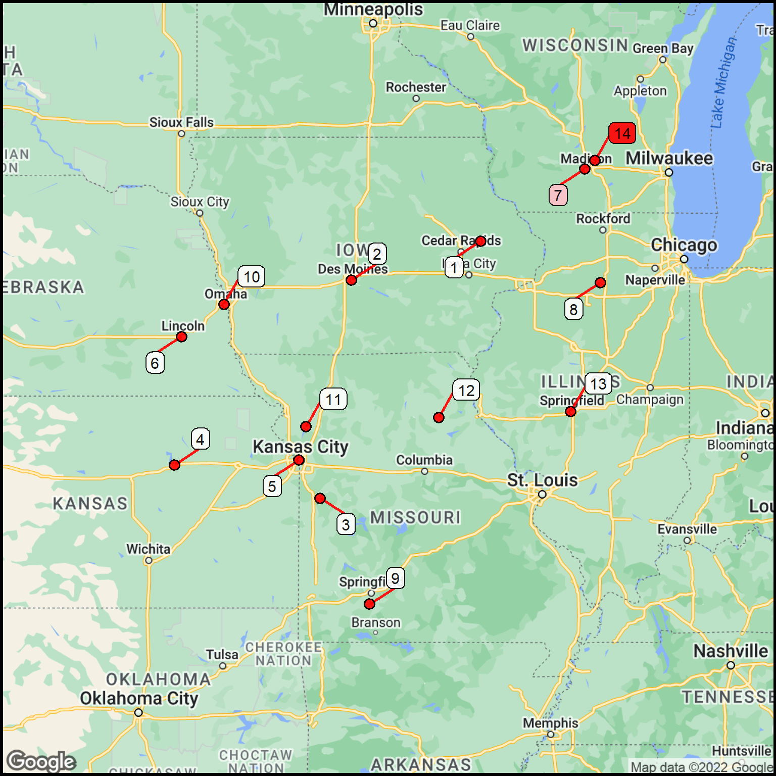
Combine rows for the same city.
Colors are used to highlight the locations where there were multiple fuel stop.
Show the code chunk
## Combine the City (as text) and Stateeast_part$citystate <-paste0(east_part$text,", ",east_part$State)## Count duplicate locations (compresses the list)station_count <-as.data.frame(table(east_part$citystate))## Modify the column namesstation_count <- station_count %>%rename(station = Var1) %>%rename(freq = Freq)## Make the station name characterstation_count$station <-as.character(station_count$station)## Number each of the locations (not gas stations)station_count$text <-as.character(seq.int(nrow(station_count)))## Re-geocode just the remaining set of stationsfuel_locs <-geocode(station_count$station, output="latlon")map_data <-cbind(station_count,fuel_locs)## Add a column for the label colorquant_variable <- map_data$freqset_of_colors <-c("white","pink","red")map_data$label_background_color <-cut(quant_variable, breaks =c(0,1,2,100),labels = set_of_colors)map_data$label_background_color<-as.character(map_data$label_background_color)## Expand the basemap a bit to accommodate the labelscolumn$margin <-0.1basemap_east <-site_google_basemap(datatable = map_data)## Plot the mapggmap(basemap_east) +site_labels(datatable = map_data) +site_points(datatable = map_data) + simple_black_box
Figure 7: Labeled fuel location for the East segment.
You can see that enough time was spent around the Madison, Wisconsin area to require quite a few fuel stops. The other stations were visited just once.
A table gives the details appropriate to the map.
Show the code chunk
gt(map_data) %>%cols_move_to_start(text) %>%cols_label(text="Ref", station="Location", freq="Frequency") %>%cols_hide(columns =c(lon, lat, label_background_color)) %>%tab_footnote(footnote ="Locations in alphabetical, not temporal order.",locations =cells_column_labels(columns = station))
Table 7: Location and frequency of fuels stops in the east segment. Location are identified in Table 7.
Ref
Location1
Frequency
1
Anamosa, IA
1
2
Des Moines, IA
1
3
Garden City, MO
1
4
Junction City, KS
1
5
Kansas City, MO
1
6
Lincoln, NE
1
7
Madison, WI
2
8
Mendota, IL
1
9
Nixa, MO
1
10
Omaha, NE
1
11
Plattsburg, MO
1
12
Shelbina, MO
1
13
Springfield, IL
1
14
Sun Prairie, WI
11
1 Locations in alphabetical, not temporal order.
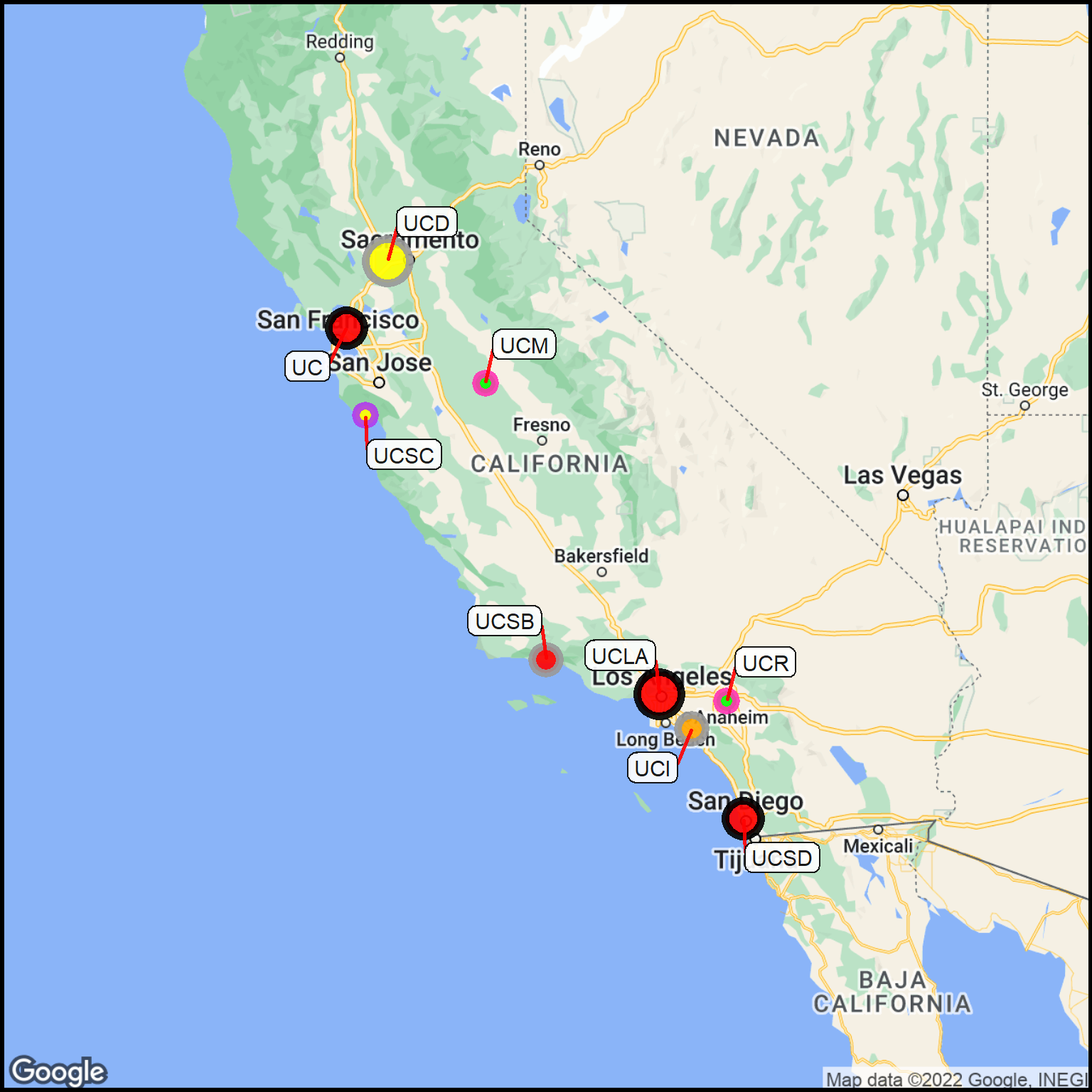
A More Complex Example
Data points can have a number of properties that convey the characteristics of the data.
Here are some data wrangling that needs to be done:
Reset the default parameters.
Get the geographic coordinates for each campus. Using the center of the city is good enough for the resolution of the map we’ll produce.
Scale the data values into categories.
Specify a wider line around the data points.
Make the column names compatible with those needed to make a map.
Don’t be concerned with how this is done here. There are methodology descriptions shown elsewhere. The goal is to demonstrate a more complex map, and that takes some data wrangling. The results are in Table 9.
Show the code chunk
## Add California to the campus cities.location <-paste0(inst$Campus,", California, USA") ## Get the coordinates from the location.coord <- coord <-geocode(location, output ="latlon")## Add the coordinates to the original location data.inst2 <-cbind(inst,coord)## Divide the Undergraduates (school size) into size categories.inst2$sindex <-site_cuts(quant_var = inst2$Undergrads, cuttype ="quartiles4")## Convert the index to a point size value; merge the size data into the data tablesize_lookup <-read_csv(col_names =TRUE, file ="sindex, point_size 1, 3 2, 5 3, 7 4, 9")inst2 <-merge(inst2, size_lookup, by ="sindex")## Cut the Acceptance data into chunksinst2$aindex <-site_cuts(quant_var = inst2$Acceptance, cuttype ="quartiles4")## Convert the index to a point color value; merge the color data into the data tablecolor_lookup <-read_csv(col_names =TRUE, file ="aindex, point_color 1, red 2, orange 3, yellow 4, green")inst2 <-merge(inst2, color_lookup, by ="aindex")## Cut the Financial Aid percentage into categoriesinst2$findex <-site_cuts(quant_var = inst2$Aid, cuttype ="quartiles4")## Assign colors to the Aid categories; merge the aid colors into the data tablecolor_lookup2 <-read_csv(col_names =TRUE, comment ="#", file ="findex, point_outline_color 1, black # little aid 2, gray60 3, darkorchid2 4, maroon1 # ample aid")inst2 <-merge(inst2, color_lookup2, by ="findex")## Change the stroke size (line around point).column$point_outline_thickness <-3## Fix the names so they are standard column names to get labels.inst2 <- inst2 %>% dplyr::rename(text = Abbrev)gt(inst2) %>%fmt_number(columns =c(lat,lon), decimals =5) %>%tab_style(style =cell_text(v_align ="top"),locations =cells_body())
The size of the point indicates the number of undergraduates.
The point color is the acceptance rate (green = high, yellow = medium, red = low).
The point outline color is the fraction of students getting financial aid (blue = high, pink = medium, black = low).
For example, UC (Berkeley) is a big campus it is hard to get into, and it gives relatively little financial aid. On the other hand, UCM (Merced) is a new campus that is small, relatively easy to get into, and offers more students financial aid.
Show the code chunk
## Expand the map margins just a bitcolumn$margin <-0.1## Generate a basemapbasemap <-site_google_basemap(datatable = inst2)## Show the map (with points & labels)ggmap(basemap) +site_points(datatable = inst2) +site_labels(datatable = inst2) + simple_black_box
Figure 8: Properties of the University of California campuses.
You should now see some of the potential available through the use of symbolism.
Note that there are no changes to the labels, nor are there any names added to this plot. Exploration in the use of symbolism has just started.