Maps are good at showing qualitative information with the available symbolism. Often, you have quantitative data. “Cuts” simply refers to the division of a set of quantitative values into segments.
Think of a data column, like elevation. You can divide the values (i.e., rows) into groups. These might be “low elevation,” “mid elevation,” and “high elevation.”
Since we’re concerned here with making maps, the next step likely would be to color code each of the data points according to the elevation divisions.
Here’s the problem: How do you say where the cuts should be made?
Let’s assume in this example that you want four elevation groups. There are several strategies for making the divisions:
Equal Range Segments: Divide into four equal ranges by dividing the range from the lowest elevation to the highest elevation by four. This is the length of each range. How many rows fit into each group depends on the distribution of the data.
Breakpoint Choices: Here you specify the boundaries for the elevation groups. For example, lowest to 1000, 1000 to 2000, 2000 to 3000, and 3000 to highest. You often have some a priori reason to use particular breakpoints. The distribution of rows into groups depends on the data distribution and the choice of breakpoints.
Quartiles: The rows are divided into four sets so that 25% of the rows are in the lowest set, 25% are in the next lowest set, and so on. Each of these groups will have a quarter (or nearly so) of the rows. The boundaries of the elevation segments will depend on the data distribution.
Standard Deviations: This uses the statistical properties of the data. The mean and standard deviation of the elevations is determined. The lowest group consists of rows that are below the mean minus one standard deviation. The second group goes from this value up to the mean value, The third and fourth groups follow this pattern above the mean value. The number of rows in each group depends on the data distribution as do the locations of elevation boundaries.
Each of these strategies has a purpose. As a mapmaker, you need to choose which strategy best fits your needs.
Getting Started
There are the usual tasks that need to be done to get started. These include loading some libraries and getting the Google Map key registered.
Show the code chunk
## Librarieslibrary(readr) ## Read in datalibrary(stringr) ## Wrap text stringslibrary(ggmap) ## Show maps, handle Google keylibrary(ggplot2) ## Build mapslibrary(dplyr) ## Data wranglinglibrary(gt) ## Tableslibrary(sitemaps) ## Functions to help build site mapslibrary(parzer) ## Convert HMS to digital coordinates## Initialize Google Map key; the key is stored in a Project directory. My_Key <-read_file("P://Hot/Workflow/Workflow/keys/Google_Maps_API_Key.txt")## Test if Google Key is registeredif (!has_google_key()){## Register the Google Maps API Key.register_google(key = My_Key, account_type ="standard") } ## end Google Key test
The next step is to initialize some data. This is another of the standard startup tasks.
Show the code chunk
## Use two functions from sitemaps to initialize parameterscolumn <-site_styles()hide <-site_google_hides()## Establish a theme that improves the appearance of a map.##This theme removes the axis labels and ## puts a border around the map. No legend.simple_black_box <-theme_void() +theme(panel.border =element_rect(color ="black", fill=NA, size=2),legend.position ="none")
With these steps done, we’re ready to look at using cuts.
The Cuts Procedure
The site_cuts function provides a simplified way to make cuts for most of the common situations.
There are three steps.
1. Apply the site_cuts function
The site_cuts function divides a quantitative variable into ranges and returns an integer value for each table row, with values going up from 1 for the lowest segment.
Here is what you provide:
The name of the column to be cut into value ranges.
A strategy that determines where breaks will be made (more about that below).
Running the site_cuts function adds a column to the data table with an index value. This index is the category value for each of the quantitative values.
2. Create a lookup table to convert the cut index
You now have a list of index values, one for each row of the data table. The name of this new column is index.
The next step is to create a table with two columns: one has index values (e.g., 1,2,3) and the other with values that correspond to each index value. Note that you need to call the “index” column index. Here is an example:
index
point_color
1
cadetblue
2
darkseagreen
3
navajowhite2
4
orange3
This example shows the creation of a point_color column with color data. This is often what you’ll do as much of the symbolism on maps uses color. It is possible to do a table look-up for a different kind of data, such as point_size (some of the data points). In this case, the column would be labeled point_size and it would have size values instead of colors.
3. Merge the lookup table data with the data table
The data table will have a variable called index. So will the look-up table. Use this common data to merge the look-up table information (e.g., the point_color column) to the data table.
You’ll see how this is done in the examples that follow. But before we get there, you need to know about the strategies for dividing the data into groups.
The site_cuts Function Strategies
The site_cuts function provides a way to do a minimal specification of the cut information. It is also structured to remind you that cuts perform a variety of groupings from simple range division to the use of statistical boundaries.
Here are the defined cuttypes:
topbottom: two groups formed by dividing the range into equal segments. Equivalent to breaks=2.
fiftyfifty: two groups with an equal number of rows in each of two categories.
quartiles3: three groups, with the lowest 25%, the middle 50% and the highest 25% of the rows.
quartiles4: four groups, each with 25% of the rows.
statistical3: three groups with one as those rows below the standard deviation, one above the standard deviation and the middle set between these two extremes. This is useful for showing outliers. Sixty-eight percent of the rows will be in the middle interval.
statistical4: four groups, similar to statistical3 except the middle group is divided at the mean value. Here, the 68% middle group is divided into two at the point of the mean value.
cutlist: the number of groups is determined by the number of values in the list that is supplied. The low and high boundaries are not included in the list.
breaks: divide the range with the number of cuts specified with the cuts value. (Equivalent to using the base function cuts)
We’ll start by reading in some rainfall data from the island of Kaua`i (Table 1).
Incidentally, 10,004 mm of rainfall is about 394 inches, or 32.8 feet. Mt. Waialeale is a very wet place. In contrast, Waimea with 531 mm (20,9 inches) has a bit more rainfall than a desert (usually considered less than 250 mm annually).
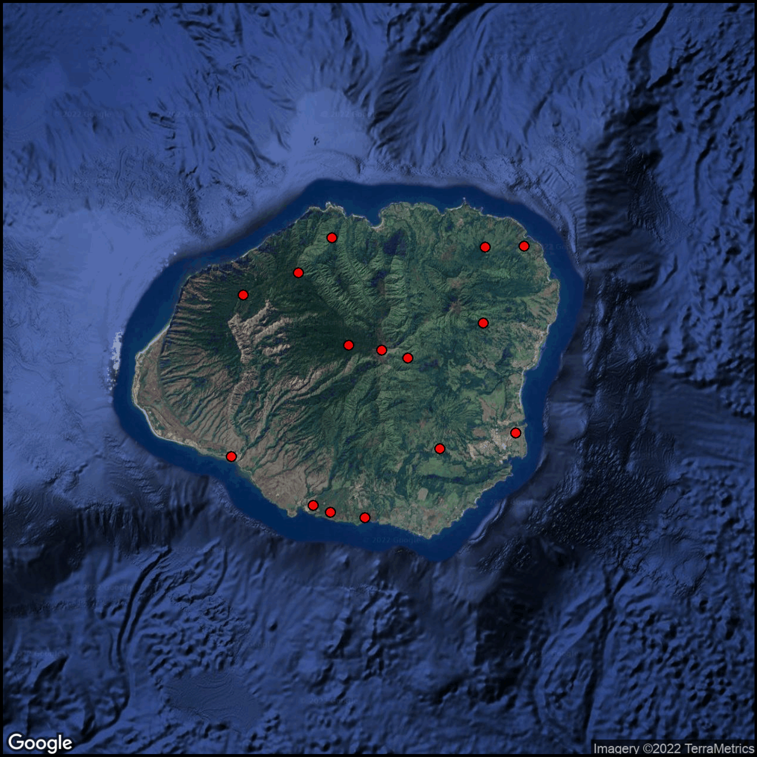
Lets start the visualization by showing the locations where the island’s rainfall is measured (Figure 1). In this example will use a satellite-image as the basemap.
Show the code chunk
## Get a satellite basemapcolumn$gmaptype <-"satellite"column$margin <-0.1basemap <-site_google_basemap(datatable = rain)## Show the rainfall station locations on the mapggmap(basemap) +site_points(datatable = rain) + simple_black_box
Figure 1: Kaua`i rainfall measurement locations.
The rainfall recoding sites are distributed quite well around the coastal areas as well as inland in the mountains.
Examining the properties of the data
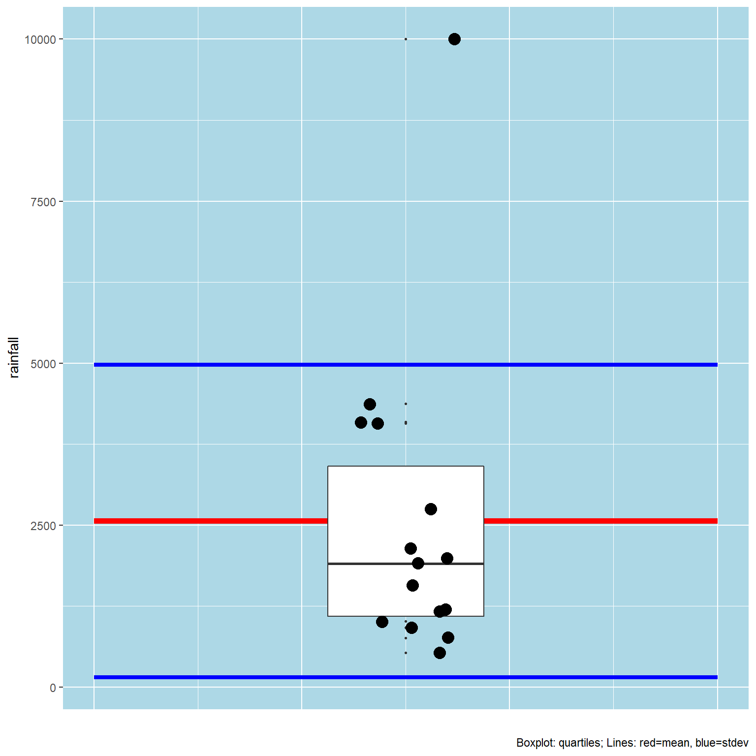
It is a good practice to look at the statistical distribution of the rainfall data (Figure 2) to see if there are any unusual properties.
Figure 2: Statistical properties of the annual Kaua`i rainfall.
You can see that there is an outlier (Mt. Waialeale, with the red circle). The boxplot shows the extent of the interquartile ranges. That value is considerably higher than any of the other values. This calls for care in dividing the data into categories.
Testing the cut strategies
We can divide the rainfall data using all of the cuttype strategies and examine the results. Table 2 shows the distribution of index values.
Show the code chunk
## Make a copy of the original datarain2 <- rain## Build sets of categories for each of the strategiesrain2$tb <-site_cuts(quant_var = rain2$rainfall,cuttype ="topbottom")rain2$ff <-site_cuts(quant_var = rain2$rainfall,cuttype ="fiftyfifty")rain2$q3 <-site_cuts(quant_var = rain2$rainfall,cuttype ="quartiles3")rain2$q4 <-site_cuts(quant_var = rain2$rainfall,cuttype ="quartiles4")rain2$s3 <-site_cuts(quant_var = rain2$rainfall,cuttype ="statistical3")rain2$s4 <-site_cuts(quant_var = rain2$rainfall,cuttype ="statistical4")rain2$ct <-site_cuts(quant_var = rain2$rainfall,cuttype ="cutlist",cuts =c(2000,4000))rain2$bk <-site_cuts(quant_var = rain2$rainfall,cuttype ="breaks",cuts =3)## Show the resultsgt(rain2)%>%fmt_number(columns =c(lat,lon), decimals =5)
Table 2: Annual rainfall on Kaua`i divided into categories.
station
lat
lon
elevation
rainfall
tb
ff
q3
q4
s3
s4
ct
bk
Waimea
21.95631
−159.67221
6
531
1
1
1
1
1
1
1
1
Eleele
21.90353
−159.57720
50
762
1
1
1
1
2
2
1
1
Wahiawa
21.89631
−159.55720
66
918
1
1
1
1
2
2
1
1
Lihue Airport
21.98157
−159.34220
31
1015
1
1
1
1
2
2
1
1
West Lawai
21.89019
−159.51720
64
1165
1
1
2
2
2
2
1
1
Puu Auau
22.18275
−159.33220
101
1193
1
1
2
2
2
2
1
1
Kanalohuluhulu
22.13018
−159.65887
1098
1568
1
1
2
2
2
2
1
1
Halenanaho
21.96491
−159.43053
149
1905
1
1
2
2
2
2
1
1
Koloko Res
22.18140
−159.37775
224
1993
1
2
2
3
2
2
1
1
Kapahi
22.10000
−159.38000
159
2140
1
2
2
3
2
2
2
1
Pow Hse Wainiha
22.19176
−159.55553
30
2746
1
2
2
3
2
3
2
1
Waialeale Trail
22.07605
−159.53611
1390
4068
1
2
3
4
2
3
3
2
Wailua Ditch
22.06250
−159.46772
338
4092
1
2
3
4
2
3
3
2
Kilohana Alakai
22.15408
−159.59461
1220
4373
1
2
3
4
2
3
3
2
Mt. Waialeale
22.07088
−159.49797
1570
10004
2
2
3
4
3
4
3
3
You should note that the sitemaps function site_cuts with the breaks strategy, acts like the R base function cut.
The data used here are quite skewed due to the massive rainfall at Mt. Waialeale. The three cuts result in having just one site in the highest category and nine sites in the lowest category. This emphasizes the bias that can occur if you use this simple, and perhaps intuitive, cut strategy.
We’ll plot one of these strategies as we look at adding colors with the index values.
Index value to color
There are a number of ways to get the segment index values associated with colors. Since we’ve been making use of tables to store data in useful structures, we’ll continue with that strategy here, too.
Create a table with two columns. One column lists the index values. The name of this column should be the same as the index name used in the main point and label table.
The other column if for the parameter you want to use for the colors. In the example below, this column is called point_color as the colors will be used to fill the point symbols.
Show the code chunk
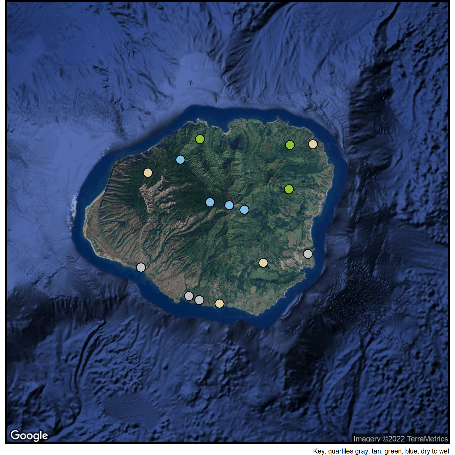
## Create a lookup tablelookup_list <-read_csv(col_names =TRUE, file ="q4, point_color 1, gray80 2, wheat 3, olivedrab3 4, lightskyblue")## Merge the lookup table with the master point and label tablerain3 <-merge(rain2, lookup_list, by="q4")## Enlarge the points so they are seen more easilycolumn$point_size <-5## Put the points on the existing basemapggmap(basemap) +site_points(datatable = rain3) +labs(caption="Key: quartiles gray, tan, green, blue; dry to wet") + simple_black_box
Figure 3: Kaua`i annual rainfall pattern.
The map (Figure 3) shows the distribution of the rainfall. Gray symbols along the coast show the location of the driest sites, the tan symbols generally lowland and inland are wetter areas, the green symbols on the windward side of the island have areas that are even wetter, and finally, the blue symbols near the mountain tops indicate the wettest sites.
In this particular case, the use of the four quartile strategy seems to provide a pretty accurate depiction of the rainfall pattern on the island.