Points and labels are, in a fundamental way, the key elements in the map-making process. Most of the map-making tasks focus on these two elements.
Point and label information is stored in a table. This is called the data table. At a minimum, this table consists of geographic coordinates (lat, lon) and, most likely, text for the labels. The rest of the datatable is optional as there are default values for all of the style variables.
Getting a good display of data depends on having a correct set of basic data (text, lat, lon) and adding table columns or adjusting column values.
Getting Started
There are the usual tasks that need to be done to get started. These include loading some libraries and getting the Google Map key registered.
Show the code chunk
## Librarieslibrary(readr) ## Read in datalibrary(stringr) ## Wrap text stringslibrary(ggmap) ## Show maps, handle Google keylibrary(ggplot2) ## Build mapslibrary(dplyr) ## Data wranglinglibrary(gt) ## Tableslibrary(sitemaps) ## Functions to help build site mapslibrary(parzer) ## Convert HMS to digital coordinates## Initialize Google Map key; this key is stored in a Project directory. My_Key <-read_file("P://Hot/Workflow/Workflow/keys/Google_Maps_API_Key.txt")## Test if Google Key is registeredif (!has_google_key()){## Register the Google Maps API Key.register_google(key = My_Key, account_type ="standard") } ## end Google Key test
The next step is to initialize some data. This is another of the standard startup tasks.
Show the code chunk
## Use two functions from sitemaps to initialize columneterscolumn <-site_styles()hide <-site_google_hides()## Establish a theme that improves the appearance of a map.## this theme removes the axis labels and ## puts a border around the map. No legend.simple_black_box <-theme_void() +theme(panel.border =element_rect(color ="black", fill=NA, size=2),legend.position ="none")
With these steps done, we’re ready to go.
Point and Label Structuring
It is useful to start with a simple example. Here, we’ll use a data table that has locations as names of places. You’ll see in the Coordinates section that we can use Google Maps to convert place names to lat/lon coordinates.
Each of the place names will result in a colored point placed on a basemap. Let’s consider the color of these points.
Red is the default point color. Let’s change this to blue. There are two ways this can be done.
Table Strategy: Make a column in the data table called point_color and add the word blue to each of the rows.
data_table <-read_csv(col_names =TRUE, file ="place, point_color Kapaa, blue Lihue, blue Kalaheo, blue Wailua, blue")
Parameter Strategy: Assign the value "blue" to the column$point_color style parameter.
When the two data tables are used with the sitemaps functions, the results will be the same.
If a characteristic (e.g., point_color) is the same for all rows in the data table, you can use a style parameter (e.g., column$point_color) assignment to specify the value for all the rows.
Maps that need to have different values for a characteristic require the use of a table column. Here, there are two different colors used for the cities in the table.
data_table <-read_csv(col_names =TRUE, file ="place, point_color Kapaa, orange Lihue, blue Kalaheo, blue Wailua, orange")
It is important that you see this difference in strategies. You’ll be using both in most maps. Here is an example.
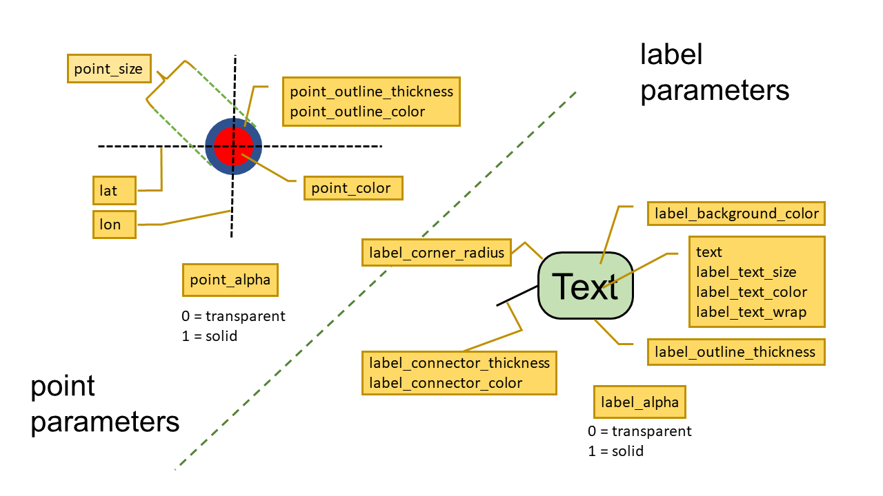
Styles are the way you add information to a table. Sometimes, the default is all you need. You’ve seen (above) how to change specification values so they meet your needs. Here is the set available.
Table 1: Symbol styles and default values.
Specification
Default Value
Notes
point_color
red
Point inside color
point_size
3
Diameter of the point
point_shape
circle
Symbol shape (circle, square, diamond, triangle, wedge, star)
point_alpha
0.9
Transparency of the symbol and outline (1=solid, 0=fully transparent)
point_outline_color
black
Color of the line around the point symbol
point_outline_thickness
1
Width of the symbol-surrounding line
Label Styles
Label styles are just like point styles. The data come from either a data table or a style specification.
Here is a list of the label styles.
Table 2: Label styles and default values.
Specification
Default Value
Notes
label_text_size
4
Height of the text
label_text_color
black
Word colorConverter
label_text_wrap
NA
Maximum number of text characters on a line. (NA=do not wrap)
label_corner_radius
3
Rounding of the box around the text
label_background_color
white
Area behind the text
label_connector_color
red
Line extending from the label to a point
label_connector_thickness
1
Width of the connector line
label_alpha
0.9
Transparency of the label (1=solid, 0=fully transparent)
Point and Label Style Cheatsheet
Multiple Data Tables
Usually, you’ll have all the point and label information in a single file. Table 3 is an example of a data table. Look at the code chunk and you’ll see how this is input and saved.
Think simple for a moment. There are times when you’ll only have points to be mapped. That means you only need to have two columns: the Geographic coordinates specified in lat and lon columns. (Reminder: these column names are always lower case. If your columns are not in lower case, you’ll need to use the dplyr::rename function to make the change.)
The default values will map simple data points, you can add complexity with attributes by adding a point_color (the color of the point) column to your data table.
Now, consider more complexity. Generally, you’ll want to label the data points. That’s why the combination of map_points and map_labels generally occur together.
We can get even more complex. Note that not all data points need a label. Entering NA in the text column will keep a label from appearing at a point. Instead, we might use a data point as a symbol to imply additional meaning even without a label.
Here is an example.
Show the code chunk
## Read the data tabletransects <-read_csv(col_names =TRUE, file ="islet, species, l_w, lat, lon Sifo, 22, 1.9, 11.14306, 166.29062 Mogiri, 14, 6.6, 11.12511, 166.34009 Enibuk, 19, 3, 11.12566, 166.36090 Eniuetakku, 11, 6, 11.12388, 166.37375 Ribouri, 18, 7.2, 11.11881, 166.40379 Kuobuen, 12, 8, 11.12347, 166.42182 Knox, 24, 1.5, 11.11685, 166.52790")## Color the transect points redtransects$point_color <-"red"## check the data tablegt(transects) %>%fmt_number(columns =c(lat,lon), decimals =5) %>%tab_source_note(source_note ="Data: 2002 field survey") %>%tab_footnote(footnote ="length/width",locations =cells_column_labels(columns = l_w))
Table 3: Ailinginae Atoll islets with transects.
islet
species
l_w1
lat
lon
point_color
Sifo
22
1.9
11.14306
166.29062
red
Mogiri
14
6.6
11.12511
166.34009
red
Enibuk
19
3.0
11.12566
166.36090
red
Eniuetakku
11
6.0
11.12388
166.37375
red
Ribouri
18
7.2
11.11881
166.40379
red
Kuobuen
12
8.0
11.12347
166.42182
red
Knox
24
1.5
11.11685
166.52790
red
Data: 2002 field survey
1 length/width
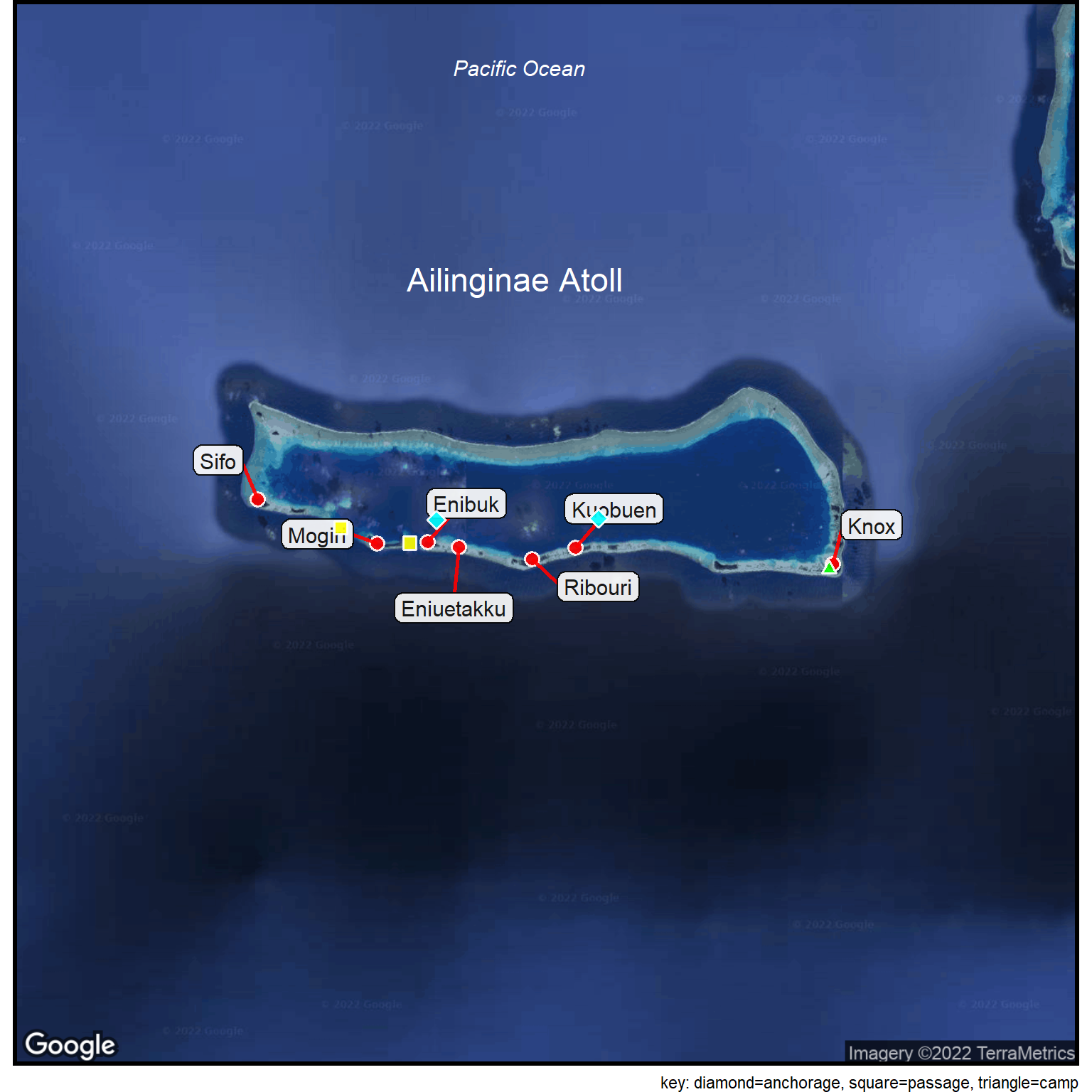
A second point and label datatable (Table 4) gives some of the logistics locations. Note that there are symbols associated with each location. The purpose of this set of data is to plot the symbol, not the text (which is NA).
The symbols are coded by providing columns in this datatable for shape (point_shape) and color (point_color).
This completes the data step. Now we can use these three tables (two data tables and one name table) and create a map.
A satellite basemap is appropriate for this uninhabited atoll in the Marshall Islands.
The transect points are used to define the extent of the basemap. This is done by simply providing the site_google_basemap function with the name of the data table (in this code it is called transects2).
We’re not going to show the basemap. Instead, we’ll continue to the third step, the rendering of the final map.
The final map (Figure 1) involves adding a series of layers to the basemap. The islet labels indicate where there were transects. Symbols (square, triangle, diamond) indicate field trip logistics information. Finally, a few names help give overall orientation for the map.
Show the code chunk
## Rename the islet column in the transects tabletransects2 <- transects %>% dplyr::rename(text = islet)## Adjust a column stylecolumn$point_outline_thickness <-1## Create a basemapcolumn$gmaptype <-"satellite"basemap <-site_google_basemap(datatable = transects2)## Plot the map## Note the layering of the points and labelsggmap(basemap) +site_points(datatable = transects2) +site_labels(datatable = transects2) +site_points(datatable = logistics) +site_names(datatable = places) + simple_black_box +labs(caption ="key: diamond=anchorage, square=passage, triangle=camp")
Figure 1: 2002 Ailinginae Atoll expedition sites.
The order of the layering of the points, labels and symbols keeps information from being hidden.
Many of the ggplot2 options can be used to enhance the map. Here, a caption is used to provide a key to the map symbols.
Overall, the map (Figure 1) serves as a reference to the data in the tables.
Complex Points
The starting data are fairly simple (Table 6). Just a ranking of high schools, along with the number of students in each school. The schools in the data table are listed by name.
Geocoding works to get the geographic coordinates for each school.
Show the code chunk
## Reset all the columneterscolumn <-site_styles()## Basic data from the websitehigh_school <-read_csv(col_names =TRUE, file ="rank, school, students 1, Roosevelt, 1448 2, Kaiser, 1174 3, Kalani, 1435 4, Moanalua, 1996 5, Kalaheo, 814 6, Mililani, 2599 7, Pearl City, 1584 8, McKinley, 1599 9, Radford, 1159 10, Aiea, 985")## Data: https://www.usnews.com/education/best-high-schools/hawaii/rankings/honolulu-hi-46520## Geocode the locationslocation <-geocode(location =paste0(high_school$school," High School, Honolulu, HI"), output ="latlon")high_school <-cbind(high_school, location)gt(high_school) %>%fmt_number(columns =c(lat,lon), decimals =5) %>%tab_source_note(source_note ="Data: www.usnews.com (2022)")
Table 6: Top 10 High Schools in Honolulu.
rank
school
students
lon
lat
1
Roosevelt
1448
−157.83743
21.31061
2
Kaiser
1174
−157.69538
21.28552
3
Kalani
1435
−157.77375
21.27865
4
Moanalua
1996
−157.90036
21.34712
5
Kalaheo
814
−157.75689
21.40925
6
Mililani
2599
−158.01056
21.45252
7
Pearl City
1584
−157.97152
21.39104
8
McKinley
1599
−157.84824
21.29900
9
Radford
1159
−157.92850
21.35984
10
Aiea
985
−157.93008
21.38490
Data: www.usnews.com (2022)
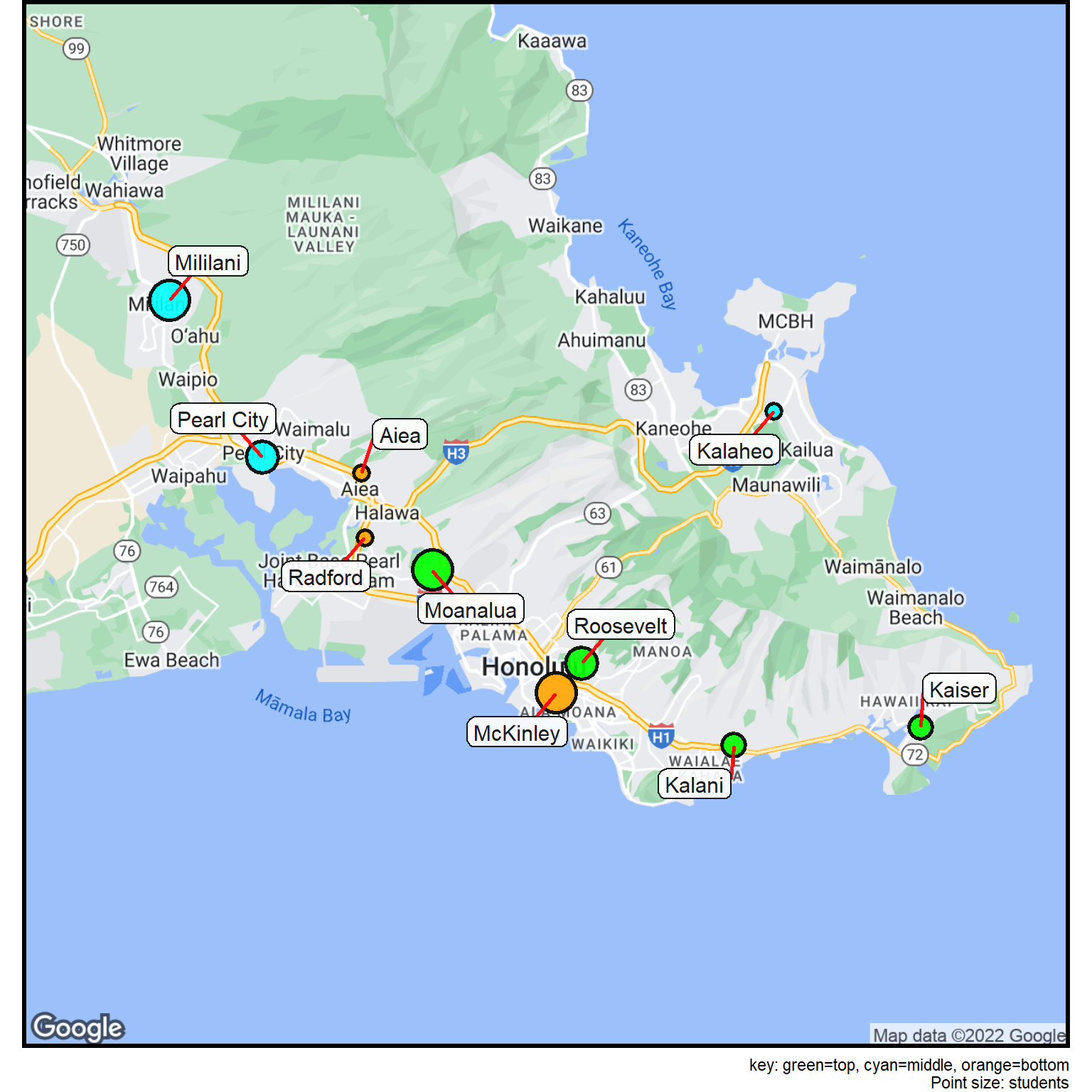
Two groupings are done next: one color codes the schools by their rank and the other grouping is for the size of each school (students).
The two quantitative variables (rank, students) are cut into segments, each with a different strategy. The rank is divided into three groups using the site_cut function (discussed in the Cuts section). The students variable is segmented using the breaks strategy and the cuts value of 3 (divide into nearly three equal-sized groups). The site_cuts function works in connection with a look-up table. In this case, the index value produced by the site_cuts function is used to assign a point size value (point_size). The point size is then merged into the data table.
Table 7 shows the results of the data manipulation.
Note that the site_style parameters (stored in column) are reset before doing anything else.
Show the code chunk
## Divide the high schools into ranks (cuts=3 is three groups)high_school$rindex <-site_cuts(quant_var = high_school$rank,cuttype ="breaks", cuts =3)## Lookup table for colorscolor_table <-read_csv(col_names =TRUE, comment ="#", file ="rindex, point_color 1, green # highest rank 2, cyan 3, orange # lowest rank")## Merge the colors into the data tablehigh_school <-merge(high_school, color_table, by ="rindex")## Divide the high schools by school size (students)high_school$sindex <-site_cuts(quant_var = high_school$students,cuttype ="quartiles4")## Lookup table for sizesize_table <-read_csv(col_names =TRUE, comment ="#", file ="sindex, point_size 1, 3 # smallest school 2, 5 3, 7 4, 9 # largest school")## Merge size into the data tablehigh_school <-merge(high_school, size_table, by ="sindex")## Print the data tablegt(high_school) %>%fmt_number(columns =c(lat,lon), decimals =5) %>%tab_source_note(source_note ="Data: www.usnews.com (2022)")
Table 7: Top 10 High Schools in Honolulu categorized.
sindex
rindex
rank
school
students
lon
lat
point_color
point_size
1
2
5
Kalaheo
814
−157.75689
21.40925
cyan
3
1
3
9
Radford
1159
−157.92850
21.35984
orange
3
1
3
10
Aiea
985
−157.93008
21.38490
orange
3
2
1
2
Kaiser
1174
−157.69538
21.28552
green
5
2
1
3
Kalani
1435
−157.77375
21.27865
green
5
3
1
1
Roosevelt
1448
−157.83743
21.31061
green
7
3
2
7
Pearl City
1584
−157.97152
21.39104
cyan
7
4
1
4
Moanalua
1996
−157.90036
21.34712
green
9
4
2
6
Mililani
2599
−158.01056
21.45252
cyan
9
4
3
8
McKinley
1599
−157.84824
21.29900
orange
9
Data: www.usnews.com (2022)
The data table is now almost ready for plotting.
The school column needs to be changed to text so it will be used in a label.
A style parameters is changed to meet the needs of this particular map.
Then the basemap is generated.
Finally, the map is created (@mapschools).
Show the code chunk
## Rename the school column as text high_school2 <- high_school %>% dplyr::rename(text = school)## Change a style parametercolumn$point_outline_thickness <-1.5## Create the basemapbasemap <-site_google_basemap(datatable = high_school2)## Plot the map## Note the layering of the points and labelsggmap(basemap) +site_points(datatable = high_school2) +site_labels(datatable = high_school2) + simple_black_box +labs(caption ="key: green=top, cyan=middle, orange=bottom\n Point size: students")
Figure 2: Top 10 Honolulu Public High Schools (2022).
Symbols and Transparency
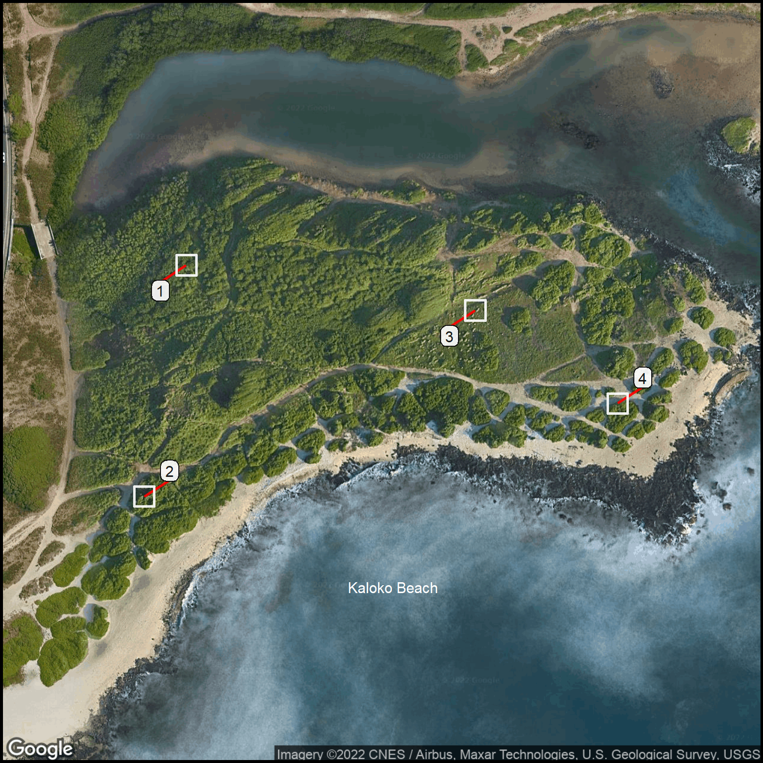
Each year, sampling is done at Kaloko Beach in four plots. Each species is identified along with its relative abundance. A map is a good way to orient researcher so they can find the tiny permanent markers that delimit each sample plot.
Here, the square symbol is used to mark the plot boundaries (about 30m on a side). The inside of the symbol is made transparent with NA as the specification for point_color. Note that the line from each label to the sample square has also been eliminated with the 0 value for label_connector_width.
This plot has minimal information in the data table. Instead, there have been many changes to the style parameters to control the appearance of the points and labels.
Show the code chunk
## Reinitialize the columnscolumn <-site_styles()## Read the datasample_plots <-read_csv(col_names =TRUE, file ="text, lat, lon 1, 21.29361, -157.66083 2, 21.29264, -157.66102 3, 21.29342, -157.65953 4, 21.29303, -157.65889")sample_names <-read_csv(col_names =TRUE, file ="text, lat, lon, name_text_color, name_text_size Kaloko Beach, 21.29226, -157.65990, white, 4")## Set some columneterscolumn$margin <-0column$gmaptype <-"satellite"column$point_color <-NAcolumn$point_size <-7column$point_shape <-"square"column$point_outline_color <-"white"column$point_outline_thickness <-1.5column$label_connector_width <-0## Basemapbasemap <-site_google_basemap(datatable = sample_plots)## Plot the map## Note the layering of the points and labelsggmap(basemap) +site_labels(datatable = sample_plots) +site_points(datatable = sample_plots) +site_names(datatable = sample_names) + simple_black_box
Figure 3: Permanent plot locations for vegetation sampling at Kaloko Beach.
Colored Labels
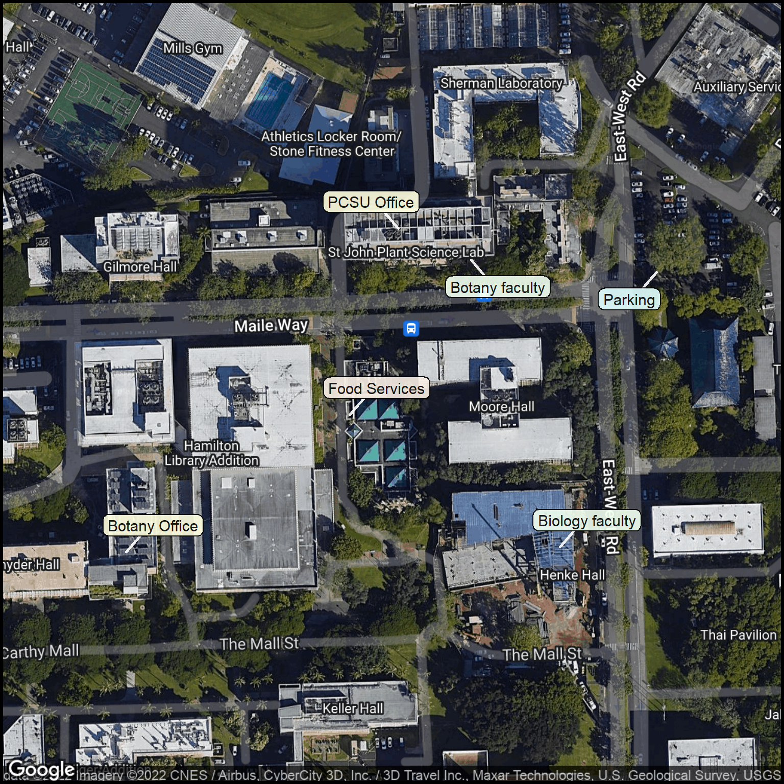
The next example shows how colored labels can group labels by their similar function. Here, a simple campus director shows important office locations along with a few places that are important for logistics (parking, food).
The data table is used just for labels. There is no need to data points on this map.
A simplified version of the data table is printed as the geographic coordinates and style parameter information are useful only for making the map.
Table 8: Office and logistics information for PCSU visitors.
office
room
Botany faculty
St John Bldg1
Botany Office
Edmondson 216
PCSU Office
St John 408
Biology faculty
Life Sci Bldg1,2
Parking
E-W Rd Parking
Food Services
Paradise Palms
1 Check building directory
2 Replaces Henke Hall
Now it is time for the map. As usual, a few small changes are made to the style parameters. The office column is changed to text so that this will become the words on the label.
Show the code chunk
## Change a few columneterscolumn$label_connector_color <-"white"column$point_outline_thickness <-3column$margin <-0column$gmaptype <-"hybrid"## Rename office to text campus3 <- campus %>% dplyr::rename(text = office)## Create the basemapbasemap <-site_google_basemap(datatable = campus3)## Plot the mapggmap(basemap) +site_labels(datatable = campus3) + simple_black_box
Figure 4: Information for visitors to the Pacific Cooperative Studies Unit at the University of Hawaii at Manoa.
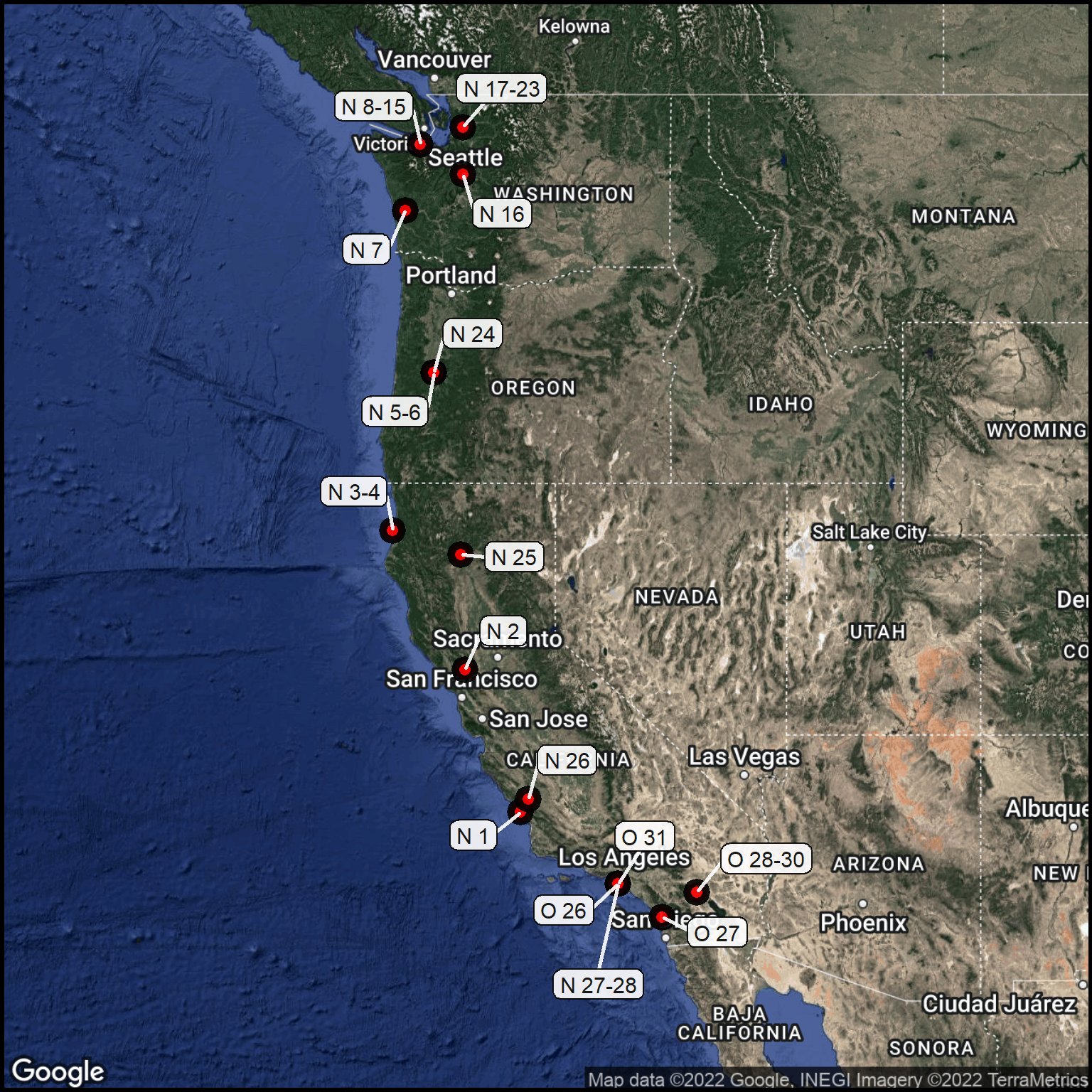
Big Areas
The next map was used for planning a West Coast driving trip. The text entries are the dates we stay in each city (i.e., “O 26” is October, 26). The trip begins and ends in Torrance, California.
Table 9 shows the driving information such as the number of miles for the day and the time this is expected to take. That’s a standard part of our trip planning.
Once we are sure the data are correct, we’ll make a map.
Show the code chunk
trip <-read_csv(col_names =TRUE, file ="text, city, state, miles, hours, comment O 26, Torrance, CA, NA, NA, Myra O 27, Lake San Marcos, CA, 107, 1:52, to Safari Park O 28-30, La Quinta, CA, 105, 2:22, Teresa & Richard O 31, Torrance, CA, 140, 2:59, Myra N 1, Morro Bay, CA, 212, 3:33, The Landing N 2, Napa, CA, 266, 4:17, Cabernet House B&B N 3-4, Trinidad, CA, 268, 4:59, View Crest Lodge N 5-6, Eugene, OR, 280, 5:15, Will & Valerie N 7, Aberdeen, WA, 297, 5:52, Best Western Plus N 8-15, Port Angeles, WA, 166, 3:16, Fir Cottage N 16, Seattle, WA, 78, 2:34, Hampton Inn N 17-23, Mt. Vernon, WA, 55, 0:53, 1901 Farmhouse N 24, Eugene, OR, 311, 4:52, Lanzarotta B$B N 25, Redding, CA, 315, 4:52, Hampton Inn N 26, Paso Robles, CA, 403, 6:14, Holiday Inn Express N 27-28, Torrance, CA, 229, 3:47, Myra")## Check the datatrip$hours <-as.character(trip$hours)gt(trip) %>%fmt_time(columns = hours, time_style ="hm")
The labels on the map show the dates we’ll be at each location. The locations of the points gives us an idea of the distances and the general part of the country we’ll traverse.
During the trip we rely on Google maps for navigation. This map is more for general planning. It is also useful as a communication tool as we discuss our trip with other people.
Saving the map as an image (“png”) lets us store the map on a mobile device so it is available for easy, off-network use.
Two adjustments were made from the default column values. The margin for the map needed to be changed to get the full West Coast shown. The label_text_size needed to be reduced so that label overlap wouldn’t be a problem (especially in Southern California) when the map was view while developing the code. However, the saved map didn’t have a problem with the larger type size. These are pretty standard issues that come up during the map creation process.
Show the code chunk
## Geocode the locationslocation <-geocode(location =paste0(trip$city, ", ", trip$state), output ="latlon")trip <-cbind(trip, location)## Adjust the basemap coveragecolumn$margin <-0.8## Generate the basemapbasemap <-site_google_basemap(trip)## Adjust labelscolumn$label_text_size <-4## Put the points and labels on the basemaptrip_map <-ggmap(basemap) +site_points(trip) +site_labels(trip) + simple_black_boxtrip_mapggsave(filename="Tripmap_West_Coast_2022.png",plot=trip_map,width=8, height=8)
Figure 5: Overnight locations for the West Coast trip.